We read every piece of feedback, and take your input very seriously.
To see all available qualifiers, see our documentation.
Have a question about this project? Sign up for a free GitHub account to open an issue and contact its maintainers and the community.
By clicking “Sign up for GitHub”, you agree to our terms of service and privacy statement. We’ll occasionally send you account related emails.
Already on GitHub? Sign in to your account
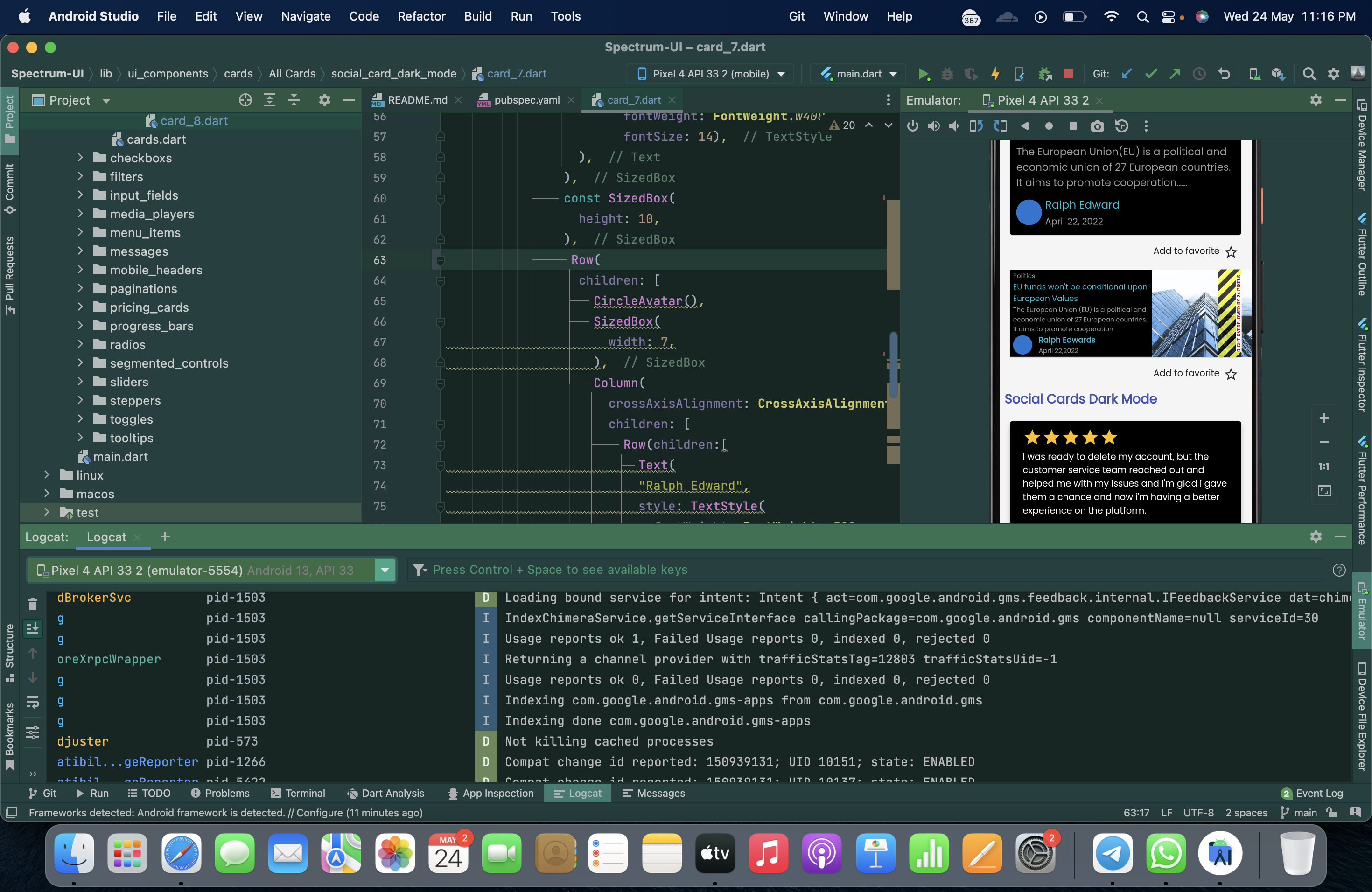
Describe the bug There is a right overflow in case of 'blog cards dark mode' in the cards section of the application.
To Reproduce Steps to reproduce the behavior:
Expected behavior There shouldn't have been this overflow, which affects the aesthetics and efficiency of the application.
Screenshots
Smartphone (please complete the following information):
Additional context I'd sort it out under the GSSOC. Please assign this work under my profile.
The text was updated successfully, but these errors were encountered:
@jaivsh you have been assigned this issue .
Sorry, something went wrong.
Hi, @ashdude1401 can u please look into this PR that I've made with regards to this issue #196? Thanks in advance!!
jaivsh
Successfully merging a pull request may close this issue.
Describe the bug
There is a right overflow in case of 'blog cards dark mode' in the cards section of the application.
To Reproduce
Steps to reproduce the behavior:
Expected behavior
There shouldn't have been this overflow, which affects the aesthetics and efficiency of the application.
Screenshots

Smartphone (please complete the following information):
Additional context
I'd sort it out under the GSSOC. Please assign this work under my profile.
The text was updated successfully, but these errors were encountered: