An information box component for react-native. This is still very much a work in progress and only handles the simplest of cases, ideas and contributions are very welcome.

- Run
npm install react-native-infobox --save
This project uses [React Native Vector Icons] (https://github.com/oblador/react-native-vector-icons) which uses Ionic fonts. Please follow the proper instructions from their project to use it in iOS or Android.
'use strict';
import React, {Component} from 'react'
import InfoBox from 'react-native-infobox'
class App extends Component {
...
render() {
return (
<InfoBox
hidden={false}
onClose={() => {}}
timeout={5}>
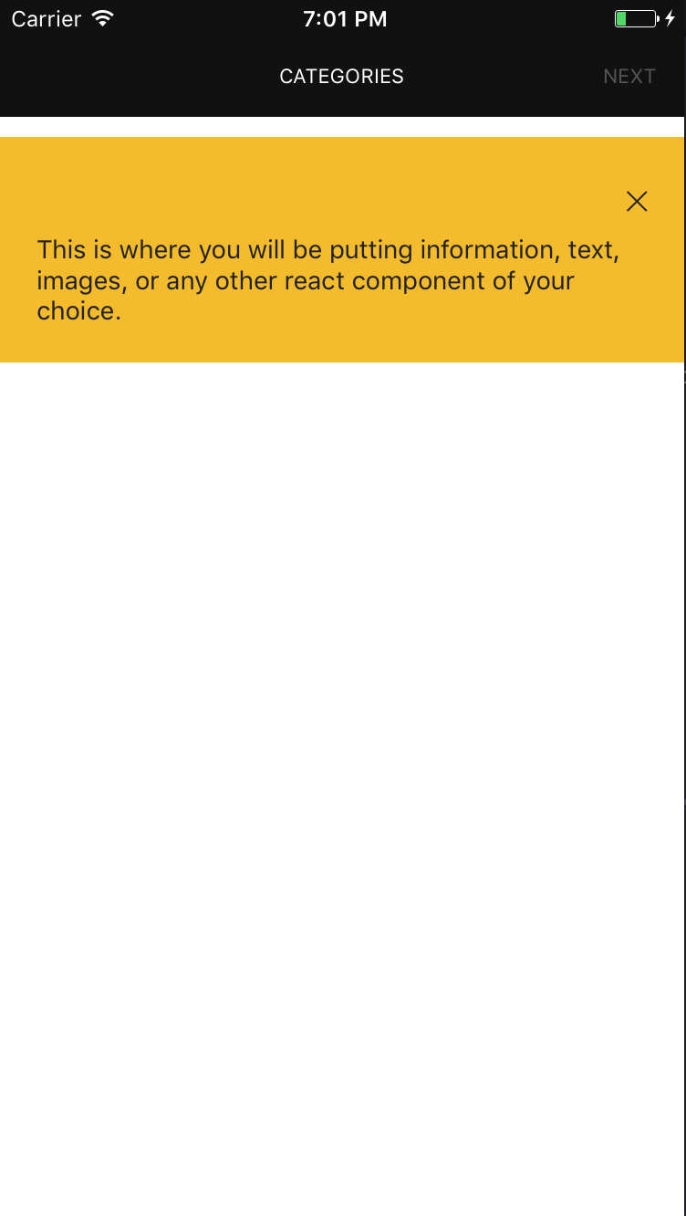
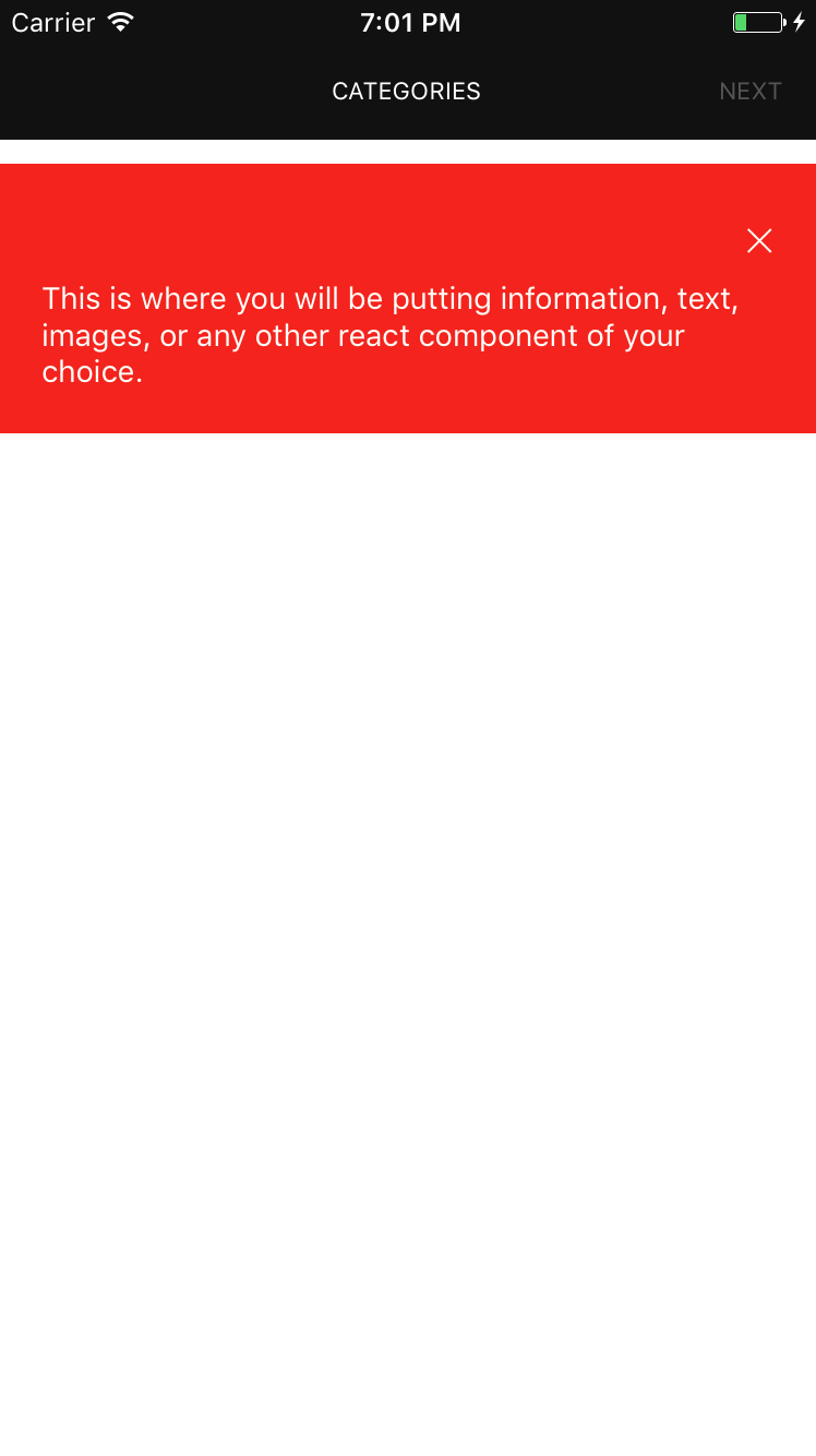
<Text style={{color: 'white'}}>Hello this is a help box.</Text>
</InfoBox>
)
}
}'use strict';
import React, {Component} from 'react'
import InfoBox from 'react-native-infobox'
class App extends Component {
...
render() {
return (
<InfoBox>
<Text style={{color: 'white'}}>Hello this is a help box.</Text>
</InfoBox>
)
}
}Component accepts several self-descriptive properties:
hidden(Bool) - iftrue, the info box will be hidden by default.onClose(Function)timeout(Number) - set timeout in seconds to define when the infobox closes automatically.children(React Component)containerStyle(Object) - applies style to the infobox container.iconName(String) - Ionicon icon name for the close icon, See ionicon font cheatsheet.iconColor(String) - Close icon color.iconSize(Number) - Close icon size.
MIT Licensed