-
Notifications
You must be signed in to change notification settings - Fork 198
Simple UX tricks to boost onboarding & KYC conversion
*Perfect = Better
Working at a digital bank got us to create Ballerine.io, an open-source Identity, KYC, and risk infrastructure, to enable maximum flexibility, and the ability to support any company’s use case in these processes.
https://github.com/ballerine-io/ballerine
But first, I’d love to tell a bit about some of the experiences we had, that got us to understand that such a tool is required in the world.
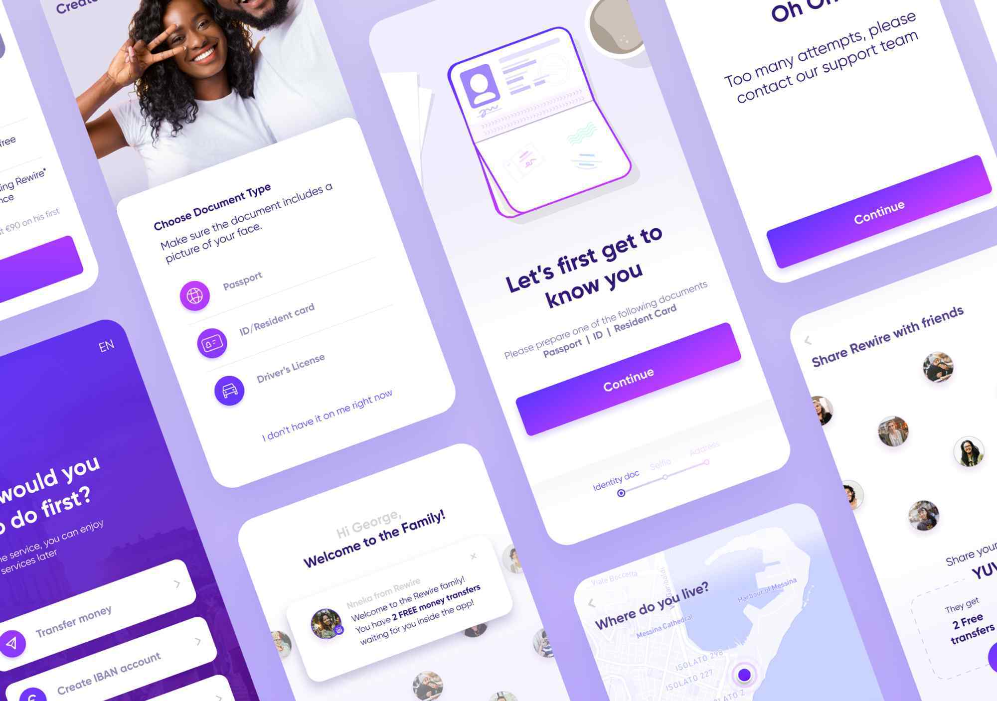
In this article, I would like to present some of the things we did in order to largely increase our active user growth for Rewire, an international digital bank for migrant workers.
We hope this article can help others understand how
Rewire was a digital bank for migrant workers worldwide, it was mainly a money transfer service for migrant workers in Israel. In the following article we will discuss those good ol’ days…
When we started Rewire we quickly came to know that we would need to take our customers through a process called “KYC” before providing any service.
Our KYC process required the customer to provide a few things:
- Fill out his full address in Israel
- Upload a photo of his ID
- Upload a selfie (so we can compare it to the ID)
Now that’s quite a friction-filled process. 😬
What is KYC? “Know your customer”, a set of personal properties a financial institution needs to regulatory collect when providing a service to a customer.
To approve that the IDs we are receiving are real, we have checked various 3rd party IDVs (Identity verification tools) based on performance, price and length of implementation and after a long due diligence process we finally came to choose a popular IDV provider to do the job.
The IDV solution does three things:
- Provide an out of the box Identity verification flow.
- Scans and sends back the presented details on uploaded IDs.
- Verifying that the documents sent by the user are real and legal.
Sound great, right?
Yeah, we thought so as well…
Initially we were pleased with our IDV provider, we had around 35% conversion rate between people who started the flow to completing it and being verified so they can use our service.
But as we grew and were able to bring the rest of our product to a good shape, it was time to try and squeeze some more from our KYC flow.
As the one in charge of growth at Rewire (at the time), I started researching what can be done…
So we know that the whole flow has a 35% conversion rate, but the flow has several screens and paths that our IDV provider does not give us any analytics on.
If I just go ahead and create a new flow I won’t really know in which parts I did better or worst than their tool.
Me: “Geez I don’t know… we’ll duplicated their flow’s code to our code?”
Devs: “mmm… yeah we can do that”
Brilliant! That way we can offer the same UX and UI to our users as our IDV, but now we’ll be able to implement our analytics and monitoring tools throughout the flow and study it to the bone.
Still at 35% conversion, but now we have analytics!
So, once we had the data, we could see that most of the users were able to pass the ID upload flow real quick. Nice!
But wait… once users upload the ID, they need to wait for it to be verified by our IDV provider’s service before they can continue using Rewire.
Our IDV provider’s average verification duration stood on 1:14 minutes.
Who the hell wants to wait inside an app for more than a minute to be able to use it???
Let’s keep them occupied while the ID is being verified.
A/B test — We switched between the flow’s parts so the user will start the ID processing flow early in the flow and the time-consuming address form will keep the user occupied while his ID is being processed.
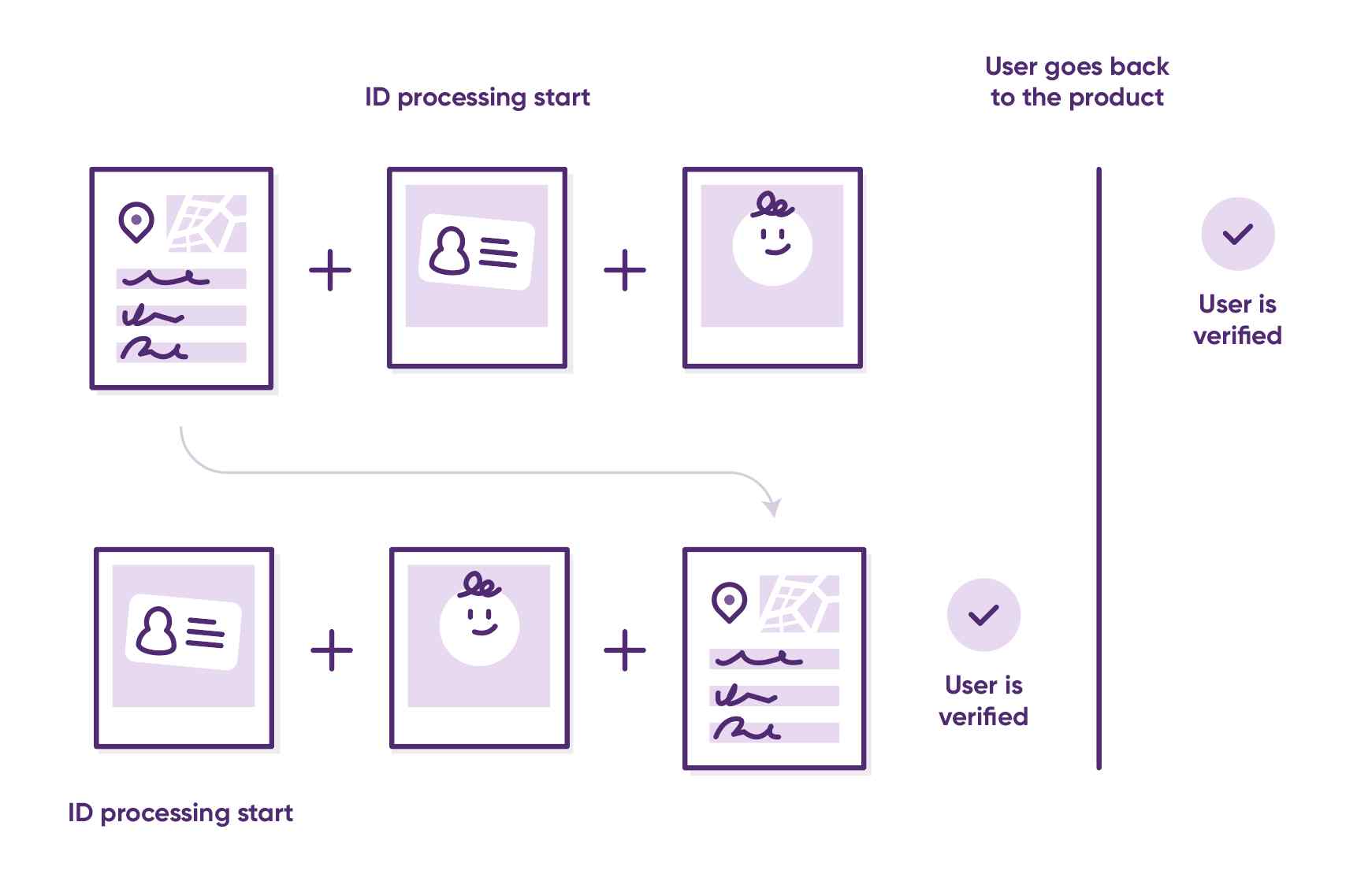
previous and new KYC flow
- Increase of 6% in users completing a money transfer within the session in which they upload an ID.
- 12% Increase in KYC conversion rate because users who uploaded weird half naked images of themselves instead of an ID are now at the end of the flow already aware that it wasn’t what we expected to get from them and that they should upload again.
Bringing our conversion rate to 39%
Yup, we actually received tons of photos that were far from what we asked for.
Selfies instead of IDs, IDs instead of selfies,
“Why is that?” we asked.
Just asking ourselves didn’t get us far, so eventually, we opened our computers and looked at the flow.

3rd party provider flow
Do you see it?
It looks like screens are just duplicated throughout the flow with some minor text changes.
Most users don’t land on a page and start reading, especially if the screen they are currently at seems to be a place they’ve already been to.
We looked at some user sessions and that’s exactly what we’ve seen… confusion.
- Users uploaded an ID and felt like the flow didn’t work and they need to upload again (even though they succeeded and are asked to upload a selfie)
- Other users tried uploading a selfie and when they didn’t like the result, went back too far in the flow, and uploaded another selfie but on the ID upload screen.
- Users that did upload the right things didn’t have enough guidance and provided photos that were cut and blurry that we couldn’t verify.
🤦♂️ 🤦♂️ 🤦♂️
Visually differentiate between the documents request screens.
🚨 KYC is a heavy friction flow, not only because of practical reasons, mostly it’s where the user’s trust alarms are starting to ring. Having a KYC process that is not consistent with the rest of the product’s experience might look sketchy and risky in the eyes of users.
Oh, so while we’re at it, we should redesign the flow to be on-brand!
Introducing our new KYC flow!
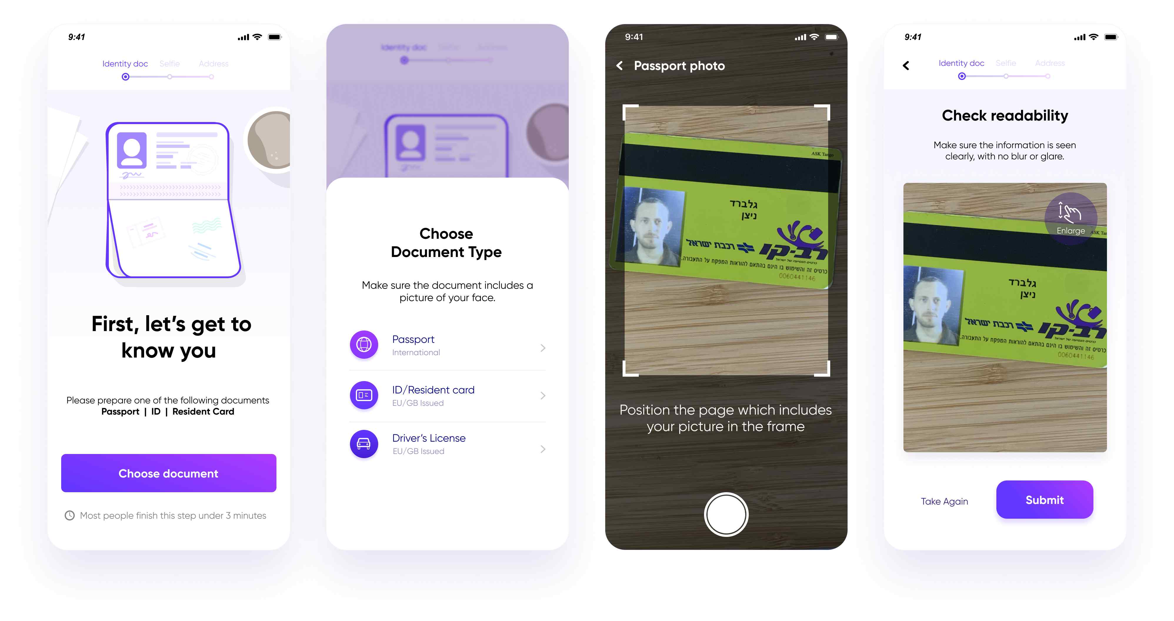
ID upload screens
- We added different animations on each step to illustrate which document should be photographed and to show exactly how we need it to be photographed.
- We placed a progress bar so the user will know how many steps they need to go through and in which step they are right now.
- We added a dark overlay with a cut-out viewport onto the camera screen (second image from the right) so users will place their ID inside of it, once photographed the image the user reviews appears to be only what was in the cut-out overlay viewport and they need to approve that the image is not cut. When we receive the image we actually get the full one that the camera took, that way, fewer images are cut and more images can be processed.
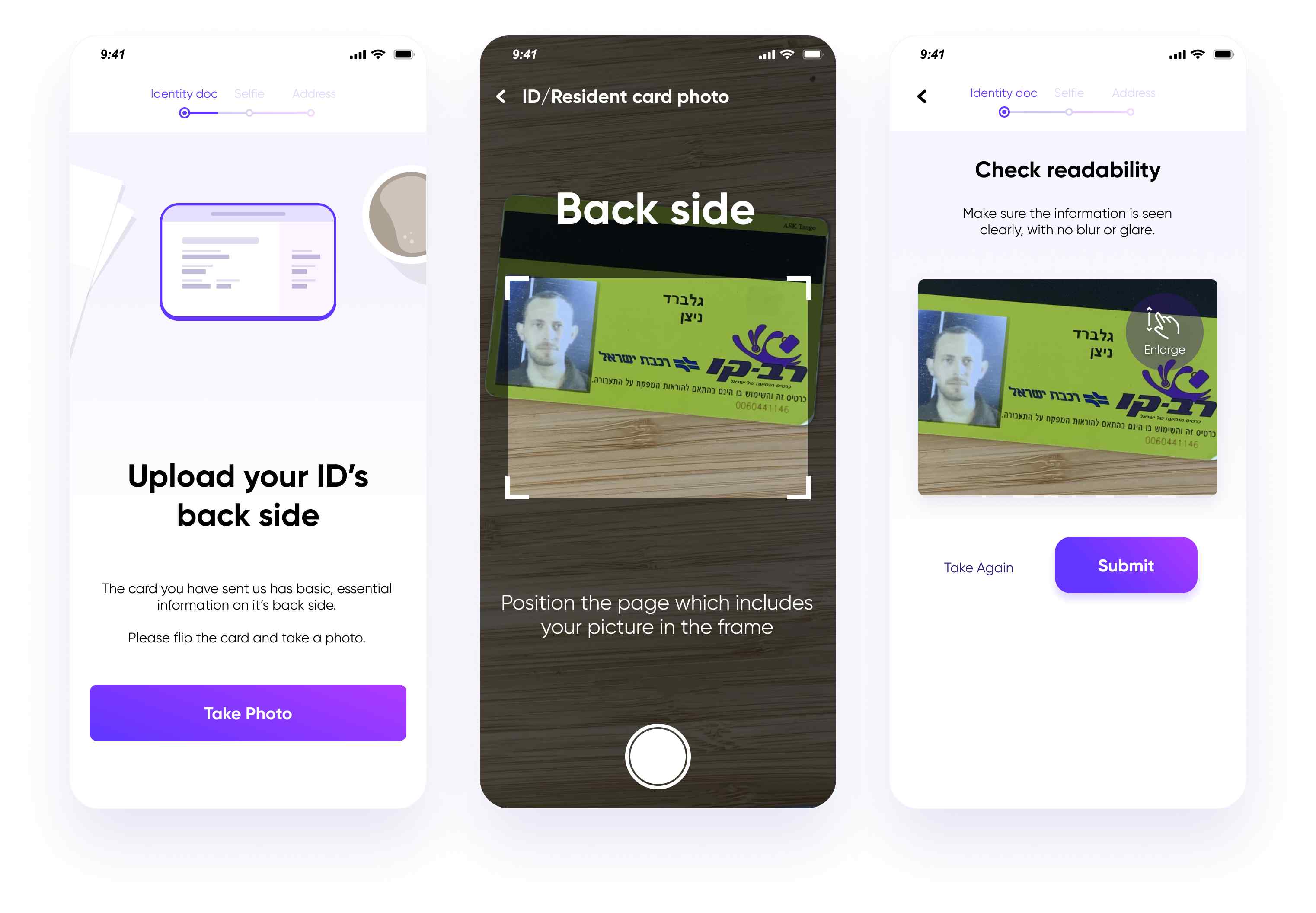
If needed, the user is asked for the ID’s back side
- Added an ID flip animation when the user needs to take a photo of the backside of his ID (you can see the animation in the video attached in this article).
- If we understand mid-flow that users need to provide us with more information they would suddenly have a “half step” in the progress bar.
- Added a clear title on the camera screen.
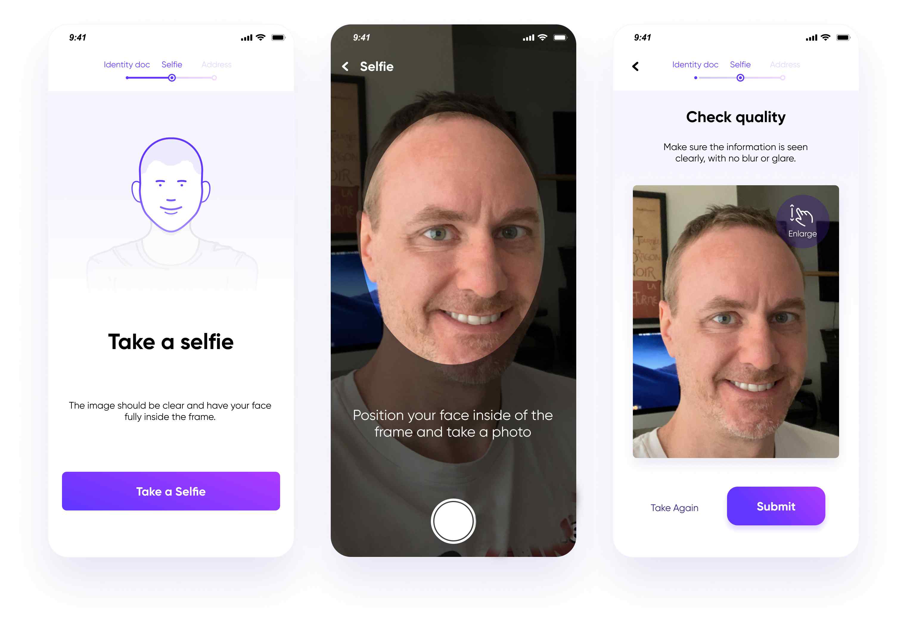
“Upload a selfie” screens (that’s a random dude I found online… (no offense if you’re that guy, thanks for the ))
- Added a selfie animation to fully demonstrate what the user should do now.
- Again an overlay on the camera but this time circular to resemble a face.
The animations we used:
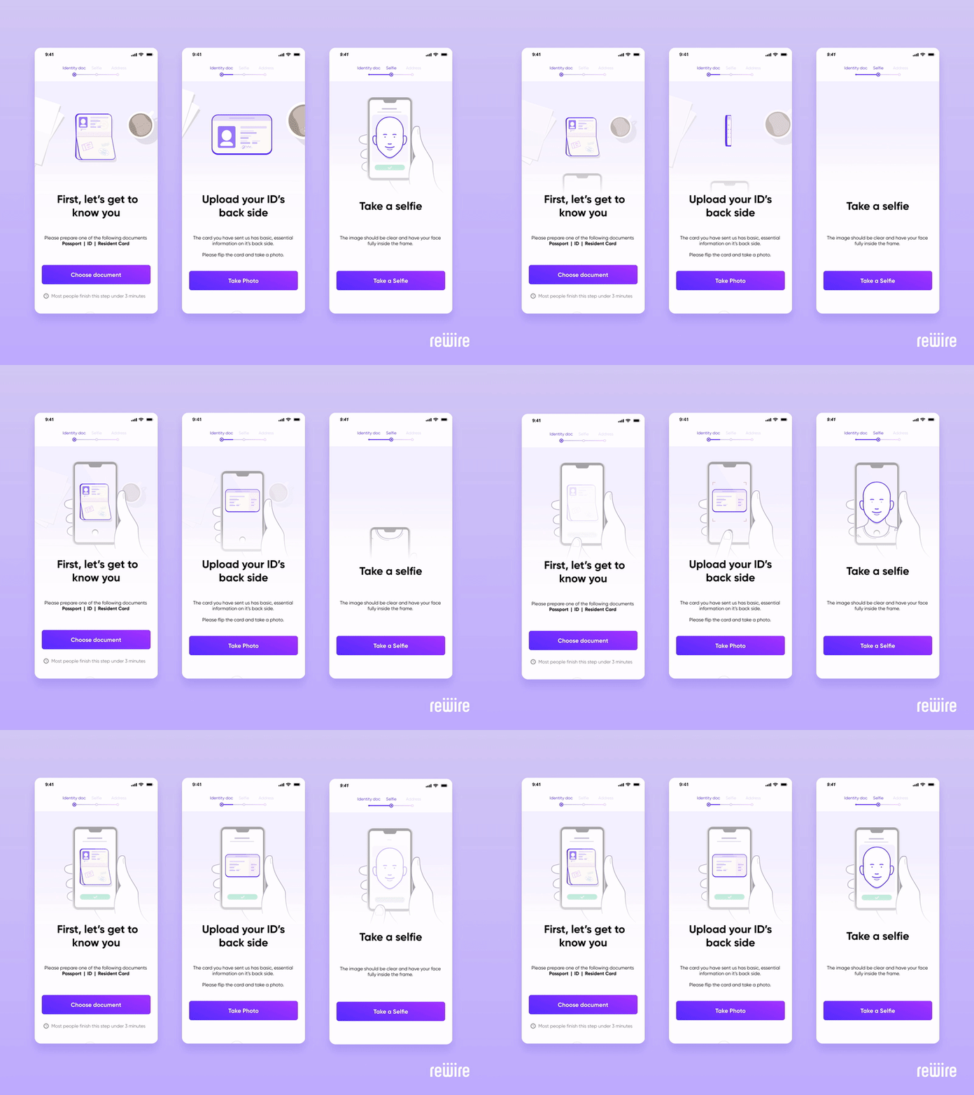
- Lottie animations (so basically vector based, can change size without loosing quality + playback can be fully controlled by code)
So…
Our KYC conversion rate is performing 23% better than the previous one! Making our KYC conversion rate 48%
Impacting thousands of new users each month!
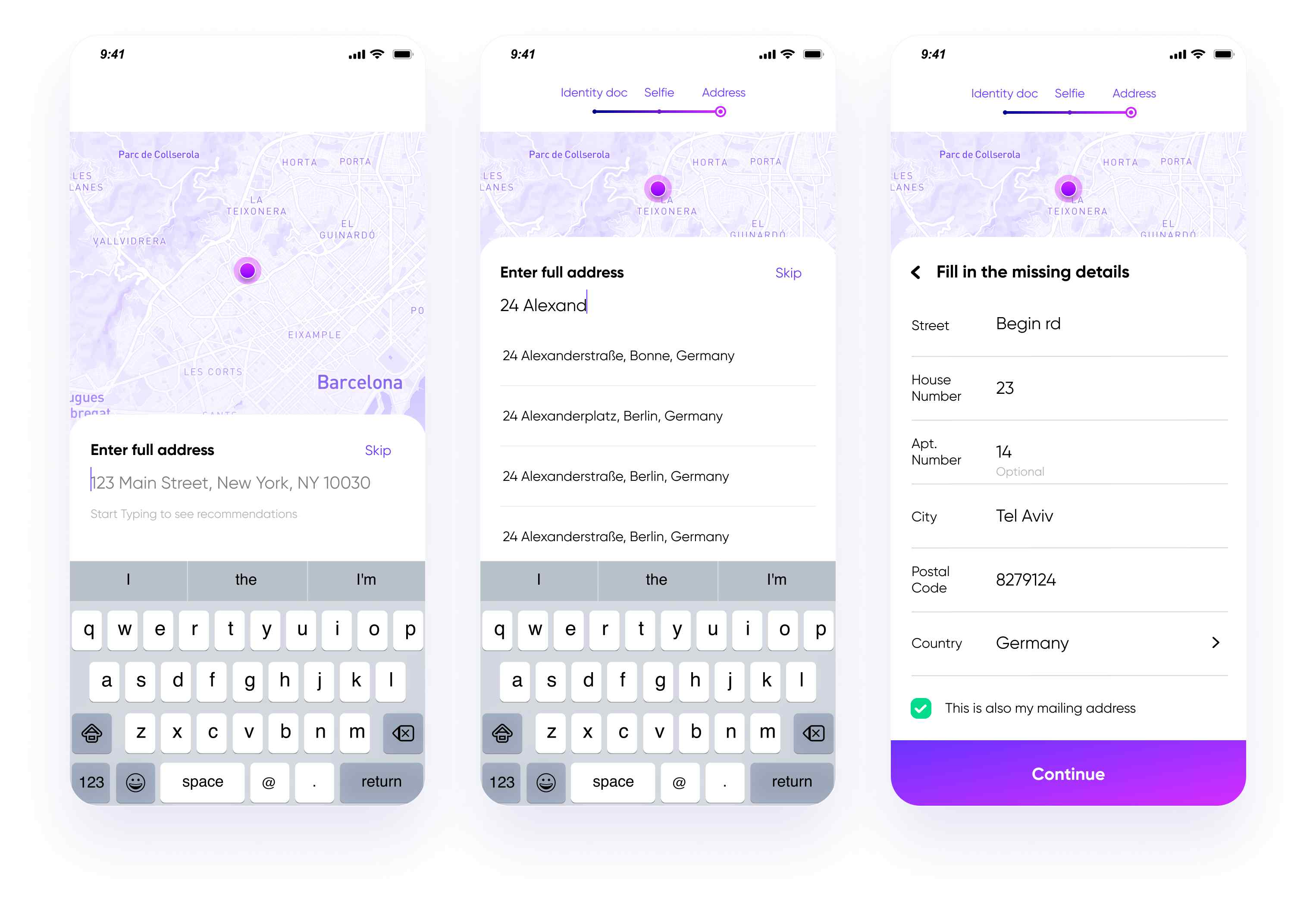
Our address form
We also significantly improved our address taking flow by
- adding an autocomplete field which after choosing an option breaks down to a full address.
- Showing the address on a map. remember, we are serving migrant workers who are living abroad. they should be confident the address they gave us is correct and a map helps ease the task.
Our address form is being completed much faster… which might again create the problem of people completing the KYC flow too early to use our service.
Don’t worry, we have plans for how to fix this… I can tell you in person if you like.
That’s it,
If you enjoyed the article, check out our open-source KYC and risk infrastracture and give us a ⭐ ! https://github.com/ballerine-io/ballerine.
Thanks.
Nitzan from Ballerine.
