-
Notifications
You must be signed in to change notification settings - Fork 0
Advanced Tutorial
import os
import numpy as np
import espresso as esp

import pandas as pd

%matplotlib inline
esp.__version__
'0.4.0'
The data is organized as follows:
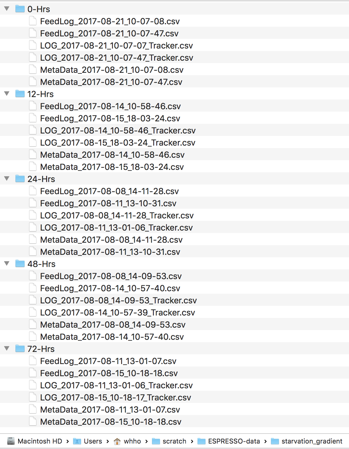
data_dir = "/Users/whho/scratch/ESPRESSO-data/starvation_gradient/"

# Because there are five different folders, one for each time point,
# we will create a dictionary, and add each timepoint to it
# as a standalone espresso object.

data_dict = {}
for t in [0 ,12, 24, 48, 72]:

    folder = "{}-hrs".format(t)
    location = os.path.join(data_dir, folder)

    # Note that you should enter the full duration of the experiment.
    # Now, the ability to select arbitary timepoints is available
    # from each plotting function. (These will be covered later.)
    data_dict[t] = esp.espresso(location, expt_duration_minutes=360)

    # We can attach a custom label to each experiment.
    # This should be used in the future for OPTO-espresso experiments.
    data_dict[t].attach_label("Starved", folder)
Starved has been added as a new label, with '0-hrs' as the custom value.
Starved has been added as a new label, with '12-hrs' as the custom value.
Starved has been added as a new label, with '24-hrs' as the custom value.
Starved has been added as a new label, with '48-hrs' as the custom value.
Starved has been added as a new label, with '72-hrs' as the custom value.
We can easily 'add' the five timepoints into a single espresso object.
# First, we extract out the dictionary values into a list.
all_data = list(data_dict.values())

# Then, we just sum up all the elements of the list!
starve_gradient = np.sum(all_data)
Calling the object will give us a summary of the espresso experiment.
The categories that are listed represents all the variables that you can use for plotting.
starve_gradient10 feedlogs with a total of 300 flies.
1 Genotype [w1118]
Categories (1, object): [w1118].
1 Status type [Sibling]
Categories (1, object): [Sibling].
2 Temperatures [25, 22]
Categories (2, int64): [22 < 25].
2 FoodChoices [NaN, 5% sucrose + 5% yeast extract]
Categories (1, object): [5% sucrose + 5% yeast extract].
1 Sex type [M]
Categories (1, object): [M].
1 type of FlyCountInChamber [1]
Categories (1, int64): [1].
1 label has been added: ['Starved']
Starved: [0-hrs, 12-hrs, 24-hrs, 48-hrs, 72-hrs]
Categories (5, object): [0-hrs < 12-hrs < 24-hrs < 48-hrs < 72-hrs]
Total experiment duration = 360 minutes
ESPRESSO v0.4.0
Note that only two categories have more than one type: Temperature and Starved.
It is a good idea to create the color palette(s) you will use for each variable of interest.
import seaborn as sns

# Because the starvation experiment represents a gradient,
# we will use the continuous palette `viridis`, but in reverse
# (hence the '_r') at the end.

# We create a palette with a helper function `create_palette()`
# that is found in the espresso package.
starved_palette = esp.create_palette('viridis_r', # The reverse viridis colormap.

                                     # The 5 types of starvation duration.
                                     starve_gradient.feeds.Starved.unique()
                                    )

sns.palplot(starved_palette.values())
I strongly suggest taking a look at the descriptive plots first (rasters and cumulative plots) before producing the estimation plots. This enables you to see if the data "makes sense".
For all plots, you can use the start_hour and end_hour keywords to plot your time window of interest.
starve_gradient.plot.rasters(
      col='Starved', # This plots each category of "Starved" in its own column.

      color_by='Starved', palette=starved_palette,

       # You can indicate the time window to be plotted
       # with the keywords below.
       # Try changing this to different values.
       start_hour=0, end_hour=1,


       ## Other keywords of interest:
       ## Change the size of each facet (panel) in inches.
       # height=10, width=10,

       ## if False, the vertical hourly gridlines will not be plotted.
       # gridlines=True,
                            )
Plotting 0-hrs
Plotting 12-hrs
Plotting 24-hrs
Plotting 48-hrs
Plotting 72-hrs
array([<matplotlib.axes._subplots.AxesSubplot object at 0x1117e9d68>,
<matplotlib.axes._subplots.AxesSubplot object at 0x111994048>,
<matplotlib.axes._subplots.AxesSubplot object at 0x1119b8ac8>,
<matplotlib.axes._subplots.AxesSubplot object at 0x1119e8588>,
<matplotlib.axes._subplots.AxesSubplot object at 0x111a16080>],
dtype=object)

Flies whose IDs are greyed out did not feed for the entire duration. So flies with IDs that are not greyed out, but do not have rasters plotted, did not feed during the time window being plotted.
fig, pct_feeding = starve_gradient.plot.percent_feeding(
         # If you only have a single category that you are interested in,
         # as in the case here, you will still need to
         # enter a category for `group_by`. Simply enter any category
         # with only one type.
         group_by='Sex',
         compare_by='Starved',

         # Again, you can select an arbitrary time window.
         start_hour=0, end_hour=0.5

        )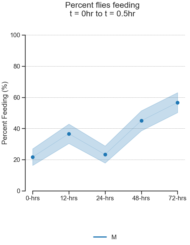
pct_feeding # The dataframe with percent feeding and CIs| percent_feeding | ci_lower | ci_upper | ||
|---|---|---|---|---|
| Sex | Starved | |||
| M | 0-hrs | 21.666667 | 16.348111 | 26.985223 |
| 12-hrs | 36.666667 | 30.445437 | 42.887897 | |
| 24-hrs | 23.333333 | 17.873039 | 28.793628 | |
| 48-hrs | 45.000000 | 38.577384 | 51.422616 | |
| 72-hrs | 56.666667 | 50.269329 | 63.064004 |
There are two types of cumulative plots.
- feed_count
- consumption
starve_gradient.plot.cumulative.feed_count(

        # The `row` and `col` keywords determine the
        # plot layout. `color_by` determines the how
        # lines and CIs are colored.
        # Try changing the variables below.
        row=None, col='Starved', color_by='Starved',

        # Arbitrary time window selection.
        start_hour=0, end_hour=2,

        palette=starved_palette,

        ## Change the ylims. Defaults should be sensible
        ## most of the time.
        # ylim=None,

        ## Change the timebin size.
        ## Try altering the value below.
        timebin='5min',

        ## Change the size of each facet (panel) in inches.
        # height=10, width=10,

        ## if False, the vertical hourly gridlines will not be plotted.
        # gridlines=True,
    )
Munging.....
Plotting....
<seaborn.axisgrid.FacetGrid at 0x119e7f4a8>

starve_gradient.plot.cumulative.consumption(

        # The `row` and `col` keywords determine the
        # plot layout. `color_by` determines the how
        # lines and CIs are colored.
        # Try changing the variables below.
        row=None, col='Starved', color_by='Starved',

        # Select the unit of measure for the ylim.
        # You will see this option for any plot
        # (cumulative, contrast) that have volume measures
        # as the y-variable.
        # Accepts 'centiliter' 'milliliter, 'microliter', 'nanoliter', and 'picoliter'.
        volume_unit='nanoliter',

        # Arbitrary time window selection.
        start_hour=0, end_hour=2,

        palette=starved_palette,

        ## Change the ylims. Defaults should be sensible
        ## most of the time.
        # ylim=None,

        ## Change the timebin size.
        ## Try altering the value below.
        timebin='5min',

        ## Change the size of each facet (panel) in inches.
        # height=10, width=10,

        ## if False, the vertical hourly gridlines will not be plotted.
        # gridlines=True,
    )
Munging.....
Plotting....
<seaborn.axisgrid.FacetGrid at 0x112bf2be0>

There are five types of contrast plots.
- feed_count_per_fly
- feed_volume_per_fly
- feed_speed_per_fly
- feed_duration_per_fly
- latency_to_feed_per_fly
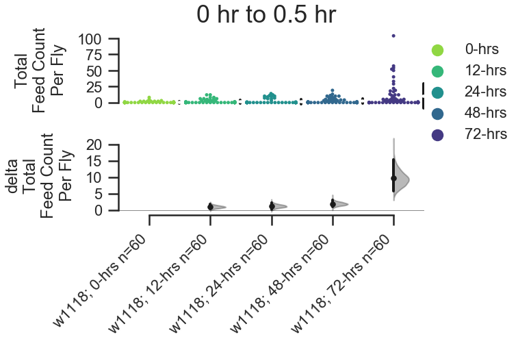
fig, stats = starve_gradient.plot.contrast.feed_count_per_fly(

    # The logic behind contrast plots is:
    # group the observations by a variable,
    # and then within that, compare between another variable.
    # Here, we group_by
    group_by='Genotype', compare_by='Starved', color_by='Starved',

    palette=starved_palette,

    # Here we select the first 30 minutes of the experiment.
    start_hour=0, end_hour=0.5,

    # Control the overall figure size in inches here.
    # Pass a tuple (x_inches, y_inches).
    fig_size=(8,5),

    ## You can control aspects of the contrastplot
    ## by passwing keywords for dabest.plot
    ## within a dict.
    contrastplot_kwargs=dict(swarmplot_kwargs={'size':5})
    )
# show the stats.
stats| reference_group | experimental_group | stat_summary | bca_ci_low | bca_ci_high | ci | is_difference | is_paired | pvalue_2samp_ind_ttest | pvalue_mann_whitney | |
|---|---|---|---|---|---|---|---|---|---|---|
| 0 | w1118; 0-hrs | w1118; 12-hrs | 1.000000 | 0.283333 | 1.850000 | 95.0 | True | False | 0.016637 | 0.044570 |
| 1 | w1118; 0-hrs | w1118; 24-hrs | 1.233333 | 0.266667 | 2.316667 | 95.0 | True | False | 0.017412 | 0.508856 |
| 2 | w1118; 0-hrs | w1118; 48-hrs | 1.916667 | 0.966667 | 3.100000 | 95.0 | True | False | 0.000727 | 0.002044 |
| 3 | w1118; 0-hrs | w1118; 72-hrs | 9.633333 | 5.683333 | 15.433333 | 95.0 | True | False | 0.000182 | 0.000003 |
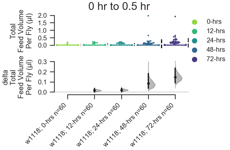
For feed_volume_per_fly() and feed_speed_per_fly(), you can also change the unit of measure on the y-axis with the volume_unit keyword.
fig, stats = starve_gradient.plot.contrast.feed_volume_per_fly(

    group_by='Genotype', compare_by='Starved', color_by='Starved',

    # Accepts 'centiliter' 'milliliter, 'microliter', 'nanoliter', and 'picoliter'.
    volume_unit='microliter',

    palette=starved_palette,

    start_hour=0, end_hour=0.5,

    fig_size=(8,5),

    contrastplot_kwargs=dict(swarmplot_kwargs={'size':5})
    )
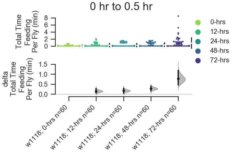
For feed_duration_per_fly() and latency_to_first_feed(), you can also change the unit of time on the y-axis with the time_unit keyword.
fig, stats = starve_gradient.plot.contrast.feed_duration_per_fly(

    group_by='Genotype', compare_by='Starved', color_by='Starved',

    #  Accepts 'second' or 'minute'.
    time_unit='minute',

    palette=starved_palette,

    start_hour=0, end_hour=0.5,

    fig_size=(8,5),

    contrastplot_kwargs=dict(swarmplot_kwargs={'size':5})
    )