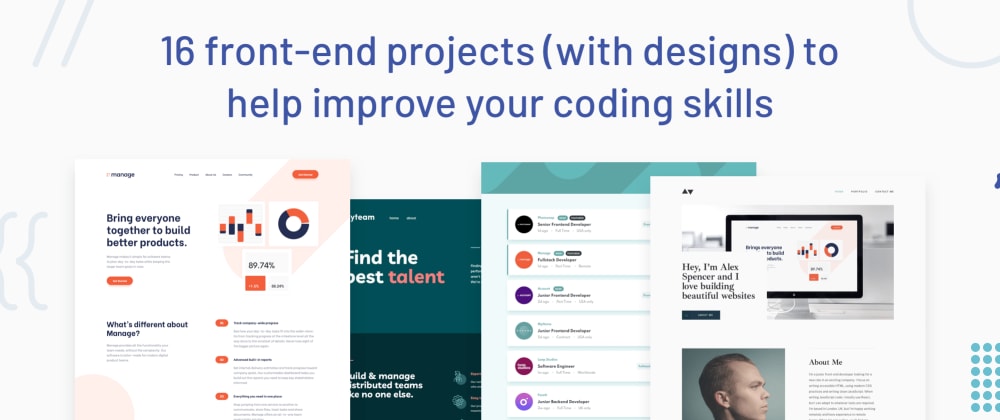
Matt Studdert for Frontend Mentor
There's nothing quite like building projects to grow as a developer. Tutorials are a brilliant learning tool. But at some point, the training wheels need to come off and you need to start building.
The problem is, as developers, we're often not the best at making things look great ourselves 😅
I wouldn't even know where to begin if someone asked me to create something beautiful from scratch! But, if a designer hands me a design I'll more than happily code it up.
If you're in the same boat, we've got some great projects for you at Frontend Mentor. Each one includes mobile & desktop designs, a front-end style guide (for fonts, colors, etc) and a basic brief. The assets are all provided and pre-optimized meaning all you need to focus on is writing the code!
You can use any tools you like while building each project. So if you're wanting to practice things like React, Vue, Sass, Tailwind you get to choose your setup.
So, without further ado let's get started on the first challenge:
| Requirements | Difficulty | Type | URL |
|---|---|---|---|
| HTML, CSS | Newbie | Free | View Project |
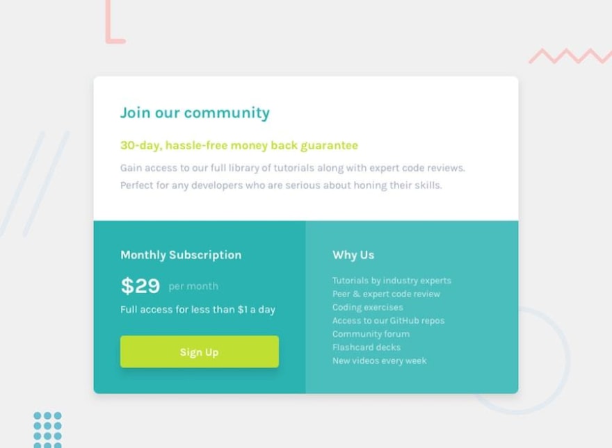
This challenge is a perfect starting point. Instead of building an entire landing page, your task is to build a single component.
Your users should be able to:
- View the optimal layout for the component depending on their device's screen size
- See a hover state on desktop for the Sign Up call-to-action
Although small, this project presents some nice layout challenges. It's a great opportunity to practice Flexbox or CSS Grid. You'll also get the basics of building a responsive component.
| Requirements | Difficulty | Type | URL |
|---|---|---|---|
| HTML, CSS | Newbie | Free | View Project |
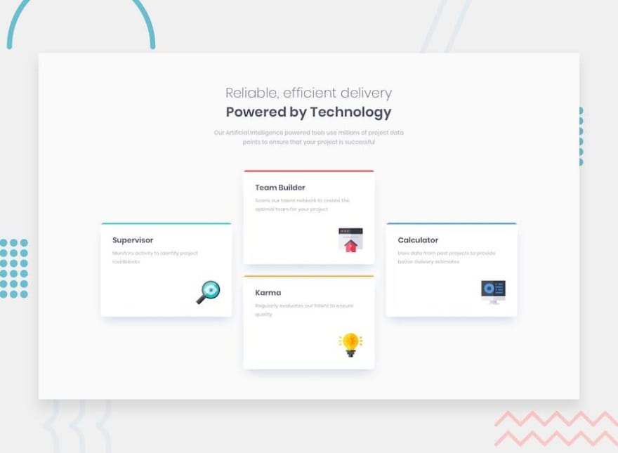
You'll face an interesting layout test in this project. How would you approach the vertically centered cards?
Your users should be able to:
- View the optimal layout for the site depending on their device's screen size
This will be another useful challenge to build up your confidence when laying out elements. You'll have to choose the best approach to align the cards and make them re-align down to mobile screen size.
| Requirements | Difficulty | Type | URL |
|---|---|---|---|
| HTML, CSS | Newbie | Free | View Project |
This challenge will build on the other two and take it up a notch. You'll need to think about how best to position and space the elements out on the page.
Your users should be able to:
- View the optimal layout for the component depending on their device's screen size
- See hover states on desktop for all interactive elements
Think about positioning images and content next to one another. Scaling the content down to mobile without it looking too squashed will be a challenge as well.
| Requirements | Difficulty | Type | URL |
|---|---|---|---|
| HTML, CSS, JS | Newbie | Free | View Project |
You'll get your first sprinkling of JavaScript in this challenge. You'll need to validate the form when it's submitted. Oh, and there's a sneaky layout order swap with the written content and the image from desktop to mobile.
Your users should be able to:
- View the optimal layout for the site depending on their device's screen size
- See hover states for all interactive elements on the page
- Receive an error message when the form is submitted if:
- The input field is empty
- The email address is not formatted correctly
You'll learn how to do basic form validation on a single field. This project will also take a bit of layout planning, so be sure to take some time, in the beginning, to think it through.
| Requirements | Difficulty | Type | URL |
|---|---|---|---|
| HTML, CSS, JS | Newbie | Free | View Project |
Now that you've done form validation on a single field, how about doing it on four? Also, don't forget to make sure the inputs are accessible to screen reader users!
Your users should be able to:
- View the optimal layout for the site depending on their device's screen size
- See hover states for all interactive elements on the page
- Receive an error message when the form is submitted if:
- Any input field is empty
- The email address is not formatted correctly
By now you should have a good handle on basic layout. So the main learning outcome here will be how to write reusable JavaScript code to check the validity of the different form fields.
| Requirements | Difficulty | Type | URL |
|---|---|---|---|
| HTML, CSS, JS | Junior | Free | View Project |
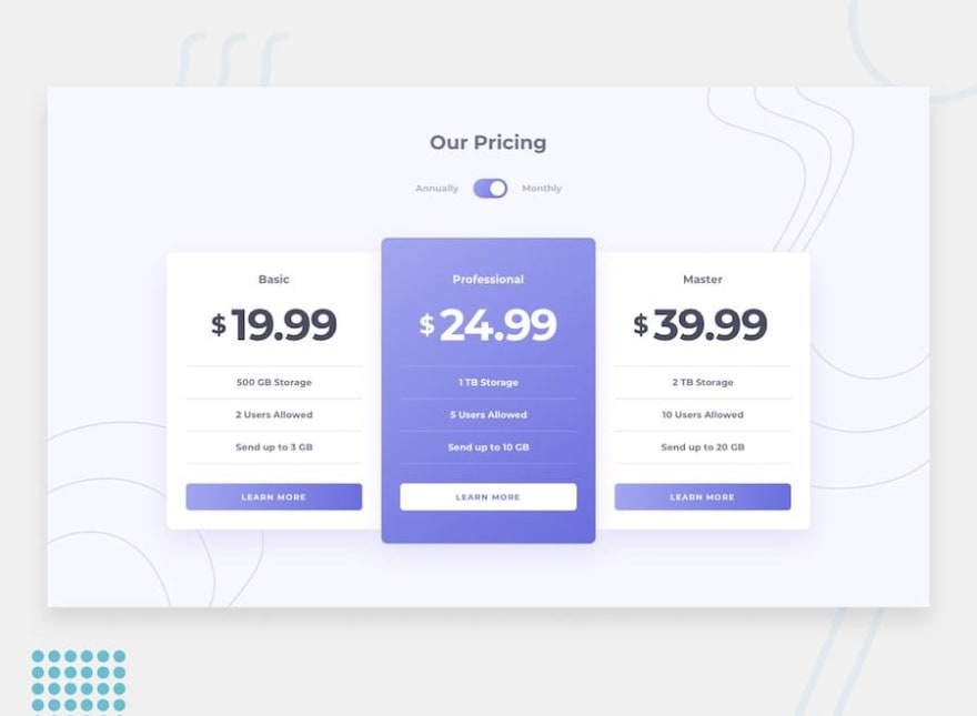
This pricing component challenge will present a nice layout challenge for you. Especially if you go for the bonus mentioned below!
Your users should be able to:
- View the optimal layout for the component depending on their device's screen size
- Control the toggle with both their mouse/trackpad and their keyboard
- Bonus: Complete the challenge with just HTML and CSS
If you go for the bonus you'll need to think through your HTML structure carefully. You'll need the perfect markup to be able to make use of pseudo-classes and sibling selectors for the toggle.
| Requirements | Difficulty | Type | URL |
|---|---|---|---|
| HTML, CSS, JS | Junior | Free | View Project |
There's only a tiny bit of JavaScript for this challenge with the mobile navigation toggle. But it will be the first time that you're building a multi-section landing page on this track.
Your users should be able to:
- View the optimal layout for the site depending on their device's screen size
- See hover states for all interactive elements on the page
Take some time to plan this out before diving into the code. You'll be faced with some interesting tests placing the background patterns.
| Requirements | Difficulty | Type | URL |
|---|---|---|---|
| HTML, CSS | Junior | Free | View Project |
Back to pure HTML and CSS for this one. It's quite a long landing page, so your layout skills will be really tested.
Your users should be able to:
- View the optimal layout for the site depending on their device's screen size
- See hover states for all interactive elements on the page
This challenge is all about the layout. Try to pay attention to the responsiveness and get it looking good at all screen sizes.
| Requirements | Difficulty | Type | URL |
|---|---|---|---|
| HTML, CSS, JS, API | Intermediate | Free | View Project |
This challenge will give you the first taste of pulling data from an API. You'll be integrating with the rel.ink API to build a fully-functional URL shortener.
Your users should be able to:
- View the optimal layout for the site depending on their device's screen size
- Shorten any valid URL
- See a list of their shortened links, even after refreshing the browser
- Copy the shortened link to their clipboard in a single click
- Receive an error message when the form is submitted if:
- The input field is empty
Learn how to make HTTP requests and integrate with an external API. This could also be a good project to start diving into JS libraries/frameworks like React or Vue. Also, have a go at using localStorage to save the list of shortened links if the user refreshes their browser.
| Requirements | Difficulty | Type | URL |
|---|---|---|---|
| HTML, CSS, JS | Intermediate | Free | View Project |
This landing page will give your CSS skills a nice test. There are some background patterns that need to be positioned accurately and some little details in the switch from desktop to mobile. There are also a few areas that will require some JS.
Your users should be able to:
- View the optimal layout for the site depending on their device's screen size
- See hover states for all interactive elements on the page
- See all testimonials in a horizontal slider
- Receive an error message when the newsletter sign-up form is submitted if:
- The input field is empty
- The email address is not formatted correctly
Your major takeaways from this challenge will be related to CSS and layout. If you haven't done so by now, you might want to try out a pre-processor, like Sass, to help keep your code maintainable.
| Requirements | Difficulty | Type | URL |
|---|---|---|---|
| HTML, CSS, JS | Intermediate | Free | View Project |
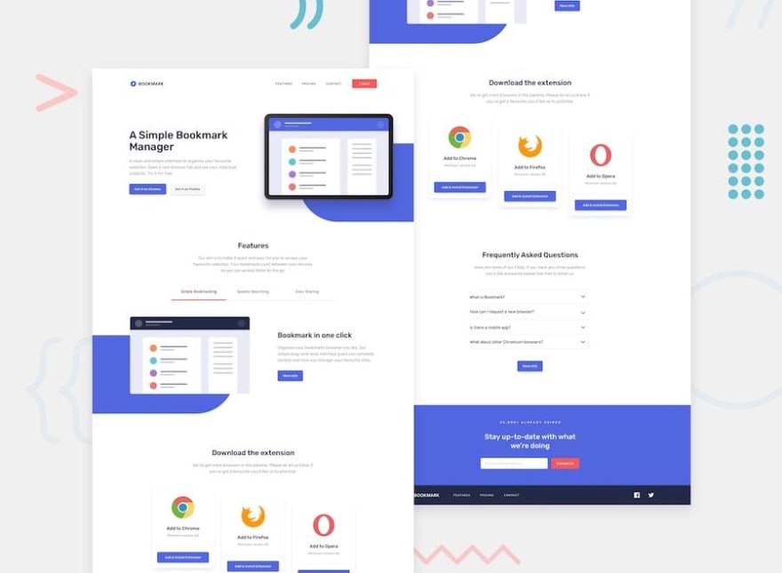
Another landing page challenge to reinforce what you learned in the last challenge. This one includes a couple of trickier elements though. Firstly, the background patterns aren't included as assets in the download, so you need to code them yourself. Secondly, we've got a couple of JS-based components with the feature tabs and FAQs section.
Your users should be able to:
- View the optimal layout for the site depending on their device's screen size
- See hover states for all interactive elements on the page
- Receive an error message when the newsletter form is submitted if:
- The input field is empty
- The email address is not formatted correctly
This challenge will help solidify your knowledge and refine workflow when creating a fairly complex layout. This is another good opportunity to use a pre-processor. You might even want to have a go at using a UI framework, like Tailwind, if you're feeling comfortable with pure CSS/Sass by now.
| Requirements | Difficulty | Type | URL |
|---|---|---|---|
| HTML, CSS, JS | Intermediate | Free | View Project |
Now that you've got a bit more comfortable with JavaScript, let's practice some filtering. In this challenge, you'll need to filter the job listings by the categories selected. There are two options to choose from for how to approach it:
- Option 1: Filter job listings based on the categories using the HTML
data-attribute. In this option, you'd use the hardcoded content that already exists in theindex.htmlfile. - Option 2: Use the local
data.jsonfile to pull the data and then dynamically add the content. This would be perfect if you're looking to practice a JS library/framework like React, Vue, or Svelte.
Your users should be able to:
- View the optimal layout for the site depending on their device's screen size
- See hover states for all interactive elements on the page
- Filter job listings based on the categories selected
You'll learn how to use JavaScript to filter items in the DOM. This is a key skill when building client-side applications, so this challenge will be great practice!
| Requirements | Difficulty | Type | URL |
|---|---|---|---|
| HTML, CSS, JS | Advanced | Free | View Project |
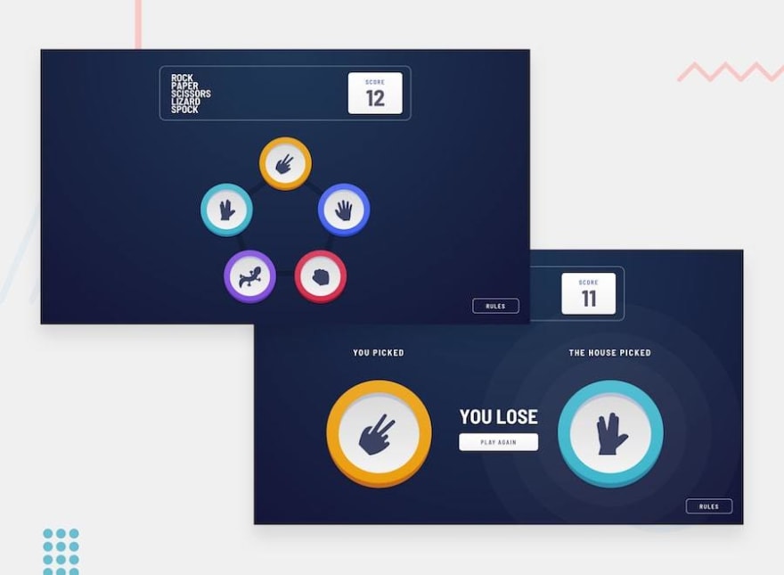
Let's move away from landing pages and filters for a moment and build a game. This Rock, Paper, Scissors game will test both your CSS skills and your JS chops. There's even a bonus game of Rock, Paper, Scissors, Lizard, Spock if you're feeling adventurous!
For those of you who don't know about Rock, Paper, Scissors, Lizard, Spock, take a look at this:
Your users should be able to:
- View the optimal layout for the game depending on their device's screen size
- Play Rock, Paper, Scissors against the computer
- Maintain the state of the score after refreshing the browser (optional)
- Bonus: Play Rock, Paper, Scissors, Lizard, Spock against the computer (optional)
This challenge will give your logic-based problem-solving skills a nice run-out. Try to push yourself to build the bonus game if you can. This is another opportunity to practice using localStorage to maintain the state of the game if the user refreshes their browser.
| Requirements | Difficulty | Type | URL |
|---|---|---|---|
| HTML, CSS, JS | Advanced | Free | View Project |
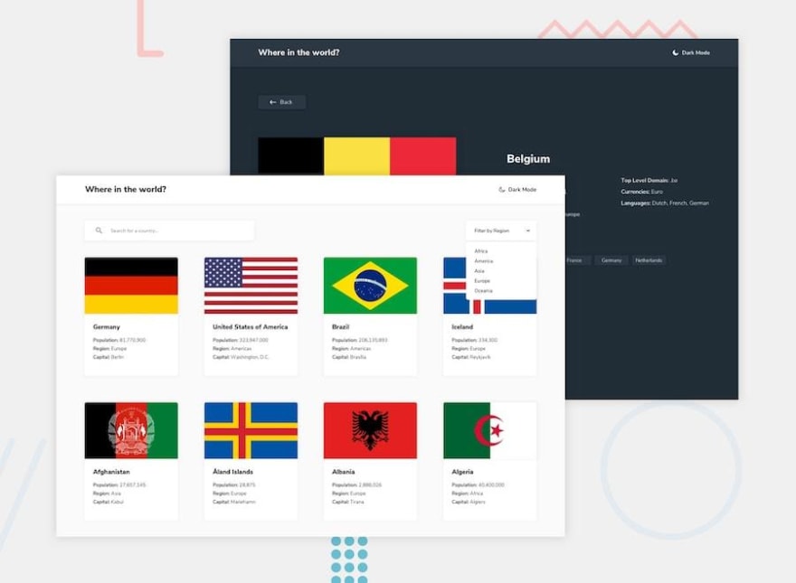
This is a perfect challenge to start really testing your skills and integrating with a 3rd-party API. You'll be using the REST Countries API to pull data from. This one is perfect for practicing JS libraries/frameworks!
Your users should be able to:
- See all countries from the API on the homepage
- Search for a country using an
inputfield - Filter countries by region
- Click on a country to see more detailed information on a separate page
- Click through to the border countries on the detail page
- Toggle the color scheme between light and dark mode (optional)
You'll learn a lot during this challenge. You can use it to practice anything you like, so try to push yourself.
| Requirements | Difficulty | Type | URL |
|---|---|---|---|
| HTML, CSS, JS | Advanced | Premium | View Project |
This is one of our premium (paid) challenges and it offers an awesome chance to build a multi-page website that would look great in your portfolio. If you want to experience the closest feeling to being a professional developer, our premium challenges are where it's at. Our premium challenges come with mobile, tablet, and desktop designs. They also include the original Sketch design file and a simple, but professional design system.
Your users should be able to:
- View the optimal layout for each page depending on their device's screen size
- See hover states for all interactive elements throughout the site
- See the correct content for each team member on the About page when the
+icon is clicked - Receive an error message when the contact form is submitted if:
- The
Name,Email AddressorMessage fieldsare empty should show "This field is required" - The
Email Addressis not formatted correctly should show "Please use a valid email address"
- The
If you've never built a multi-page website you should learn loads by completing this challenge. Because it's a larger site, planning it out first is a must. Focus on structuring your CSS/Sass/Styles (or whatever) to keep your code scalable. Some great patterns to look into here are ITCSS, SMACSS, and 7:1. They're all great approaches and will help massively when building larger websites.
| Requirements | Difficulty | Type | URL |
|---|---|---|---|
| HTML, CSS, JS | Intermediate | Premium | View Project |
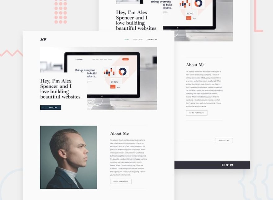
If you've got this far then you're definitely going to need a great looking portfolio site to show off your hard work! That's exactly what you can use this challenge for. Build it to the design and then customise it to make it your own.
Your users should be able to:
- View the optimal layout for each page depending on their device's screen size
- See hover states for all interactive elements throughout the site
- Click the "About Me" call-to-action on the homepage and have the screen scroll down to the next section
- Receive an error message when the contact form is submitted if:
- The
Name,Email AddressorMessagefields are empty should show "This field is required" - The
Email Addressis not formatted correctly should show "Please use a valid email address"
- The
This challenge is another great opportunity to practice writing reusable and maintainable code. As I mentioned above, premium challenges come with mobile, tablet, and desktop designs and include the original Sketch design file. So you can really practice building a fully-responsive website.
