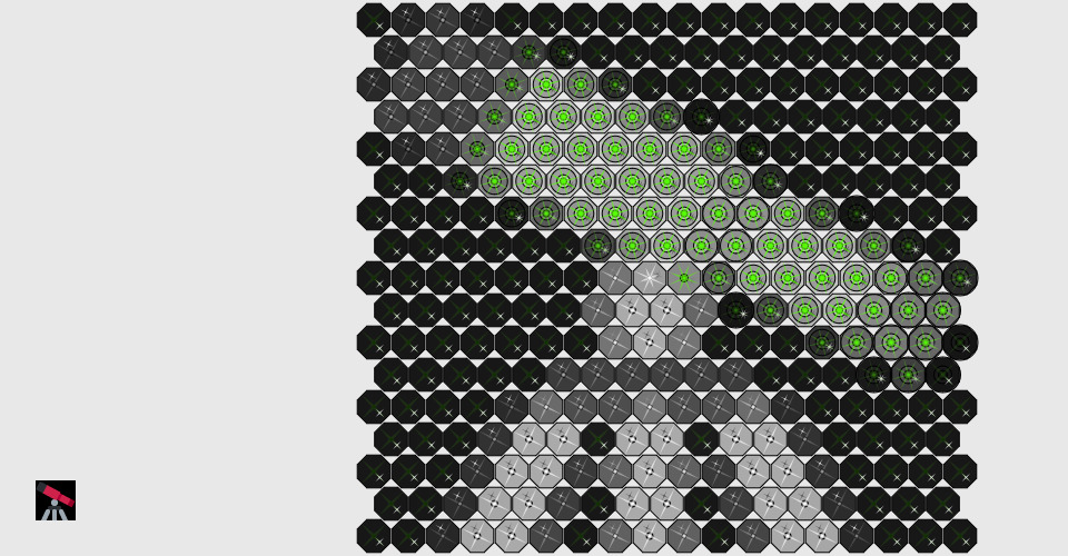
The most satisfying part of this project is how the glyph has evolved from the initial sketch. At first I was unsure of how to represent the colour red and initially used a danger symbol. However I wasn't satisfied so kept looking for inspiration which I found in Japan's Rising Sun flag. The resulting glyph has served as the inspiration for all parts of the project even though it has evolved into something quite different than the original sketch.
As part of the assignment we learnt about colour models. A key takeaway for me was that the saturation dimension determines the purity of a colour. I decided I wanted my glyph to represent this and have designed my glyphs so they are in their most pure form when the saturation level is set to 100%.
I also wanted to ensure that all 360 hues had a different appearance regardless of the size of the glyph. I did achieve this in the glyph_system part of the assignment but wasn't totally satisfied. It wasn't until toward the end of the glyph_object part of the assignment that I came up with solution that truly has 360 different possibilities for the hue dimension.
My representation of the hue dimension was also inspired by the work in progress reviews. Someone mentioned how the dimension wraps around itself and that a value of 360 is the same as a value of 0. I really liked this idea and decided my glyph should also behave like this.
For the final part of the assignment I wanted to use the colour splash effect but I also wanted all images to have a touch of colour. So I implemented some functionality that determined if their would be a decent colour splash using my chosen hue. If not it then determined which hue was most commonly used which then becomes the basis for creating a colour splash but always using my chosen hue as the splash.
