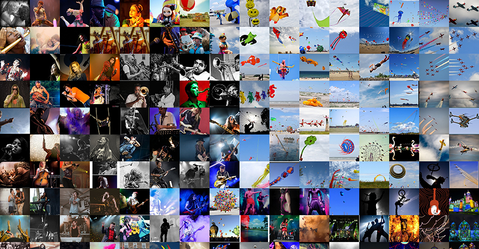
The main motivation that determined how I have chosen the images for my montages was the desire to create visually interesting and beautiful images. I wanted the results to be montages that I can use for desktop backgrounds on my home computer.
The images used in the final montage have been scraped from flickr using the tag 'festival' and by retrieving all 80 pages that are available. This meant I had over 3000 images before commencing the manual filtering. Due to this the curation process was quite daunting so I tried to do it very quickly.
My main goal was to remove the images I felt didn't fit the festival theme or I didn't find very visually interesting. The reason for this is that I wanted the final montage to be a better representation of the theme. I removed all the images I didn't find visually interesting because of my overall goal to create beautiful and interesting montages. I also tried to make sure I removed any images that were duplicates or too similar.
I also attempted to create a script that would remove all the unwanted images when using the run script. This worked great on a site that I used earlier as the results didn't change very often. However it didn't work for flickr as the results are constantly changing.
I thought the unsorted images were excellent, visually interesting and mostly high quality. They were definitely evocative of the festival theme and I think even the unfiltered grids will work pretty well.
The colour grid worked great and looks fantastic. A lot of the images are very colourful so obviously this helped a lot to make the layout look good. The smart grid also looks great but I don't think it looks as good when zoomed out. When you zoom in it is a lot more interesting as you start to see how the images have been grouped together.
In my resize script I chose dimensions of 240x216 and in the customgrid script I set the tile argument to 48x40. These dimensions work great in regards to my initial idea as the final montage can be cut perfectly into 12 different 4k background images, each consisting of a 16x10 grid of thumbnails.
In the final montage the most obvious zones are in the top right hand corner and bottom right hand corner. Both these zones consist of images with the sky in the background. In the top right are images taken during the day and in the bottom right are images taken during the night.
Due to the large number of images used, other zones aren't obviously evident until you zoom in and start looking around. One zone that I found quite interesting was near the bottom left hand corner. The smart grid has done an excellent job of grouping all the festival posters and graffiti in the same area. Another zone that I thought was good was an area near the top right hand corner next to the images in the sky. In this zone you can see all the close ups on musicians playing their instruments.
