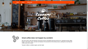
The purpose of this project is to edit an existing Tsunami Coffee website code using relative units and responsive web design so that the website appears correctly on varying screen sizes.
List of features ready:
The .container class limits the with of the sections to a specific widht (making them not as wide as the screen)
.main section displays a background image in the main section at the top of the page, with the Tsunami Coffee logo in the middle and contains the navigation menu (Store, Hours, Wholesale).
Followed by 4 div sections (.supporting, .rating, .gallery, .location)
.supporting: includes an image of three beans to the left and a description of the company set in a div with class .description to the right.
.rating: includes a critique and rating by a "Coffee critic". in a div.container
.gallery: contains three images, they are set to show the three in the same line.
.location: contains a map and a legend "Brewed with love in ..."
footer: Includes a copyright and the navigation menu at the bottom of the page.
- Add link interaction (hover, active, etc.)
- Fix those media queries for gallery in smaller sizes.
- Maybe add menu items.
- The footer is too high.
- HTML 5
- CSS 3
na
na
Project is: in progress
This project uses clearfix which I don't yet understand completely. For reference:
https://www.w3schools.com/howto/howto_css_clearfix.asp
https://www.w3schools.com/css/css_float_clear.asp
Project based on Codecademy course Learn Responsive Design here: https://www.codecademy.com/learn/learn-responsive-design
Used reset.css from https://github.com/necolas/normalize.css


