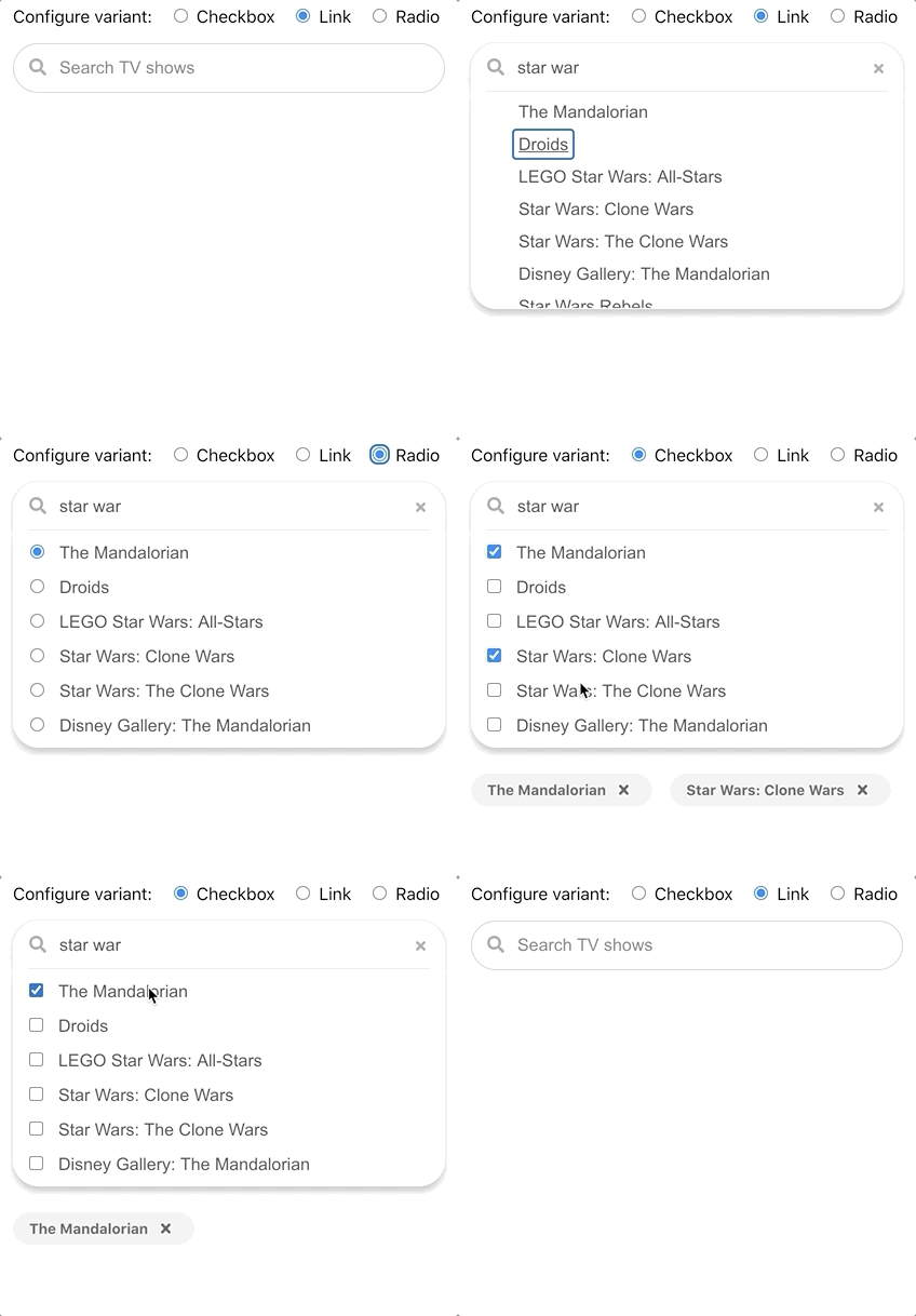
A react search panel that expands, autocompletes, and support single or multi select.
There is a demonstration of react-search-panel as coded in the example folder.
Many other variants of this component are demonstrated in this Storybook demonstration.
Here is documentation of the component API.
npm install --save-dev react-search-panel
git clone https://github.com/jeremydavidson/react-search-panelcd examplenpm installnpm start
This is an example in Typescript with all available props:
import React from "react";
import { SearchPanel } from "react-search-panel";

const App = () => {
  const [input, setInput] = React.useState("");
  const [selectedChoices, setSelectedChoices] = useState(choices);
  return (
    <SearchPanel
      chips
      choices={choices}
      float
      maximumHeight={250}
      onChange={event => setInput((event as React.ChangeEvent<HTMLInputElement>).target.value)}
      onClear={() => setInput("")}
      onFocus={event => handleFocus((event as React.FocusEvent<HTMLInputElement>).target.value)}
      onSelectionChange={setSelectedChoices}
      noChoiceItem={noChoiceItem}
      placeholder="Search"
      selectedChoices={selectedChoices}
      shadow
      small
      value={input}
      variant={SearchPanelVariant.checkbox}
      width={300}
    />
  );
}
export default App;This is an example in Javascript with only the required props.
import React from "react";
import { SearchPanel } from "react-search-panel";

const App = () => {
  const [input, setInput] = React.useState("");
  const [selectedChoices, setSelectedChoices] = useState(choices);
  return (
    <SearchPanel
      choices={choices}
      onChange={event => setInput(event.target.value)}
      onSelectionChange={setSelectedChoices}
      placeholder="Search"
      selectedChoices={selectedChoices}
      value={input}
    />
  );
}
export default App;