_A modal (also called a modal window or lightbox) is a web page element that displays in front of and deactivates all other page content. To return to the main content, the user must engage with the modal by completing an action or by closing it. Modals are often used to direct users’ attention to an important action or piece of information on a website or application. ~_ Jamie Juviler - HubSpot.
Having this definition in mind we jump to a question, what do we expect from a modal window in our apps?.
Answer: Well, for Ionic Framework a modal will be a window that will use the whole screen size every time.
But, we don't always need these fullscreen windows, sometimes we just need an alert/dialog, a popup, a drawer or we just want to highlight an image in the middle of the screen.
There are two main behaviours that Ionic gives to its modal component.
- Fullscreen size
- OS System defaults
At this point you've to be aware that we won't stick to iOS or Android, we will use the best of both in case we need, or why not, avoid using them.
For this suggestion we will define 3 common use cases you may have in your project.
- The default modal (which is the way Ionic likes)
- The pop-up modal
- The bottom drawer modal
Curiously Ionic Framework already has these 3 components very clear and specifically separate, ion-modal, ion-alert, ion-action-sheet. You can find them in Ionic Docs.
Disclaimer: Unfortunately, Ionic is too strict about customizing its core components, especially these 3, and here is why this post was created. Manipulate Ionic modals in order to create custom pop-ups and drawers. Sounds good, isn't it?
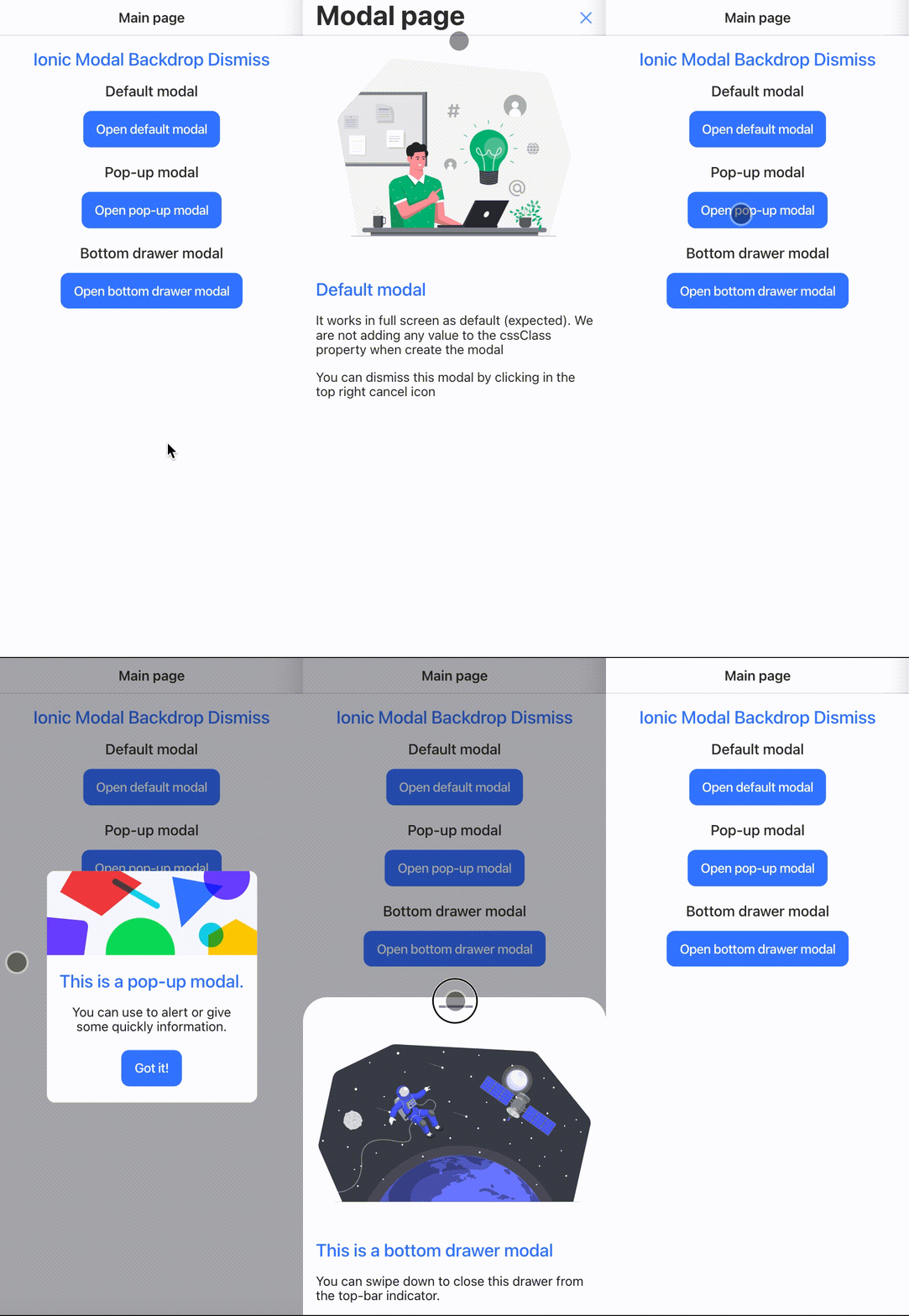
Live example
Just use the default way to create modals in Ionic and that's it. The only notable change here is that we are forcing the ion-backdrop to appear in every single modal, which is different from the default behavior (backdrop only for the first modal). You can see the backdrop becomes darker after each consecutive modal you open.
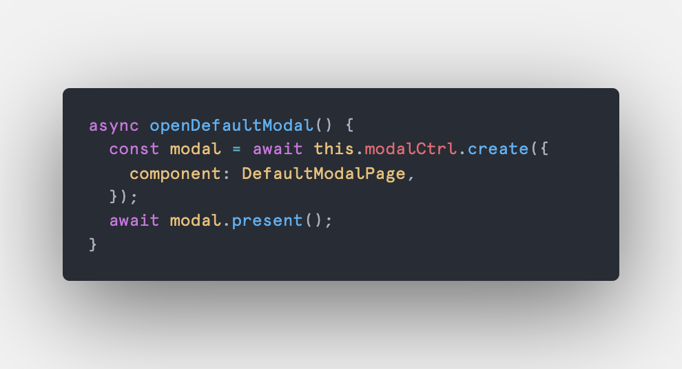
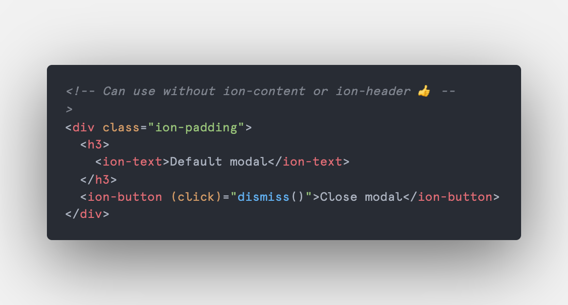
Code example:
Typescript
HTML
In this case (the most common one) we are looking for an alert/popup-like component, where you can highlight a small piece of content and keep (or not?) the "dismiss on backdrop clicked" behavior. In order to keep these options available, we will keep using the modal instance options, in this case, will be the backdropDismiss property, by default this prop is true so we don't have to change anything, but in case you don't want to dismiss the modal when the backdrop is clicked just set the property to false.
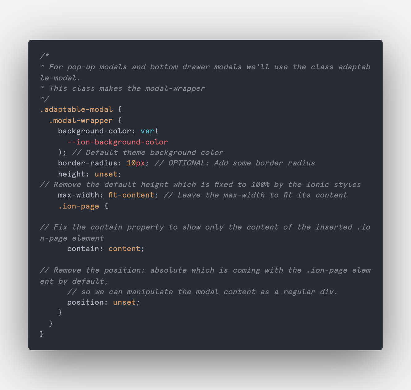
For the pop-up modal as well as the bottom-drawer modal we will use the .adaptable-modal class.
Adaptable modal class
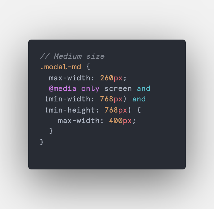
Depending on the project (actually the design team), you will customize the content size of your modal components as you need. Here are 5 common sizes you can use: xs, sm, md, lg and xl.
PopUp medium size modal class
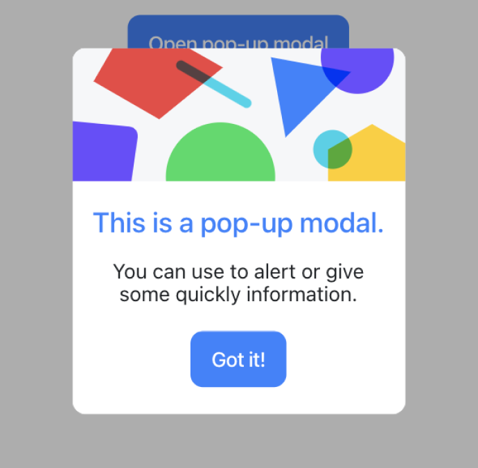
PopUp medium size modal
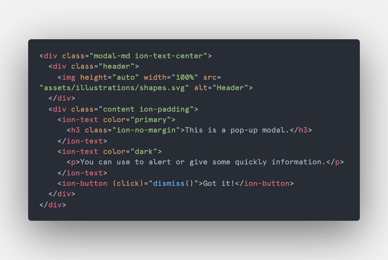
Pop-up modal html
As you can see there is a slight difference in the pop-up width, here is where you customize sizes as much as you need.
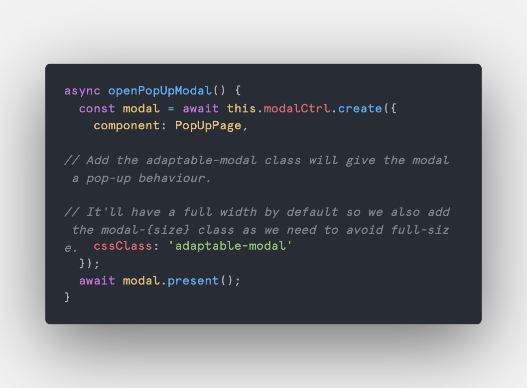
Creating and opening a popup modal.
PopUp modal typescript
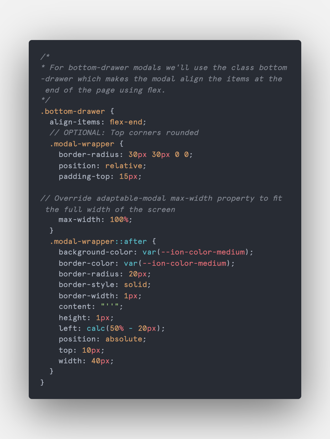
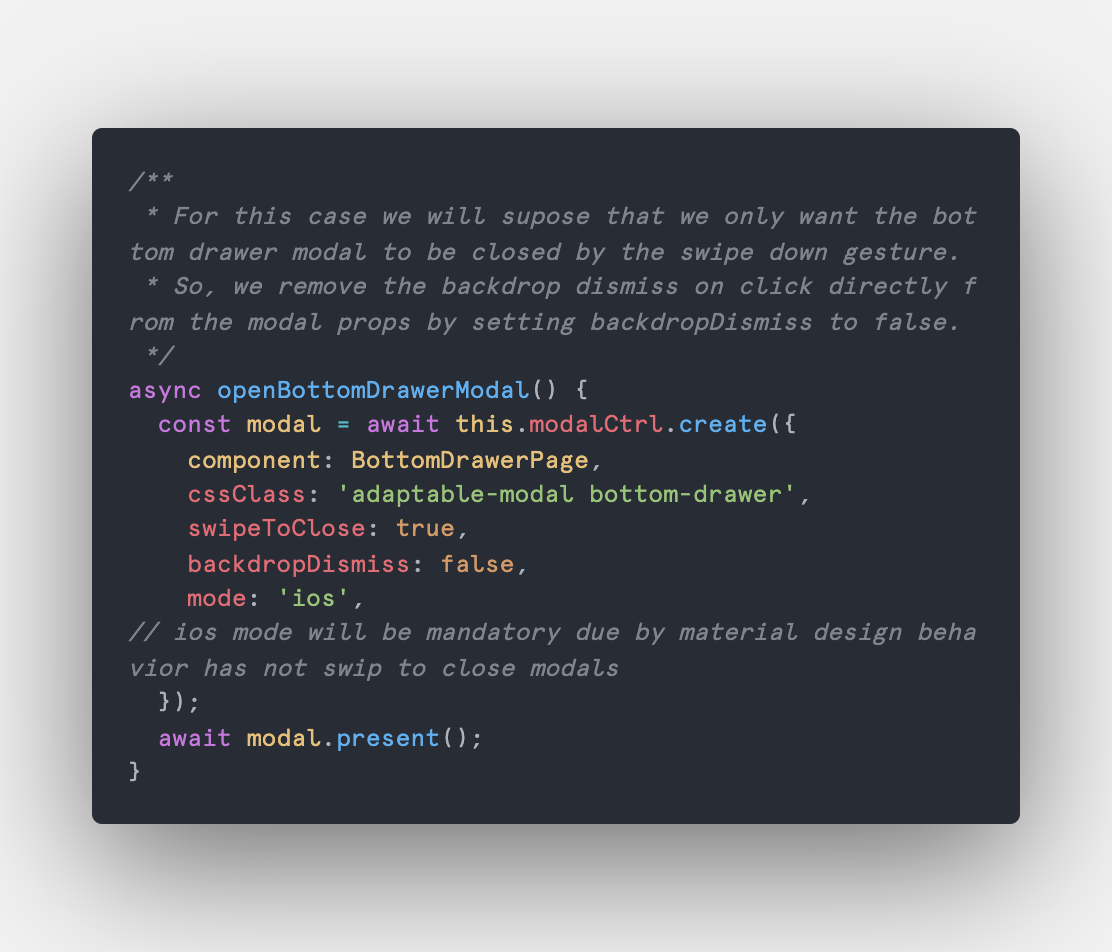
The purpose of the bottom drawer is to allow users to close it by swiping it down. Android doesn't have this feature natively so we force the mode to be iOS. We also add the swipeToClose property to true. With the bottom-drawer class, we set the items inside the ion-modal component to be positioned at the bottom of the page and override the previously assigned width to 100%, in order to always fit the screen width, even on tablet screen size.
Bottom drawer class
👈 Optional: Add the after pseudo-element to the modal wrapper. Create a top-bar indicator to visually let the user know that the bottom drawer is draggable.
Bottom drawer modal typescript
Customizations can go as deep as we need, with this solution we tried to make modals less painful when you want to modify them, as well as integrate them in multiple ways to our projects.
Any feedback, comment, or story around this topic will be appreciated and replied ☕
