Various scripts to plot neuroimaging results especially functional connectivity results (fMRI), compatible with both Python 2 and Python 3 (although Python 2 compatibility is not maintained explicitly anymore):
-
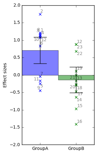
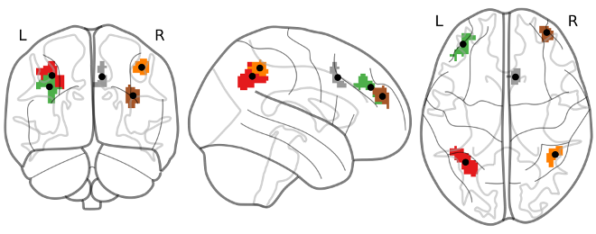
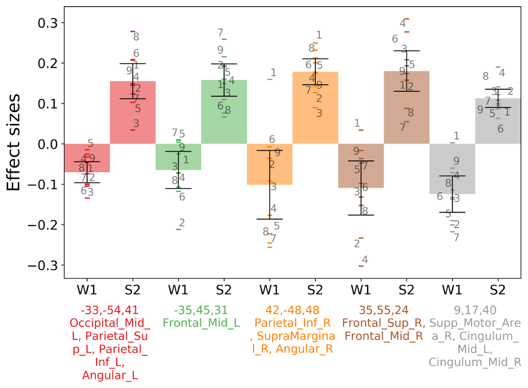
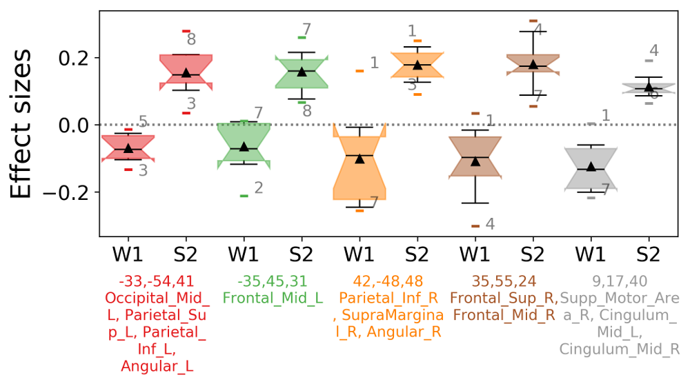
barplotwithsamples.ipynb is a Jupyter Notebook script to plot bars with 90% Confidence Interval error bars and also the subjects points and (optionally) the subjects labels. It just expects as input a txt file with one value per line (one value = one subject). It works particularly well with CONN REX output (results.ROIs.rex.data.txt). It can also plot multiple ROIs, and it can visualize the ROI maps on a glass brain and synchronize with the bar display (same color as glass brain + ROIs centers' coordinates will be displayed in the bar plot + atlas regions names covered by ROIs will be extracted from AAL2 atlas). Can also plot a boxplot instead of bars.
-
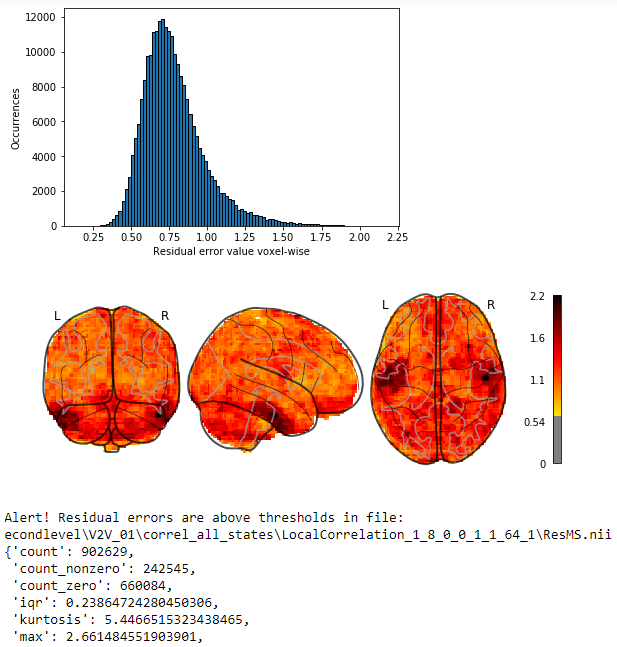
plot-residual-errors-recursive-checker.ipynb is a Jupyter notebook that will recursively find all residual error images (ResMS.img|nii for SPM) of a General Linear Model (GLM) and will compute descriptive statistics. Alert thresholds can be set for any feature of these statistics, and a report of the images reaching above those thresholds will be generated, with a histogram plot of residual error repartition as well as a neuroimage plot to spatially localize where the biggest errors are localized.
- plot_correl_maps_overview.ipynb is a Jupyter notebook to plot a LOT of correlation maps in a concise manner. The visualization consists of multiple glass brain images, stacked on a grid, according to your needs (eg, columns for contrasts, rows for groups/conditions). It can also plot a single image. It supports both plotting correlation maps and contours (particularly useful to plot unthresholded correlation map, with contours of significant/thresholded maps), both negative and positive. It can also synchronize the colorbar range, so that the same colorbar is used either for all figures, or for all figures in a row, or each figure with an individual colorbar (unsynchronized).
- plot_project_overlapping_masks_to_atlas.ipynb is a Jupyter Notebook to extract and plot all regions overlapping multiple correlation maps. The idea is to project each correlation map to an atlas (AAL2 by default) and then compute how many maps include which region. In the end, an "overlapping atlas" is generated, along with a summary table. To avoid including regions that are covered only by 1 or a few voxels, and thus probably false positives, it is possible to threshold on the absolute number of voxels per region, or the percentage of the region area covered by the correlation map (eg, 10% of the region's full area needs to be covered by the provided correlation map to be included), or finally by the minimum amount of overlap (eg, need at least 2 maps overlapping on the same region to include the region). The purpose is to provide a concise summary for cross-sectional studies with multiple conditions/groups, or to pinpoint the possible origins of a cluster-corrected finding (as we cannot know the source for sure, this tool at least allows to get an overview and help to derive the big picture).
All the scripts are provided under the opensource MIT License.
All the scripts were fully made by Stephen Karl Larroque at the Coma Science Group - Centre Du Cerveau² - Hospital of Liège, Belgium.
To cite this package, please use the following:
neuro-python-plotting, Stephen Karl Larroque, RRID:SCR_022548, https://github.com/lrq3000/neuro-python-plotting .
