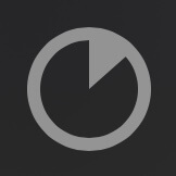
The simple yet flexible Cupertino pie-style circular progress indicator for your Flutter apps.


The pie_progress_indicator package provides a customizable and flexible Cupertino pie-style circular progress indicator for Flutter applications. Designed with simplicity and minimal dependencies in mind, this widget can be used as a drop-in replacement for CircularProgressIndicator, allowing for a seamless transition with enhanced visual appeal.
- Cupertino Pie-Style Design
- Emulates the pie-style progress indicators seen in iOS, perfect for apps following Cupertino design guidelines.
- Drop-In Replacement
- Can be easily used in place of
CircularProgressIndicatorwithout additional adjustments.
- Can be easily used in place of
- Highly Customizable
- Adjust the color, stroke width, and background of the progress indicator.
- Control the size and thickness of both the progress and the surrounding circle.
- Simplicity and Minimal Dependencies
- Focuses on being simple to use and lightweight, ensuring your app remains efficient and fast.
- Accessibility Support
- Includes options for semantics labels and values to improve accessibility.
Using the PieProgressIndicator is straightforward. You can create an indicator with just the value and color parameters, or customize it further with additional options. You can also replace CircularProgressIndicator with PieProgressIndicator directly in your code.
import 'package:flutter/material.dart';
import 'package:pie_progress_indicator/pie_progress_indicator.dart';

void main() {
  runApp(const MyApp());
}

class MyApp extends StatelessWidget {
  const MyApp({super.key});

  @override
  Widget build(BuildContext context) {
    return MaterialApp(
      home: Scaffold(
        body: Center(
          child: PieProgressIndicator(
            value: 0.15, // The progress value, ranging from 0.0 to 1.0.
            // color: Colors.grey.withOpacity(0.5), // The color of the progress segment with 50% opacity.
            // strokeColor: Colors.black, // The color of the surrounding circle. Defaults to the color parameter if not provided.
            // strokeWidth: 8.0, // The thickness of the surrounding circle. Defaults to 16% of the size if not provided.
            // backgroundColor: Colors.white, // The background color behind the progress indicator.
            // valueColor: AlwaysStoppedAnimation<Color>(Colors.blue), // An optional animation for the progress color.
            // semanticsLabel: 'Loading progress', // A label for accessibility purposes.
            // semanticsValue: '15%', // A value description for accessibility purposes.
            // size: 100.0, // The size of the progress indicator. Defaults to 36.0 dp minimum if not provided.
            // valueStrokeFactor: 0.5, // The factor determining the thickness of the progress segment relative to the surrounding circle.
            // backgroundStrokeFactor: 0.5, // The factor determining the thickness of the background relative to the surrounding circle.
          ),
        ),
      ),
    );
  }
}value: The progress value, ranging from 0.0 (0%) to 1.0 (100%).
color: (Optional) The color of the progress segment. You can use withOpacity() to apply transparency.
strokeColor: (Optional) The color of the surrounding circle. Defaults to the color parameter if not provided.
strokeWidth: (Optional) The thickness of the surrounding circle. Defaults to 16% of the size parameter if not provided.
backgroundColor: (Optional) The background color behind the progress indicator.
valueColor: (Optional) Allows you to animate the color of the progress segment.
semanticsLabel: (Optional) A label for screen readers to describe the progress indicator.
semanticsValue: (Optional) A value description of the current progress for screen readers.
size: (Optional) Sets the size of the progress indicator. Defaults to a minimum of 36.0 dp.
valueStrokeFactor: (Optional) Determines the relative thickness of the progress segment compared to the surrounding circle.
backgroundStrokeFactor: (Optional) Determines the relative thickness of the background compared to the surrounding circle.
If you find this package useful, please consider giving it a like on pub.dev and starring it on GitHub to help others discover it. Your support helps motivate the maintainers to continue improving this package.
Contributions are always welcome! If you would like to contribute, feel free to fork the repository, make your changes, and submit a pull request. For any issues or suggestions, please open an issue on the GitHub repository.
This package is licensed under the BSD 3-Clause License, allowing for both personal and commercial use, modification, distribution, and private use.
This package is designed with simplicity and minimal dependencies in mind, making it lightweight yet powerful. Feedback from the Flutter community is greatly appreciated. As the package evolves, we look forward to acknowledging all contributors who help improve it.