Demo of supporting multiple themes within an app. Not an exhaustive example, but includes the following capabilities:
- Customizing
androidnamespace attributes - Defining custom theme-specific attributes
- Theme overlays
- Changing themes at runtime
- Backwards compat (minSdkVersion 16)
If using AppCompat, ignore android namespace (i.e. colorControlNormal in place of android:colorControlNormal)
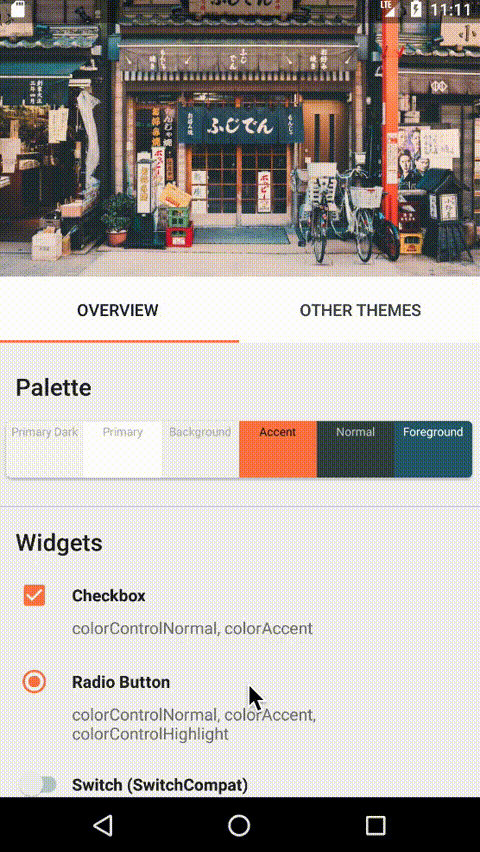
Checkbox
- Unchecked:
android:colorControlNormal - Checked:
android:colorAccent - Ripple:
android:colorControlHighlight
RadioButton
- Deselected:
android:colorControlNormal - Selected:
android:colorAccent - Ripple:
android:colorControlHighlight
Switch (use SwitchCompat for theme colors to be respected)
- Off Thumb:
colorSwitchThumbNormal - Off Track:
android:colorForegroundat opacity 30% - On Thumb:
colorControlActivated(defaults tocolorAccent) - On Track:
colorControlActivatedat 30% transparency (defaults tocolorAccent) - Ripple:
android:colorControlHighlight
Buttons
- Default (style:
Widget.AppCompat.Button)- Text Appearance:
TextAppearance.AppCompat.Widget.Button(android:textAppearanceButton)- Color:
android:textColorPrimary - Size: 14sp
- Caps: true
- Color:
- Text Appearance:
- Colored (style:
Widget.AppCompat.Button.Colored)- Text Appearance:
TextAppearance.AppCompat.Widget.Button.Colored- Color:
android:textColorPrimary;android:textColorPrimaryInverse(Disabled) - Size: 14sp
- Caps: true
- Color:
- Background:
colorAccent;colorButtonNormal(Disabled)
- Text Appearance:
- Colored Borderless (style:
Widget.AppCompat.Button.Borderless.Colored)- Text Appearance:
TextAppearance.AppCompat.Widget.Button.Borderless.Colored- Color:
colorAccent(Colored);android:textColorSecondary(Disabled) - Size: 14sp
- Caps: true
- Color:
- Background: transparent
- Text Appearance:
TextAppearances (android:textAppearance) are styles applied specific to text.
Android provides different text colors attributes (e.g. android:textColorPrimary) that can be set in your custom theme
and will be used with different text appearances. The value of a textColor can either be a simple color,
or a selector (e.g. for disabled states).
The main text colors used:
- android:textColorPrimary - used for many of the AppCompat TextAppearances such as Headline, Large, Title, Subhead, Body1, Body2, Button, Menu, Action bar.
- android:textColorSecondary - used for secondary TextAppearances such as Caption, Medium, Action bar subtitle, and so forth. Material themes use the same RGB values for secondary text as primary, but different opacity/alpha value.
- android:textColorTertiary - used for tertiary TextAppearances such as
TextAppearance.AppCompat.Small, but generally not used. In Material themes, this is currently the same value as the secondary text color (e.g.@color/secondary_text_default_material_dark). - android:textColorLink - used for links/href attributes
- android:textColorHint - used for fields such as EditTexts that are not filled out
Each color has a corresponding inverse:
- android:textColorPrimaryInverse
- android:textColorSecondaryInverse
- android:textColorTertiaryInverse
- android:textColorLinkInverse
- android:textColorHintInverse
Main background colors:
- android:windowBackground - used for the application window background
- android:colorBackground - the background color of the activity and other components.
- android:colorForeground - the background used for
Inversestyles/overlays - colorBackgroundFloating - this is use for dialog backgrounds and other floating elements
There's a bunch of other background-related attributes such as android:colorForegroundInverse,
android:backgroundDimAmount, and colorBackgroundCacheHint. I would recommend making sure your app theme extends
the appropriate parent (i.e. android default Light or Dark themes) and customize from there. Otherwise it can be easy to
miss certain attributes and you could end up with light text on light backgrounds.
TODO
TODO
Upsplash - Curtis Mac Newton
Upsplash - Angelina Odemchuk
Upsplash - Clay Banks