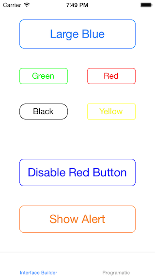
#RDMBorderedButton
A subclass of UIButton that adds a border.
##Usage
In code: Use initWithFrame to create a button and add to a subview.
Interface Builder: Add a button as usual. Set the class to RDMBorderedButton — there are some bugs with iOS 7.1 that require you to set the buttom type to Custom in Interface Builder. All properties can be adjusted using Attributes Inspector. The example project shows this with the black and yellow buttons.
###Corner Radius
By default, RDMBorderedButton will adjusts the corner radius of its border based on its frame. You can turn this off with:
button.adjustsCornerRadiusBasedOnFrame = NO; //Default is YES
You can also change the ratio of the corner radius of this automatic adjustment:
button.cornerRadiusRatioToSmallestSide = 1.0/4.0; //Default is 1.0/6.0
Note that changes to Corner Radius will not be animated. If you would like a corner radius change to be animated you will need to animate the key path using CoreAnimation. See the programatic view controller in the example project to see an example of this.
The corner radius can be adjusted manually (this turns off automatic adjustments):
//This will forward the cornerRadius to the button's layer and turn off automatic adjustments
button.cornerRadius = 6.0;
###Border Width
The border width of the button can be adjusted programmatically:
button.borderWidth = 2.0;
###Color
The text and border color are adjusted together. For normal state they can be changed using either:
button.tintColor = [UIColor greenColor];
or:
[button setTitleColor:[UIColor greenColor] forState:UIControlStateNormal];
Disabled state can be adjusted using:
[button setTitleColor:[UIColor grayColor] forState:UIControlStateDisabled]; //Default is [UIColor grayColor]
The text color when highlighted should be changed using:
[self setTitleColor:[UIColor blueColor] forState:UIControlStateHighlighted]; //Default is [UIColor whiteColor]
