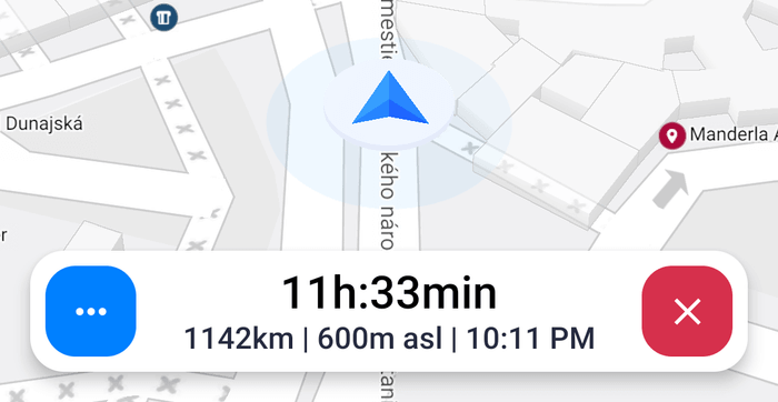
UiKit Infobar
A Infobar view can be used as an visual presentation component for the navigation info data (eta, distanceToEnd, altitude etc.) and as user interaction component. It contains two ImageButton's (left/right) and pre-customized primary/secondary TextView which can be controlled with InfobarTextData class. The Infobar design can be completely changed with the custom infoBarStyle or the standard android attributes as background, navigationTextColorPrimary or navigationTextColorSecondary can be used.
The Infobar view has also own attributes such as leftButtonIcon, leftButtonIconTint, leftButtonBackground, leftButtonBackgroundTint, rightButtonIcon, rightButtonIconTint, rightButtonBackground and rightButtonBackgroundTint.
Note: This view uses the custom theme attribute, which needs to be defined. See: Global theme attributes section below.
<com.sygic.maps.uikit.views.navigation.infobar.Infobar
    android:id="@+id/infobar"
    android:layout_width="match_parent"
    android:layout_height="wrap_content"
    app:layout_constraintBottom_toBottomOf="parent"
    app:layout_constraintEnd_toEndOf="parent"
    app:layout_constraintStart_toStartOf="parent"
    app:leftButtonBackgroundResource="@{navigationFragmentViewModel.leftInfobarButtonWrapper.backgroundResource}"
    app:leftButtonBackgroundTint="@{navigationFragmentViewModel.leftInfobarButtonWrapper.backgroundTintColor}"
    app:leftButtonImageResource="@{navigationFragmentViewModel.leftInfobarButtonWrapper.imageResource}"
    app:leftButtonImageTint="@{navigationFragmentViewModel.leftInfobarButtonWrapper.imageTintColor}"
    app:leftButtonVisible="@{navigationFragmentViewModel.leftInfobarButtonWrapper.visible}"
    app:onLeftButtonClickListener="@{() -> navigationFragmentViewModel.onLeftInfobarButtonClick()}"
    app:onRightButtonClickListener="@{() -> navigationFragmentViewModel.onRightInfobarButtonClick()}"
    app:primaryTextData="@{infobarViewModel.textDataPrimary}"
    app:rightButtonBackgroundResource="@{navigationFragmentViewModel.rightInfobarButtonWrapper.backgroundResource}"
    app:rightButtonBackgroundTint="@{navigationFragmentViewModel.rightInfobarButtonWrapper.backgroundTintColor}"
    app:rightButtonImageResource="@{navigationFragmentViewModel.rightInfobarButtonWrapper.imageResource}"
    app:rightButtonImageTint="@{navigationFragmentViewModel.rightInfobarButtonWrapper.imageTintColor}"
    app:rightButtonVisible="@{navigationFragmentViewModel.rightInfobarButtonWrapper.visible}"
app:secondaryTextData="@{infobarViewModel.textDataSecondary}" /><style name="AppTheme" parent="Theme.AppCompat.DayNight">
<item name="infoBarStyle">@style/CustomInfoBarStyle</item>
</style>
<style name="CustomInfoBarStyle">
<item name="android:background">@drawable/bg_infobar_rounded</item>
<item name="android:layout_margin">16dp</item>
</style><!-- Note: this colors needs to be defined in your theme or you can inherit from our predefined theme "Theme.Sygic..." instead.-->
<item name="navigationTextColorPrimary">#000</item>
<item name="navigationTextColorSecondary">#252a3f</item>