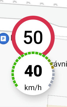
UiKit Speed Limit View
A SpeedLimitView is designed to be used as an visual presentation component for the speed limit value. It contains two predefined speed limit styles SpeedLimitType.EU and SpeedLimitType.US.
The SpeedLimitView design can be only little bit changed with the custom speedLimitViewStyle or the navigationTextColorPrimary attribute.
Note: This view uses the custom theme attribute, which needs to be defined. See: Global theme attributes section below.
<com.sygic.maps.uikit.views.navigation.speed.SpeedLimitView
    android:id="@+id/speedLimitView"
    android:layout_width="56dp"
    android:layout_height="56dp"
    app:limitType="@{speedLimitViewModel.speedLimitType}"
app:limitValue="@{speedLimitViewModel.speedLimitValue}" /><style name="AppTheme" parent="Theme.AppCompat.DayNight">
<item name="speedLimitViewStyle">@style/CustomSpeedLimitViewStyle</item>
</style>
<style name="CustomSpeedLimitViewStyle">
<item name="android:elevation">6dp</item>
<item name="android:layout_margin">16dp</item>
</style><!-- Note: this colors needs to be defined in your theme or you can inherit from our predefined theme "Theme.Sygic..." instead.-->
<item name="navigationTextColorPrimary">#000</item>