Theme Basics
This chapter covers the creation of a simple hello world style theme and its visual customization. It uses the Codename One Designer tool to demonstrate basic concepts in theme creation such as 9-piece borders, selectors and style types. We would recommend reviewing this even if you end up using CSS.
Codename One themes are pluggable CSS like elements that allow developers to determine/switch the look of the application in runtime. A theme can be installed via the UIManager class and themes can be layered one on top of the other (like CSS). A theme can be generated from CSS as well, we’ll cover this (and the supported CSS syntax) soon.
By default, Codename One themes derive the native operating system themes, although this behavior is entirely optional.
A theme initializes the Style objects, which are then used by the components to render themselves or by the LookAndFeel and DefaultLookAndFeel classes to create the appearance of the application.
Codename One themes have some built-in defaults. E.g. borders for buttons and padding/margin/opacity for various components. These are a set of “common sense” defaults that can be overridden within the theme.
Codename One themes are effectively a set of UIID’s mapped to a Style object. Codename One applications always have a theme, you can modify it to suit your needs and you can add multiple themes within the main resource file.
You can also add multiple resource files to a project and work with them. In code a theme is initialized using this code in your main class:
private Resources theme;

public void init(Object context) {
    theme = UIManager.initFirstTheme("/theme");
}
The initFirstTheme method is a helper method that hides some try/catch logic as well as some verbosity. This could be expressed as:
try {
    theme = Resources.openLayered("/theme");
    UIManager.getInstance().setThemeProps(theme.getTheme(theme.getThemeResourceNames()[0]));
} catch(IOException e){
    e.printStackTrace();
}We can launch the designer tool by double clicking on the theme.res file found in typical Codename One applications.
In the left side you can see the section picker and within it the Theme section.
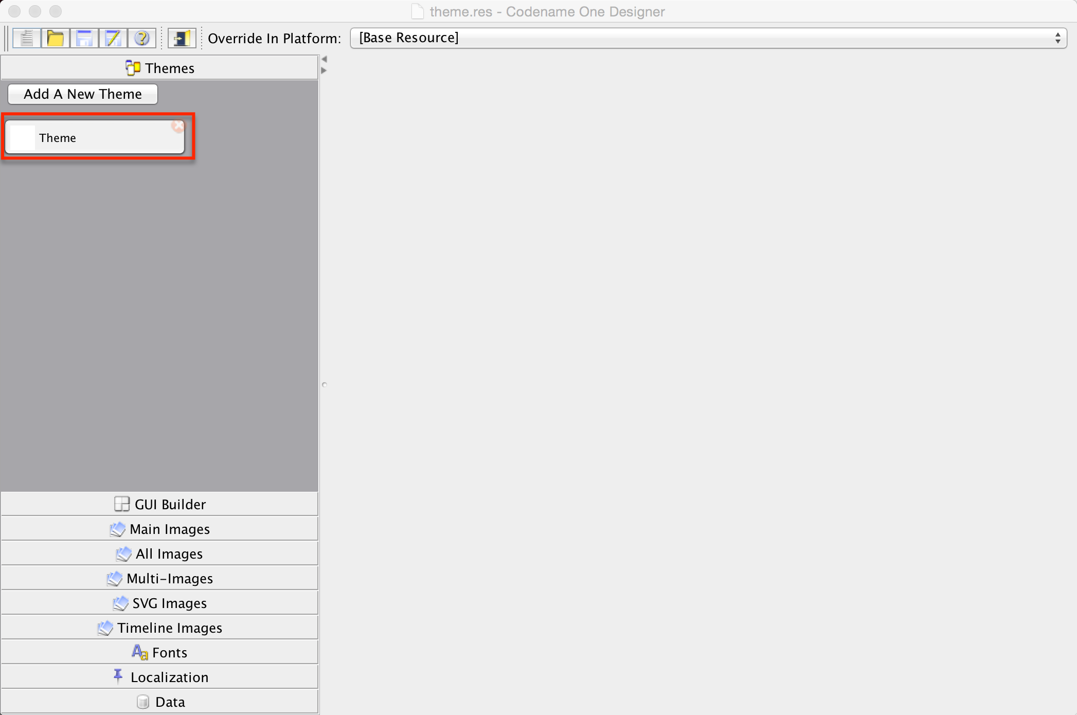
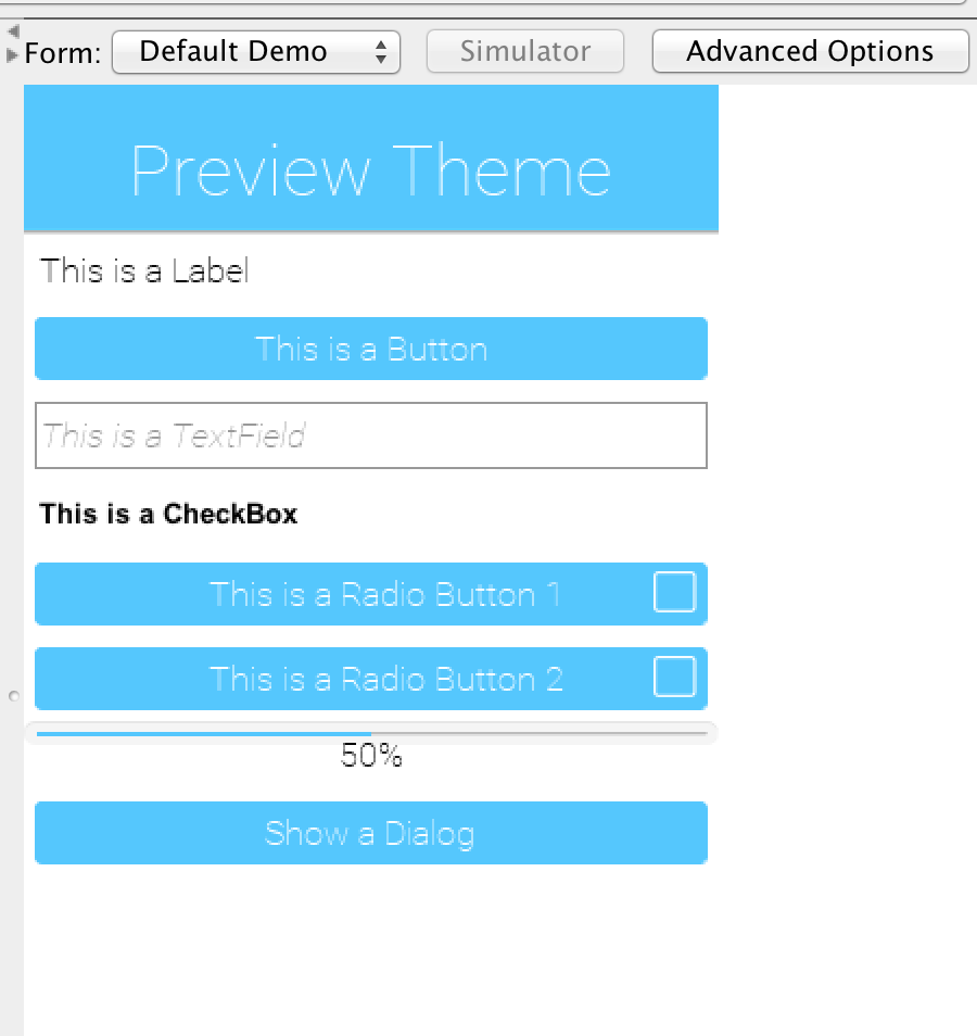
When you select the theme you will see the theme default view.
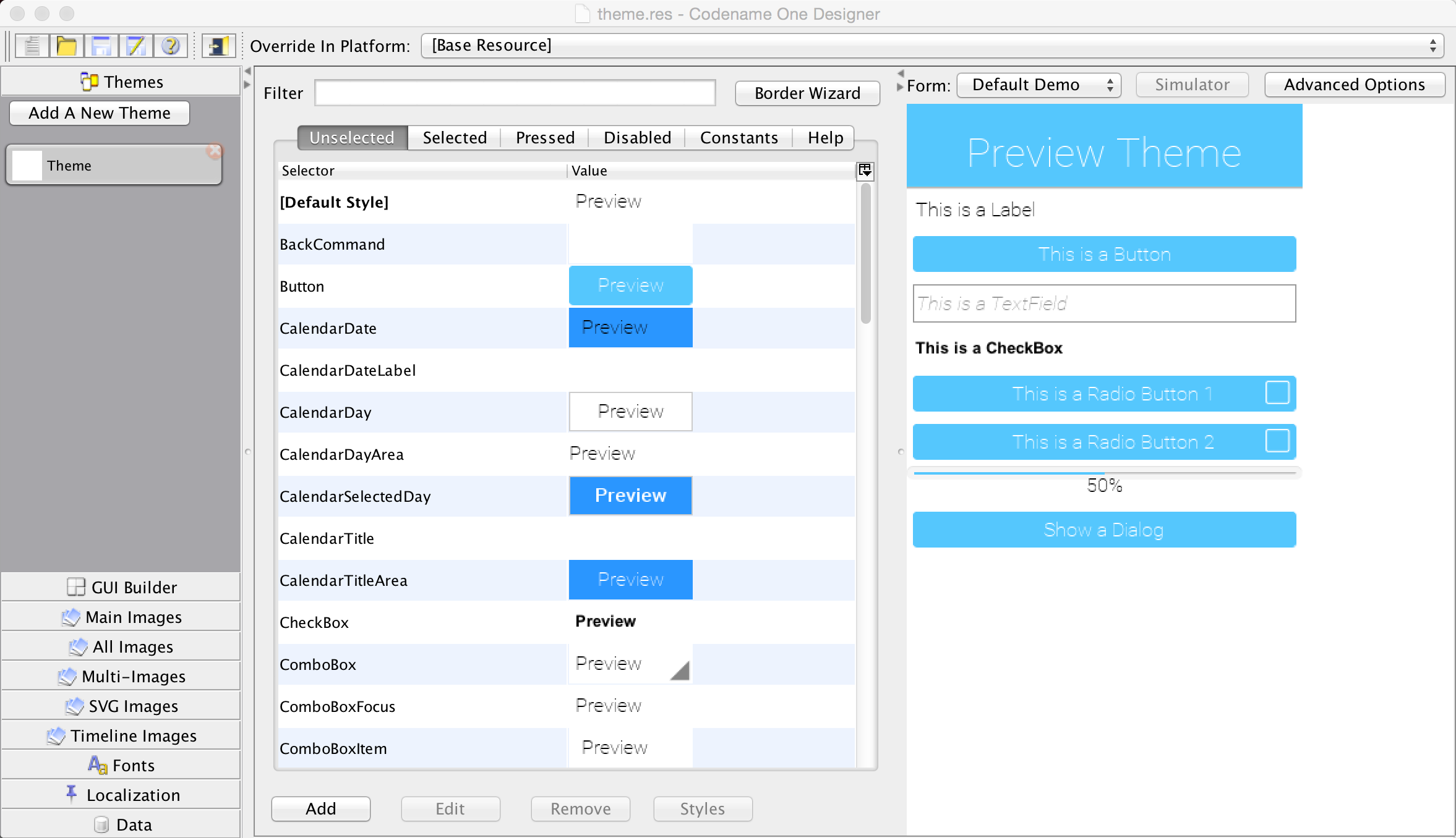
There are several interesting things to notice here the preview section allows us to instantly see the changes we make to the theme data.
The theme state tabs and constant tabs allow us to pass between the various editing modes for the theme and also add theme constants.
We discussed styles before, you can pick the right style mode through the tabs.

The most important section is the style section. It allows us to add/edit/remove style UIID’s.
Notice the Default Style section, it allows us to customize global defaults for the styles. Use it with caution as changes here can have wide implications.
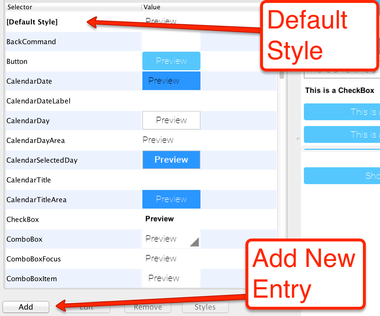
When we add an entry to the style we can just type the desired UIID into the box at the top of the dialog. We can also pick a UIID from the combo box but that might not include all potential options.
|
Tip
|
You can use the Component Inspector tool in the simulator to locate a component and its UIID in a specific Form |

When we add/edit an entry an important piece of the puzzle is the Derive check box that appears next to all of the UIID entries. All styles derive from the base style and usually from the native theme defaults, so when this flag is checked the defaults will be used.
When you uncheck that checkbox the fields below it become editable and you can override the default behavior. To restore the default just recheck that flag.
|
Note
|
A common oddity for developers is that when they press Add and don’t derive any entry nothing is actually added. The entries in the theme are essentially key/value pairs so when you don’t add anything there are no keys so the entry doesn’t show up |
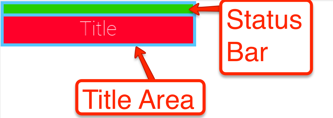
The title is a great target for customization since it includes a few interesting "complexities".
The Title is surrounded by a TitleArea container that encloses it, above the title you will also see the StatusBar UIID that prevents the status details from drawing on top of the title text.
|
Tip
|
The StatusBar UIID is a special case that is only there on iOS. In iOS the application needs to render the section under the status bar (which isn’t the case for other OS’s) and the StatusBar UIID was added so developers can ignore that behavior.
|
A slightly confusing aspects of styles in Codename One is the priorities of backgrounds. When you define a specific type of background it will override prior definitions, this even applies to inheritance.
E.g. if the theme defined a border for the Button UIID (a very common case) if you will try to define the background image or the background color of Button those will be ignored!
|
Tip
|
The solution is to derive the border and select the Empty border type
|
The order for UIID settings for background is as follows:
-
Border - if the component has a border it can override everything. Image borders always override all background settings you might have.
-
Image or gradient - an image or gradient background overrides background color/transparency settings.
-
Background Color/Transparency - If transparency is larger than 0 then this takes effect.
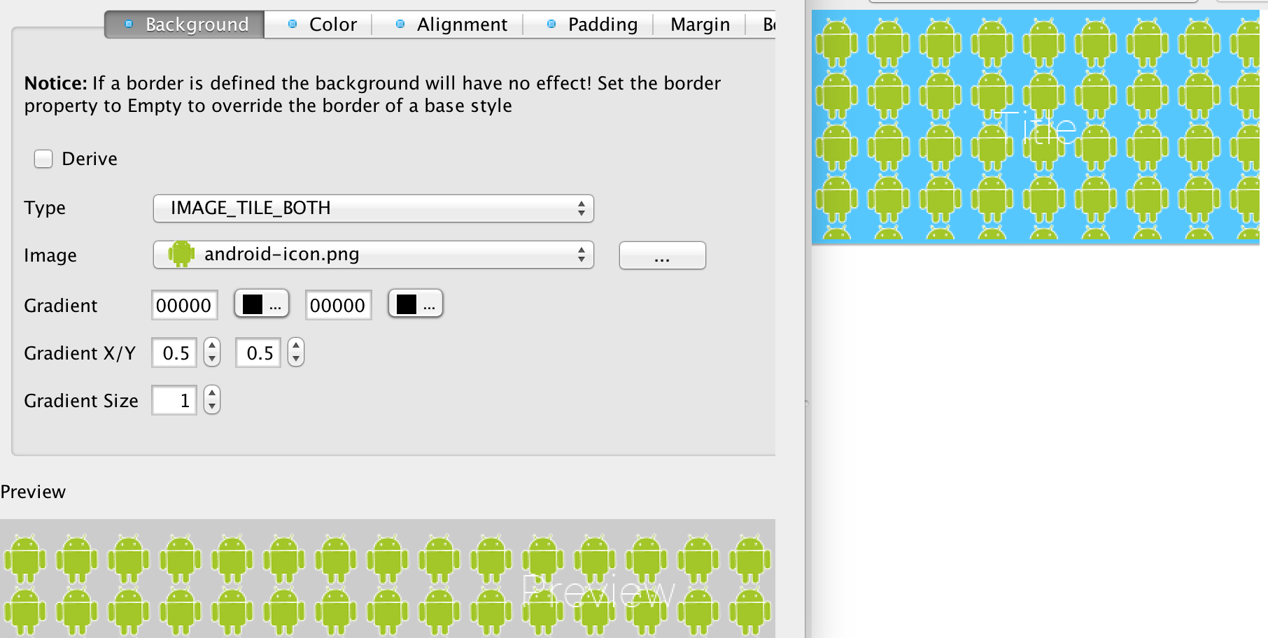
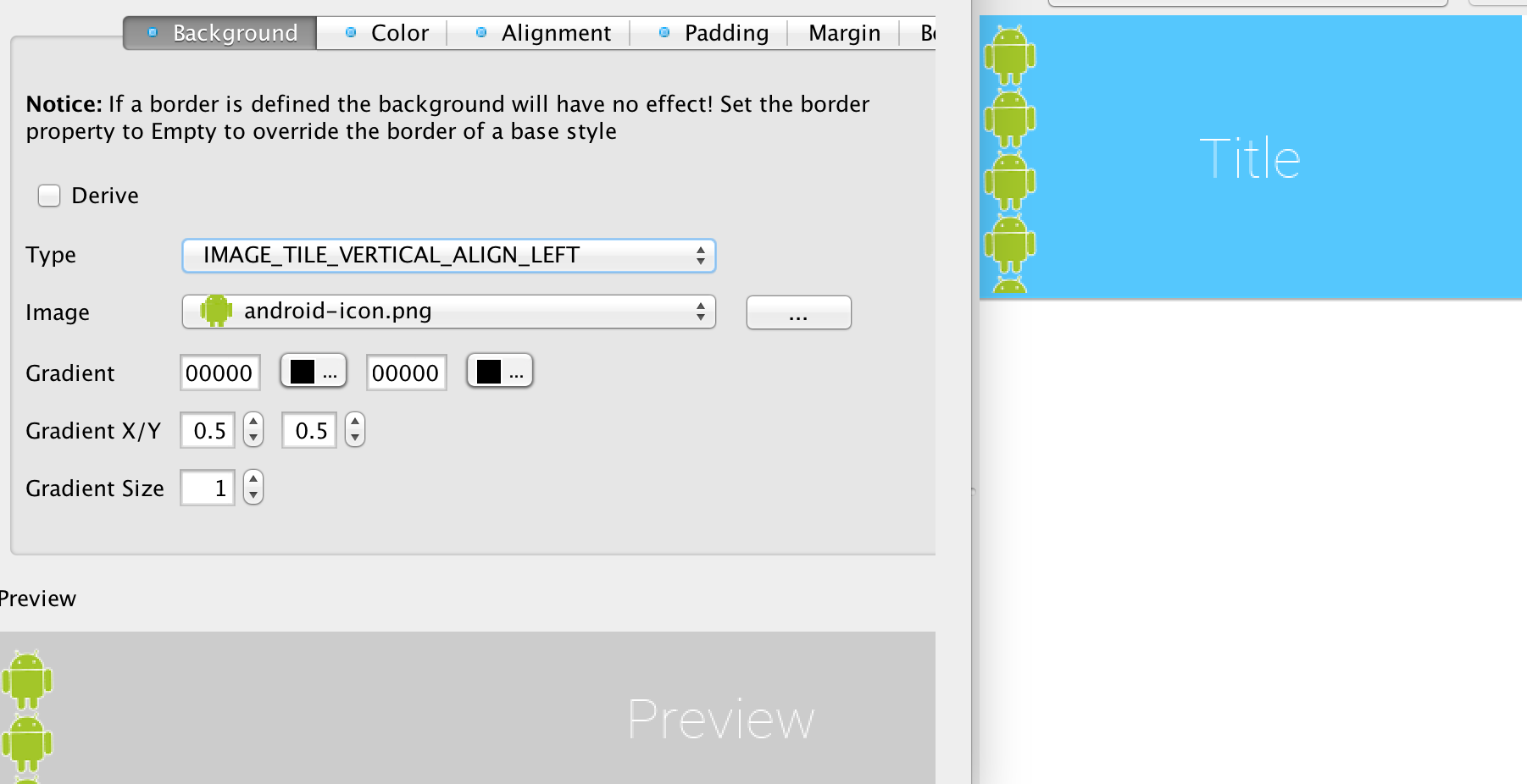
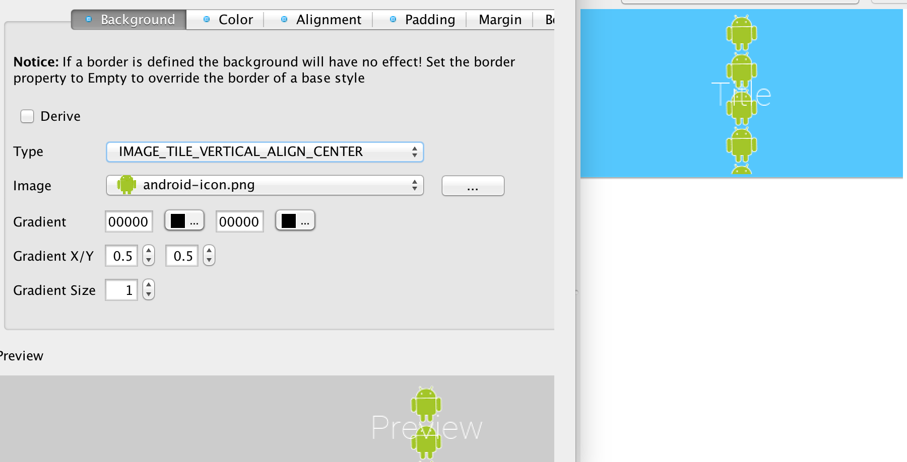
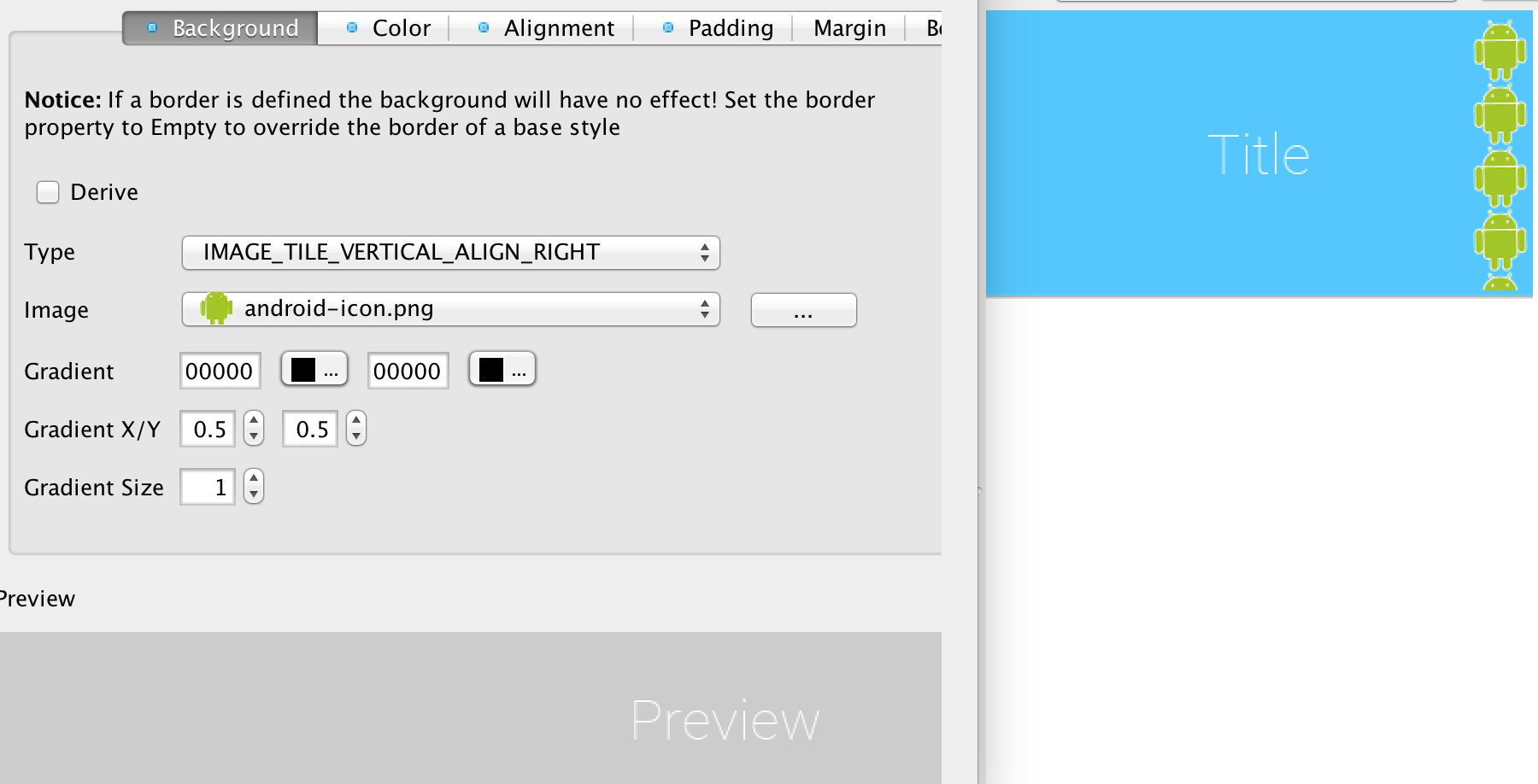
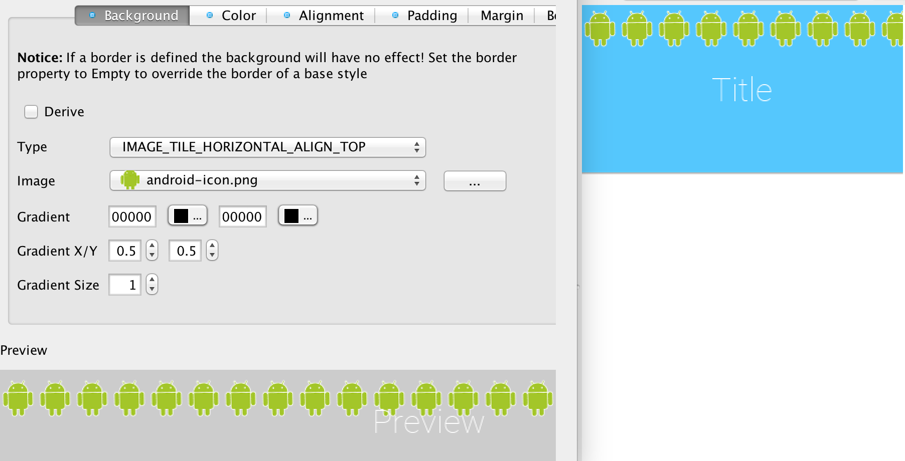
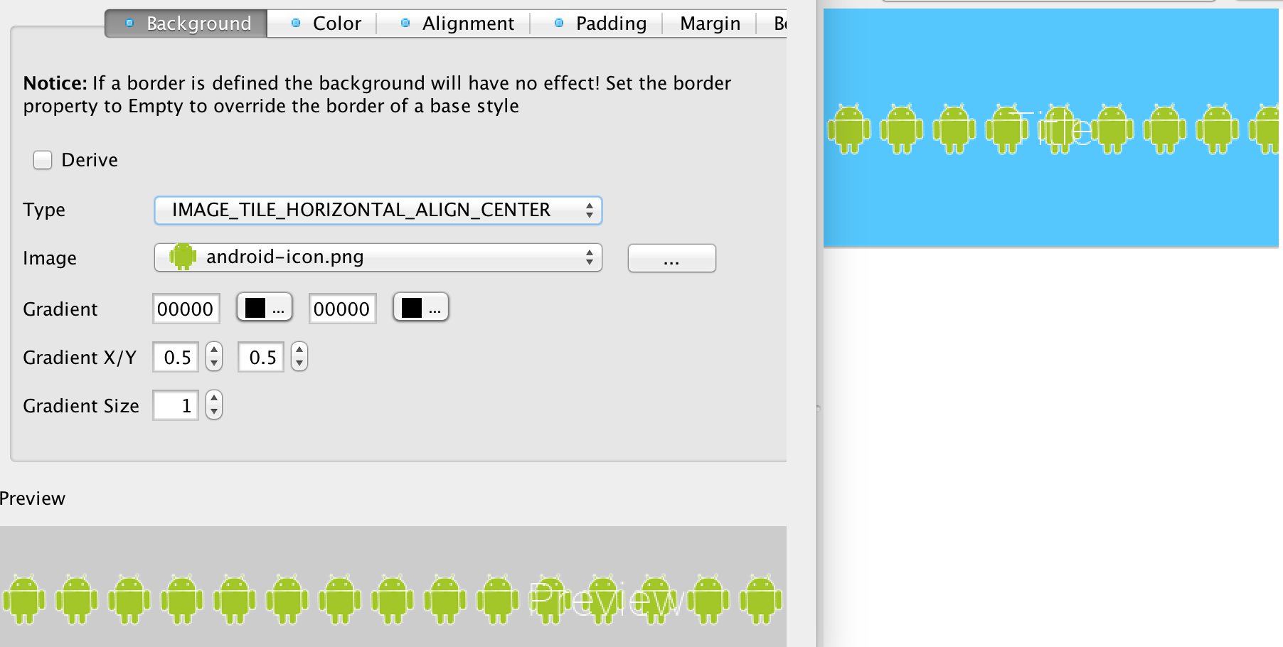
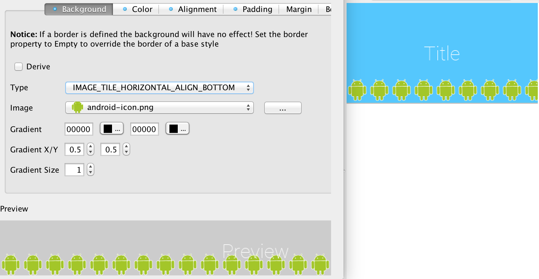
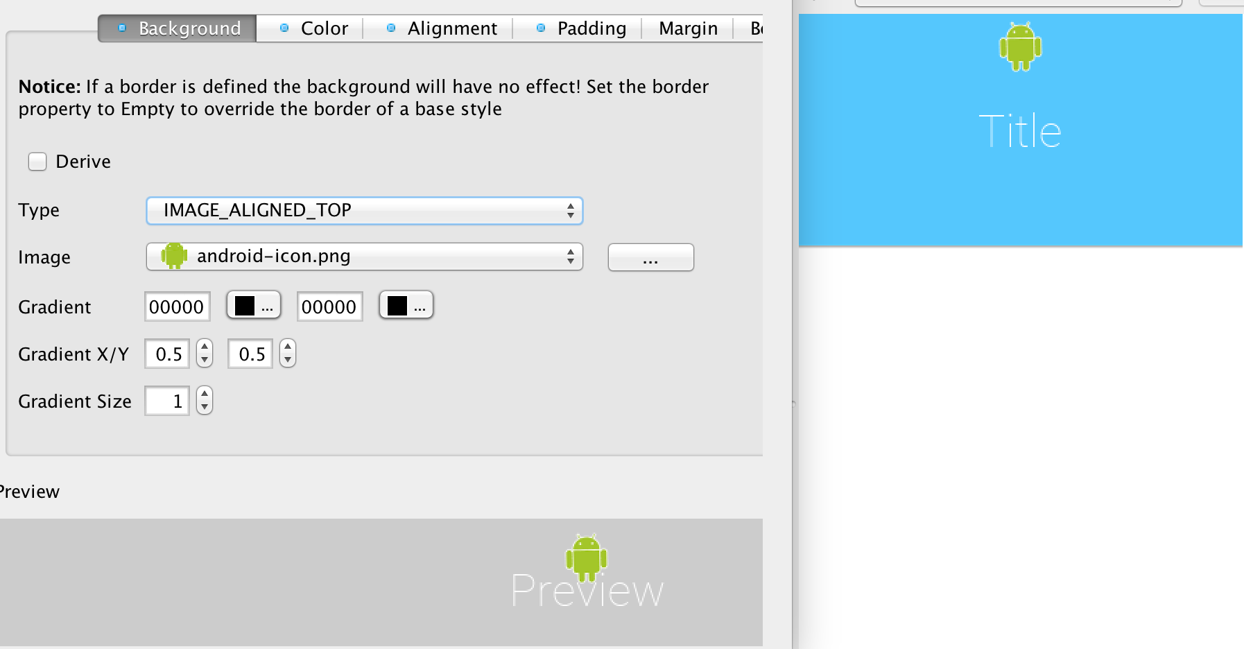
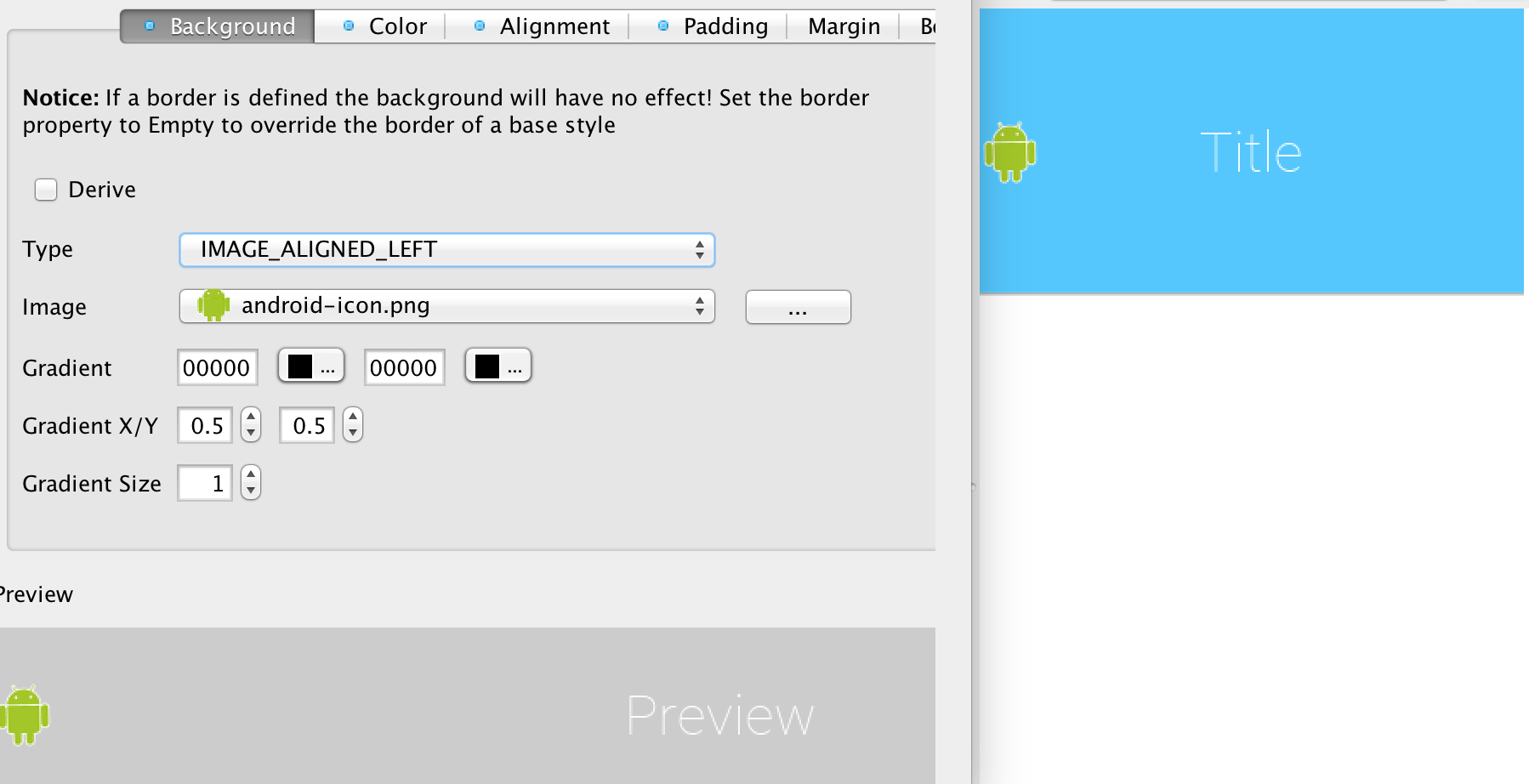
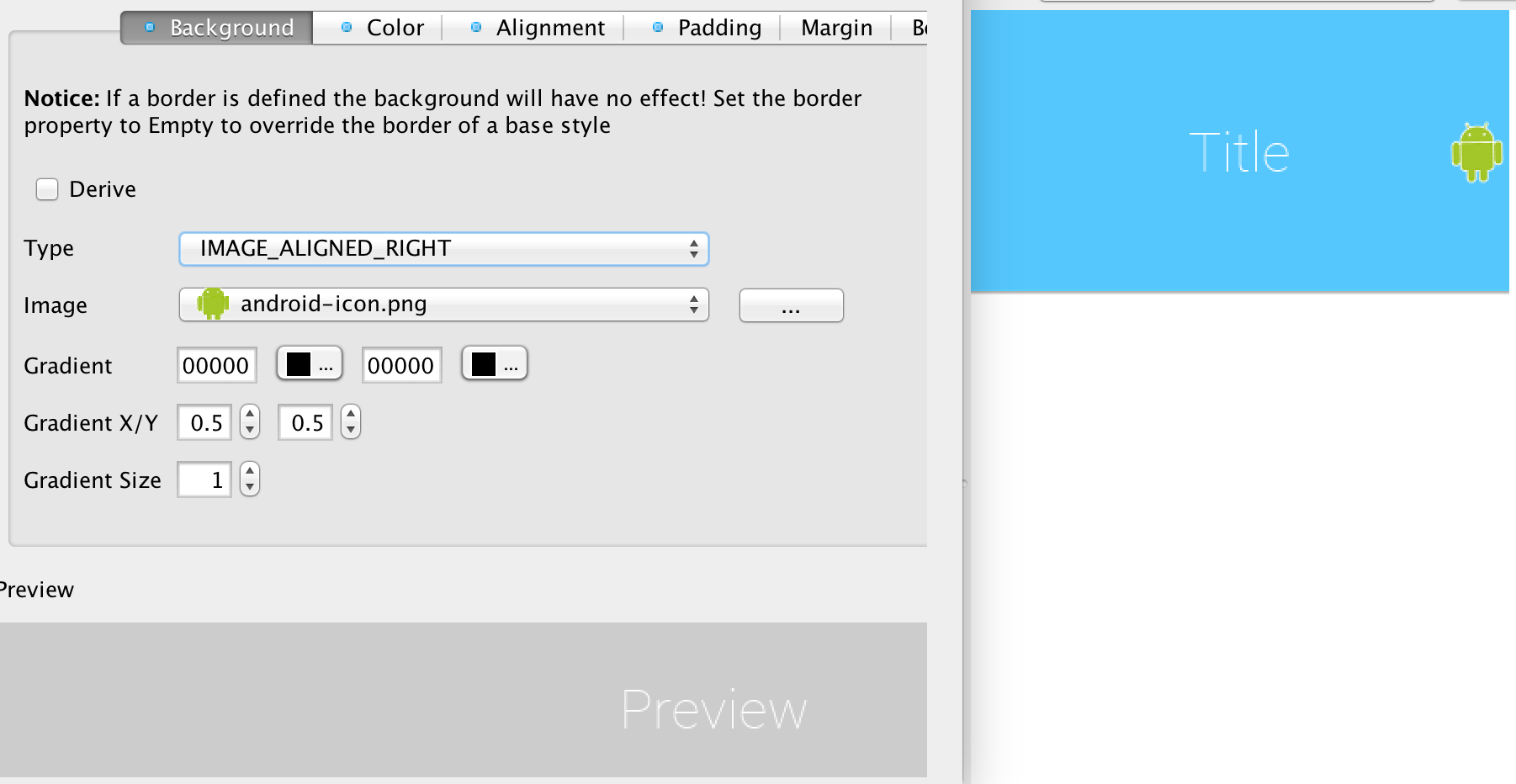
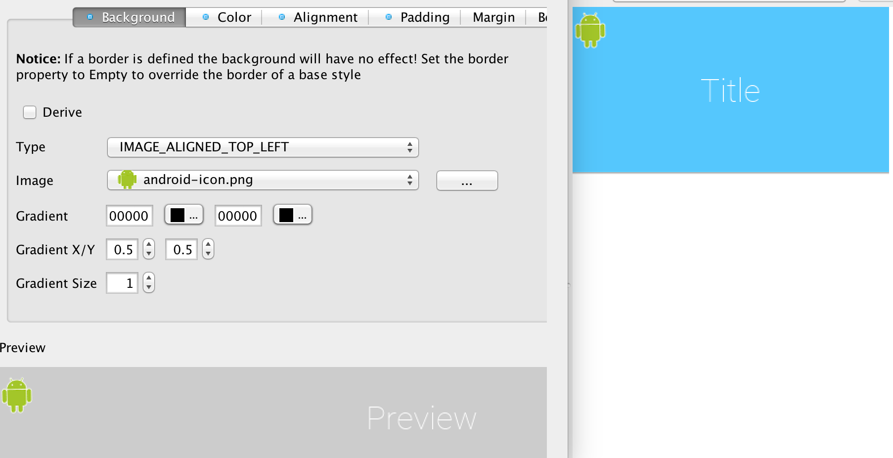
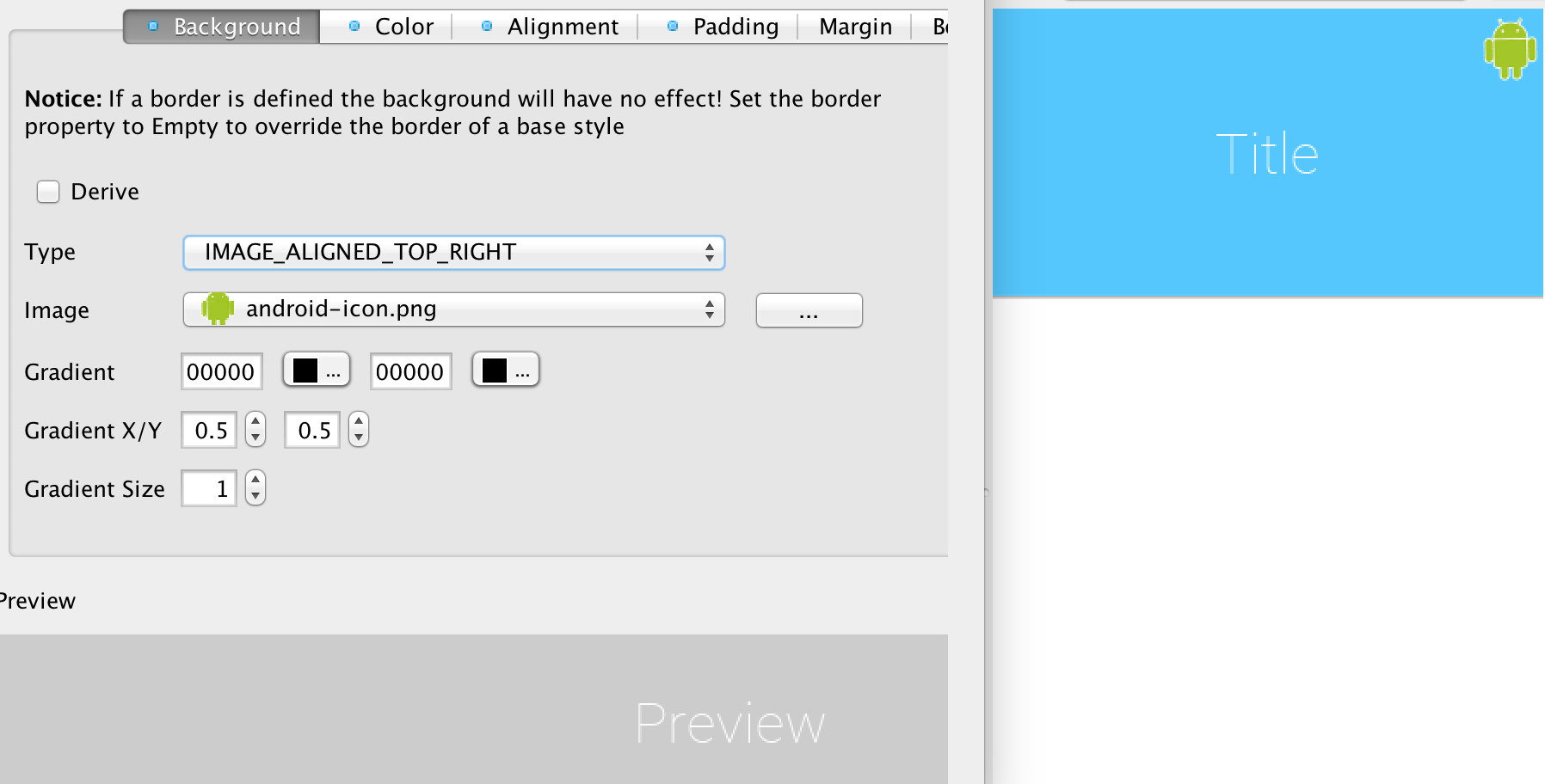
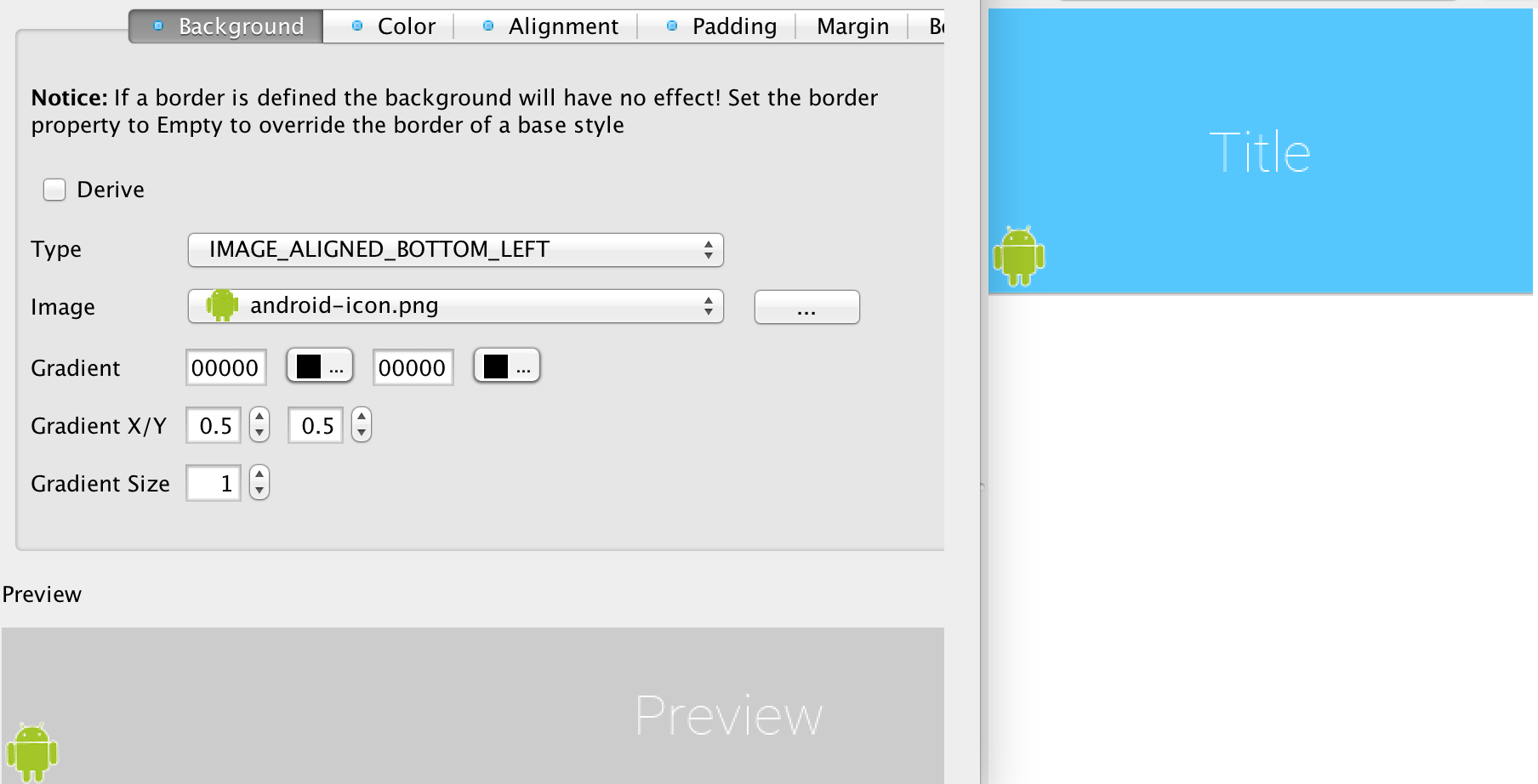
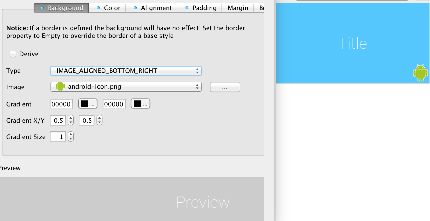
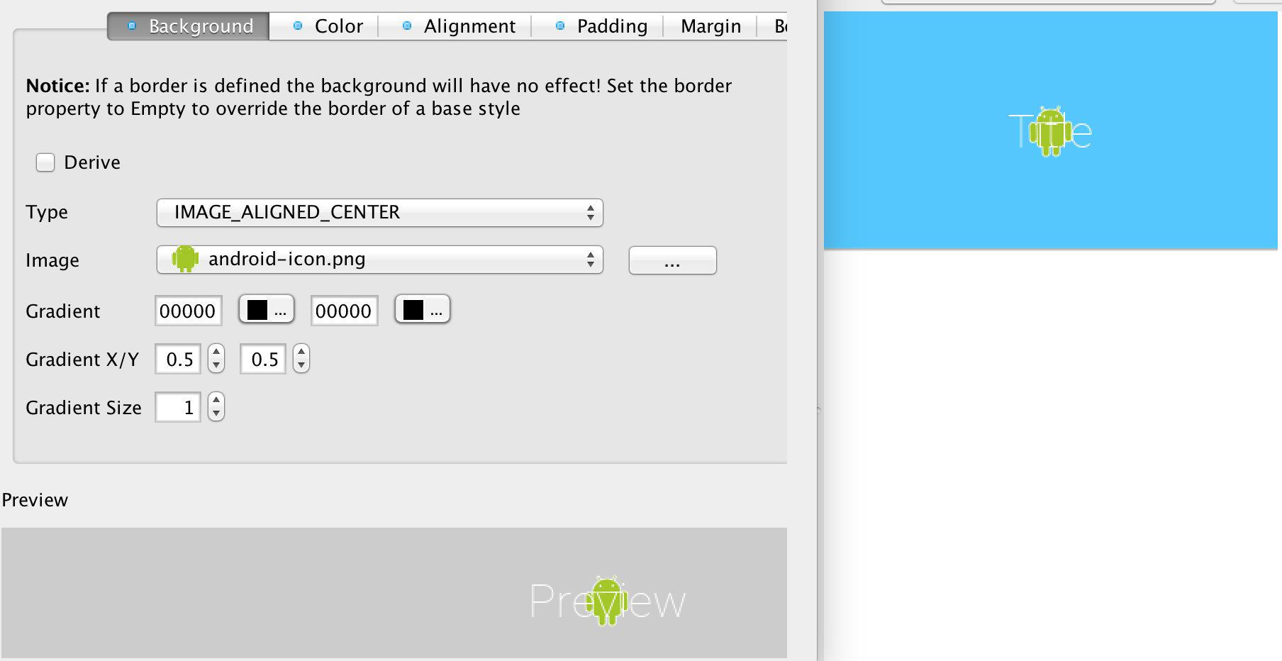
Lets start in the first page of the style entry, we’ll customize the background behavior for the Title UIID and demonstrate/explain some of the behaviors.
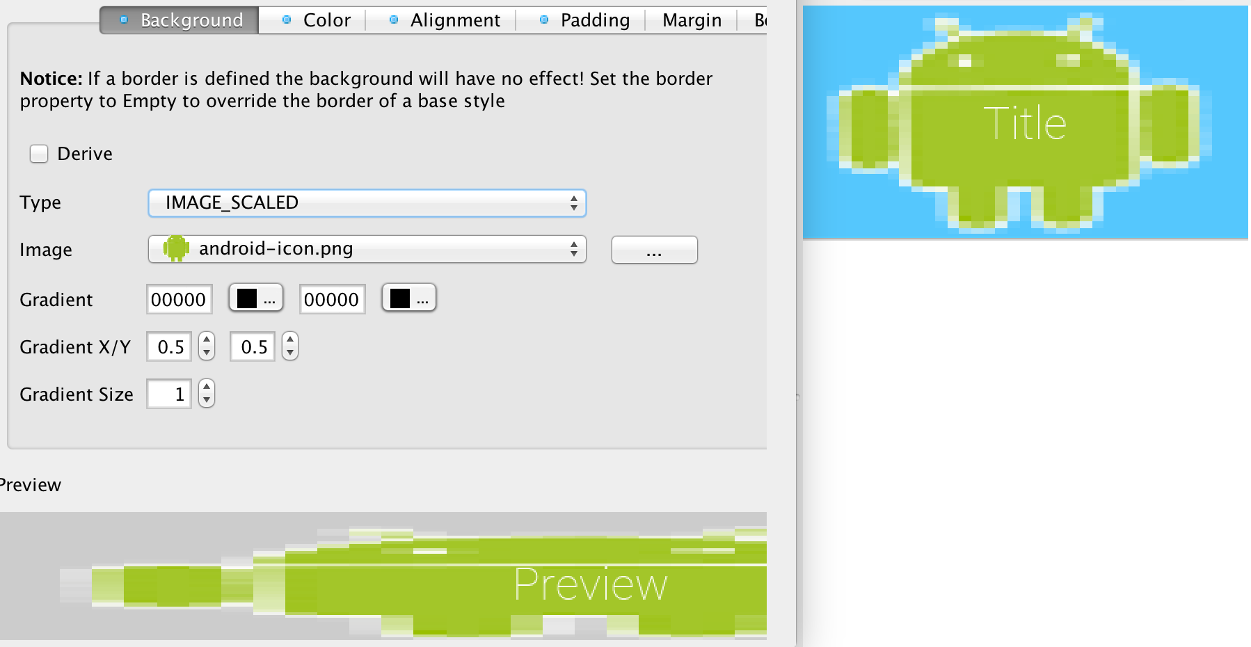
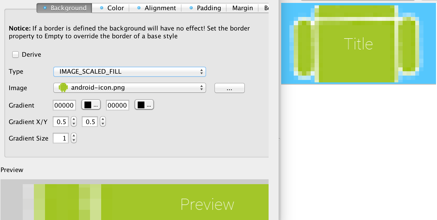
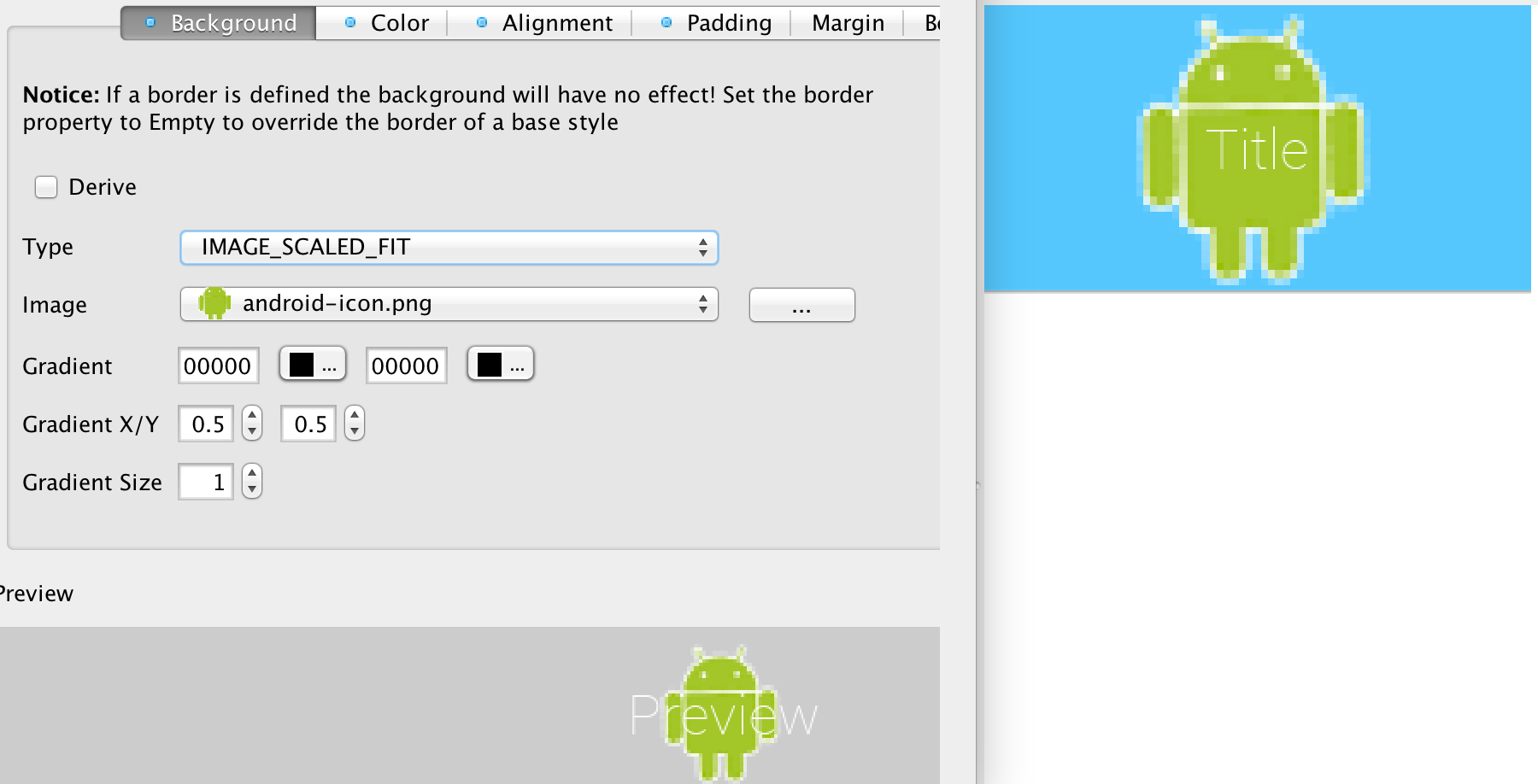
The pictures below demonstrate the different types of background image behaviors.
|
Tip
|
Aspect ratio is the ratio between the width and the height of the image. E.g. if the image is 100x50 pixels and we want the width to be 200 pixels preserving the aspect ratio will require the height to also double to 200x100.We highly recommend preserving the aspect ratio to keep images more "natural". |

The color settings are much simpler than the background behavior. As explained above the priority for color is at the bottom so if you have a border, image or gradient defined the background color settings will be ignored.
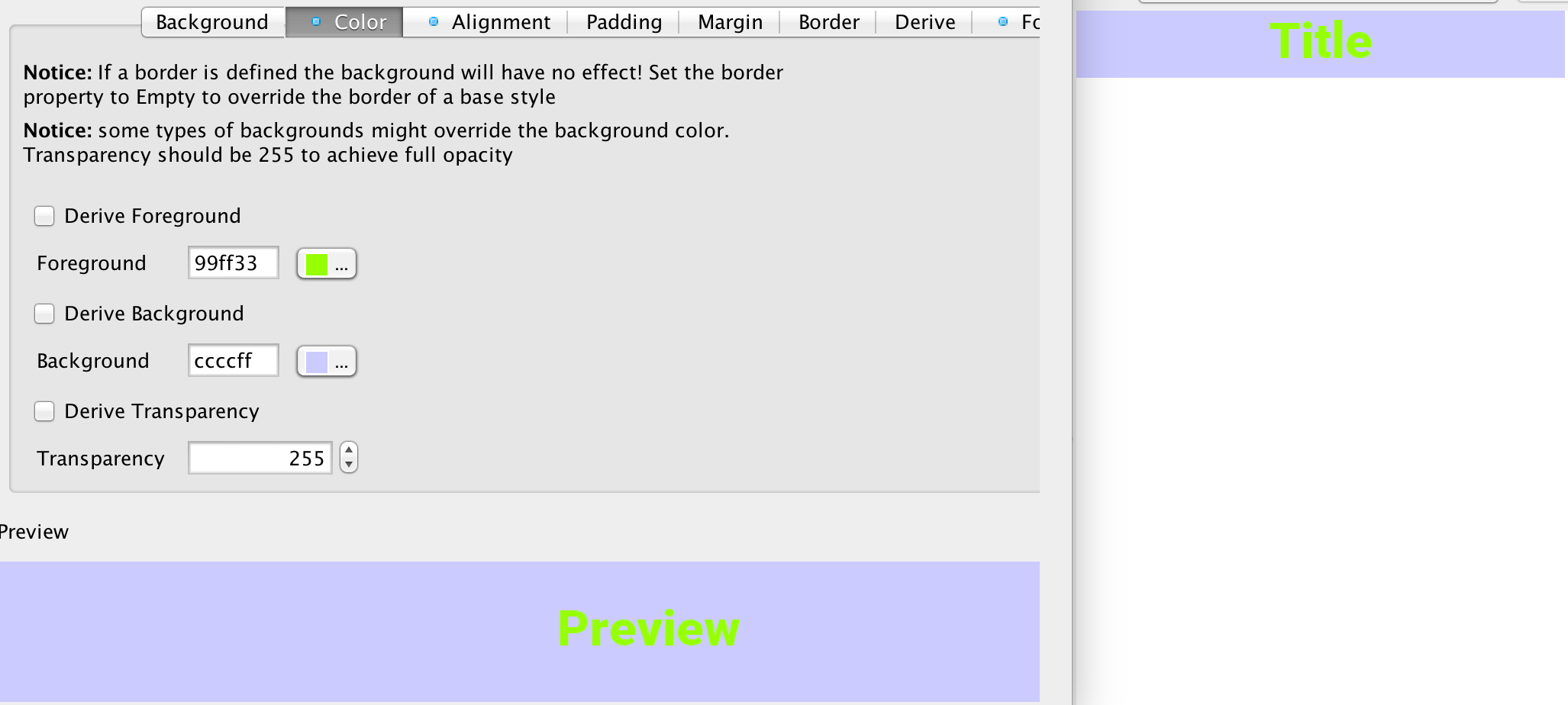
There are three color settings:
-
Foreground color is the RRGGBB color that sets the style foreground color normally used to draw the text of the component. You can use the color picker button on the side to pick a color
-
Background same as foreground only determines the background color of the component
-
Transparency represents the opacity of the component background as a value between 0 (transparent) and 255 (opaque)
|
Tip
|
Setting the background will have no effect unless transparency is higher than 0. If you don’t explicitly define this it might have a different value based on the native theme |
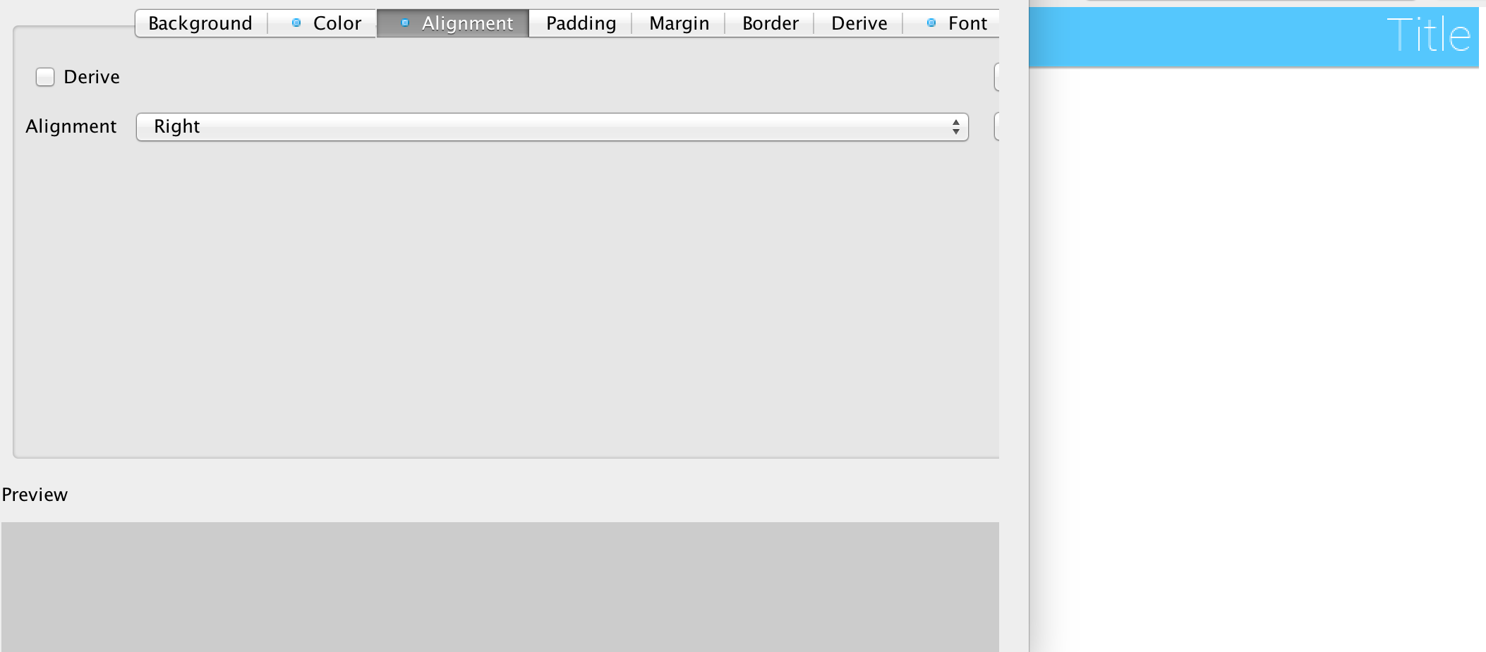
Not all component types support alignment and even when they do they don’t support it for all elements. E.g. a Label and its subclasses support alignment but will only apply it to the text and not the icon.
Notice that Container doesn’t support alignment. You should use the layout manager to tune component positioning.
|
Warning
|
Aligning text components to anything other than the default alignment might be a problem if they are editable. The native editing capabilities might collide with the alignment behavior. |
|
Note
|
Bidi/RtL layout reverses the alignment value so left becomes right and visa versa |
Padding and margin are concepts derived from the CSS box model. They are slightly different in Codename One, where the border spacing is part of the padding, but other than that they are pretty similar:
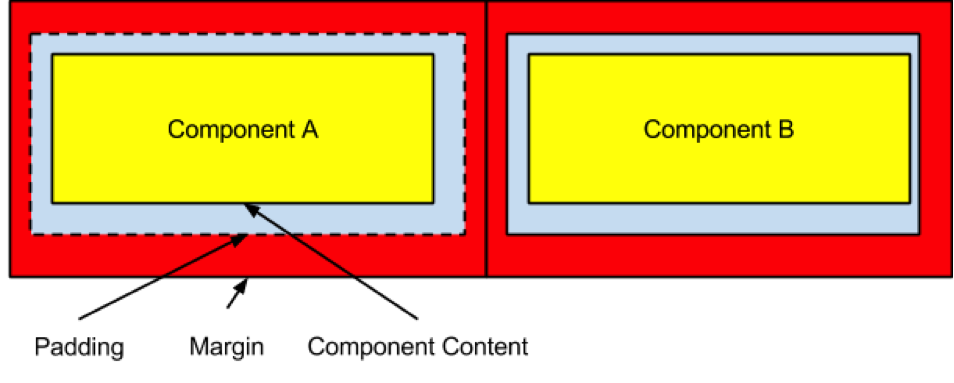
In the diagram, we can see the component represented in yellow occupying its preferred size. The padding portion in gray effectively increases the components size. The margin is the space between components, it allows us to keep whitespace between multiple components. Margin is represented in red in the diagram.
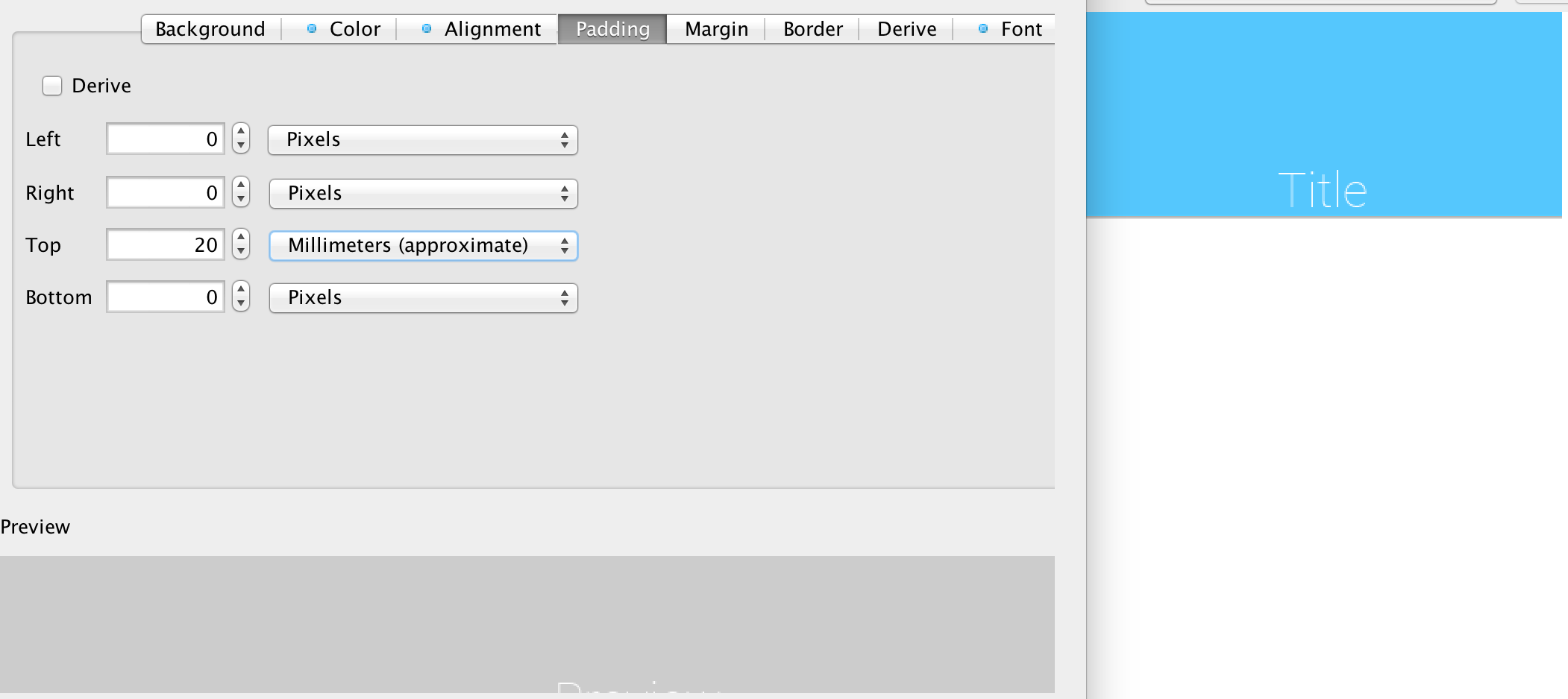
The theme allows us to customize the padding/margin, and specify them for all 4 sides of a component. They can be specified in pixels, millimeters/dips, or screen percentage:
|
Tip
|
We recommend using millimeters for all spacing to make it look good for all device densities. Percentages make sense only in very extreme cases |
Borders are a big subject in their own right, the UI for their creation is also a bit confusing:
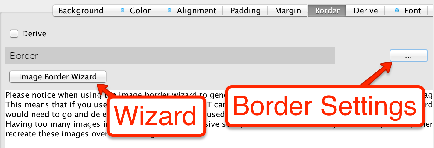
A common border type is the 9-piece image border, to facilitate that border type we have a special Image Border Wizard.
A 9 piece image border is a common convention in UI theming that divides a border into 9 pieces 4 representing corners, 4 representing the sides and one representing the middle.
|
Tip
|
Android uses a common variation on the 9-piece border: 9-patch. The main difference between the 9-piece border and 9-patch is that 9-piece borders tile the sides/center whereas 9-patch scales them |
9-piece image borders work better than background images for many use cases where the background needs to "grow/shrink" extensively and might need to change aspect ratio.
They don’t work well in cases where the image is asymmetric on both axis. E.g. a radial gradient image. 9-piece images in general don’t work very well with complex gradients.
The image border wizard simplifies the process of generating a 9-piece image border using a 3 stage process.
|
Tip
|
Use an image that’s designed for a high DPI device |
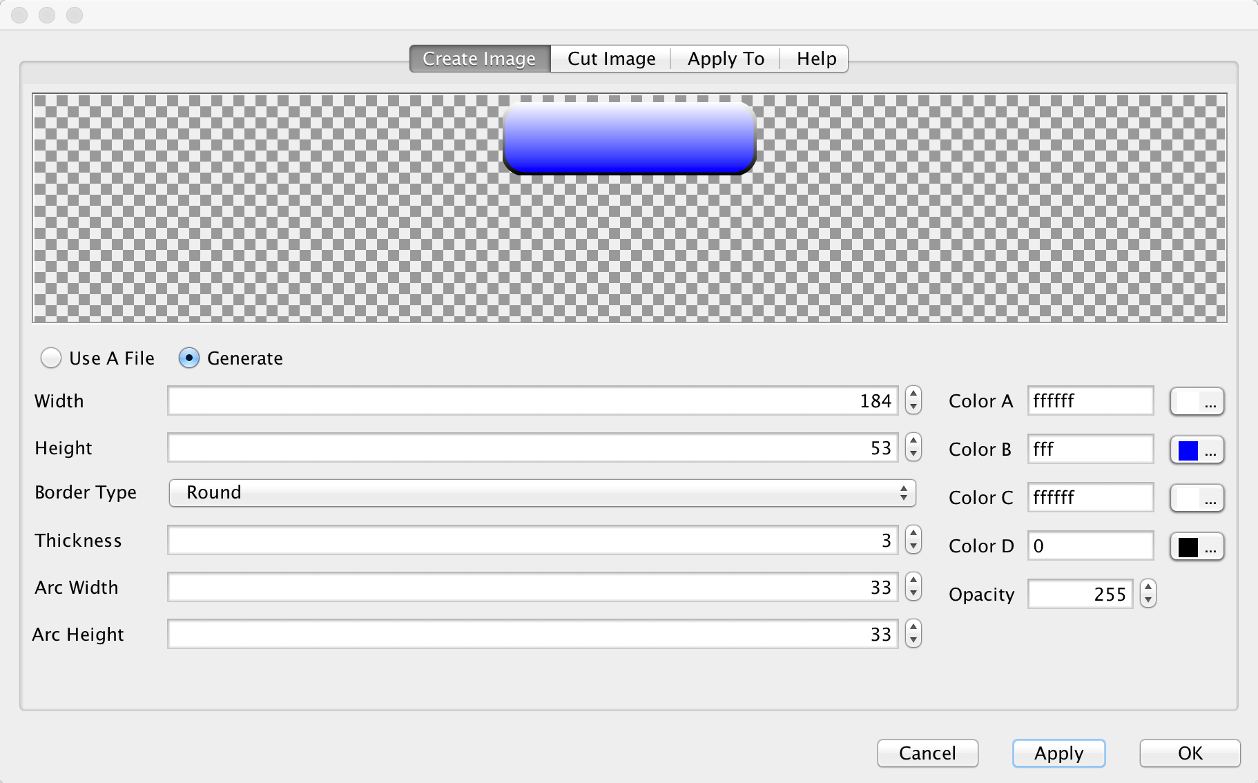
For your convenience you can create a rudimentary image with the create image stage but for a professional looking application you would usually want to use a design by a professional designer.
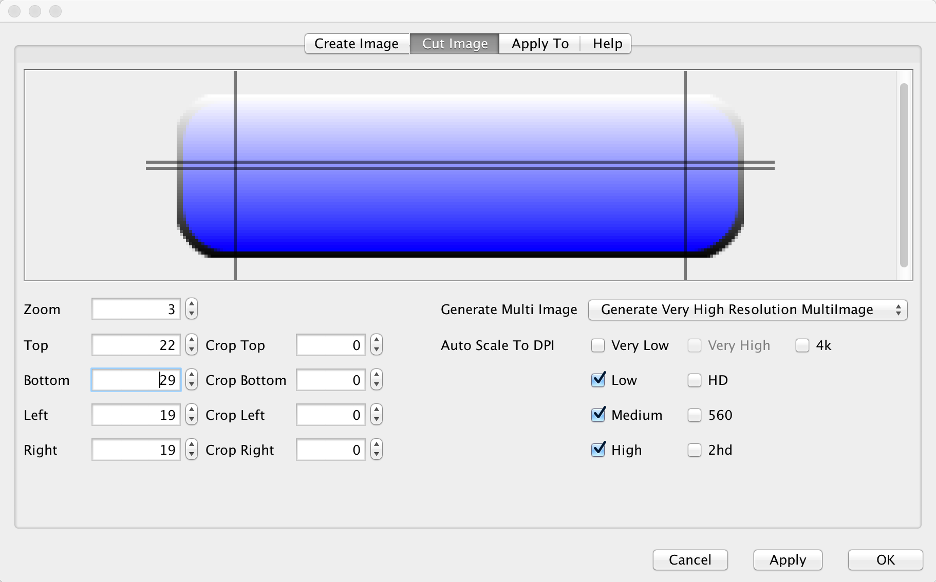
The second stage is probably the hardest and most important one in this wizard!
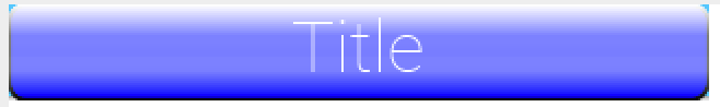
You can change the values of the top/bottom/left/right spinners to move the position of the guide lines that indicate the various 9 pieces. The image shows the correct cut for this image type with special attention to the following:
-
The left/right position is high enough to fit in the rounded corners in their entirety. Notice that we didn’t just leave 1 pixel as that performs badly, we want to leave as much space as possible!
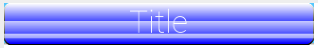
-
The top and bottom lines have exactly one pixel between them. This is to avoid breaking the gradient. E.g. if we set the lines further apart we will end up with this:
-
The elements on the right hand side include the Generate Multi Image options. Here you can indicate the density of the source image you are using (e.g. if its for iPhone 5 class device pick Very High). You can then select in the checkboxes below the densities that should be generated automatically for you. This allows fine detail on the border to be maintained in the various high/low resolution devices.
|
Tip
|
We go into a lot of details about multi images in the advanced theming section. |
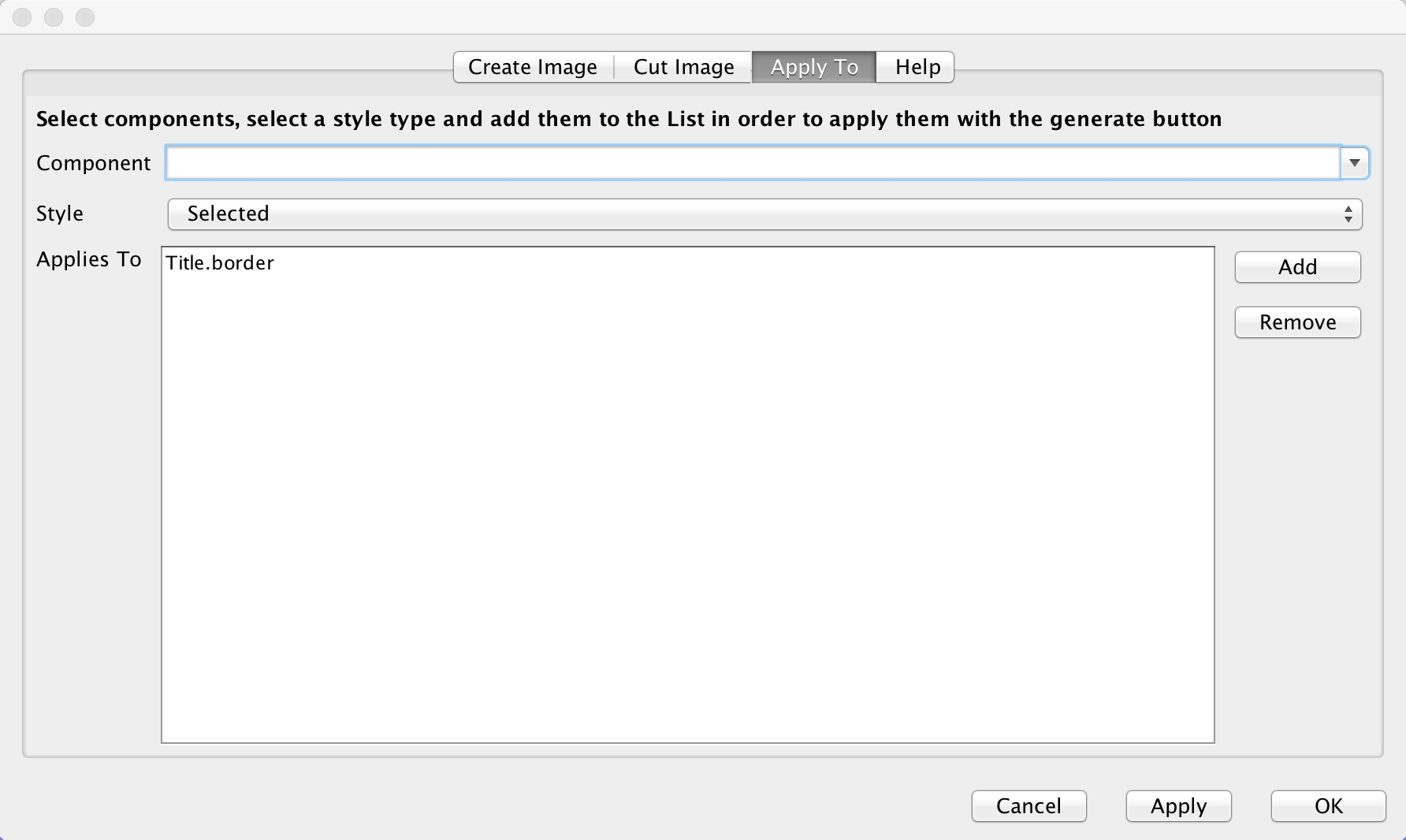
The last page indicates the styles to which the wizard will apply the border. Under normal usage you don’t really need to touch this as its properly filled out.
You can define the same border for multiple UIIDs from here though.
A common oddity when using the image borders is the fact that even when padding is removed the component might take a larger size than the height of the text within it.
The reason for that is the border. Because of the way borders are implemented they can’t be drawn to be smaller than the sum of their corners. E.g. the minimum height of a border would be the height of the bottom corner + the height of the top corner. The minimum width would be the width of the left + right corners.
This is coded into the common preferred size methods in Codename One and components generally don’t shrink below the size of the image border even if padding is 0.
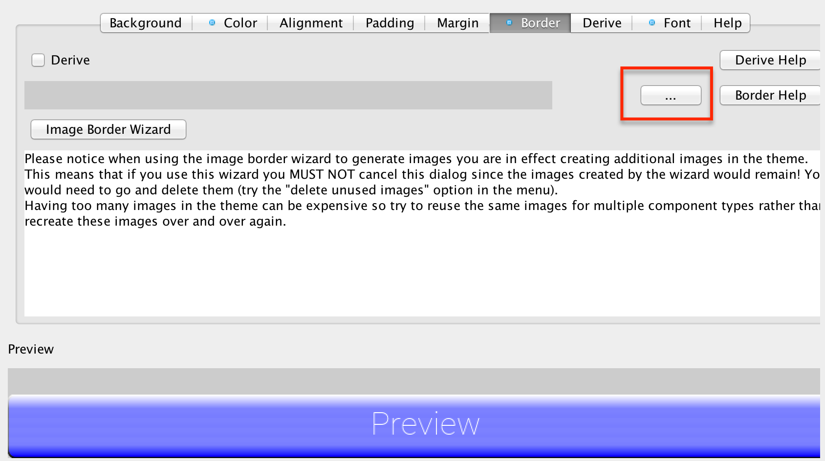
Normally we can just use the 9-piece border wizard but we can also customize the border by pressing the "…" button on the border section in the theme.
The UI for the 9-piece border we created above looks like this.
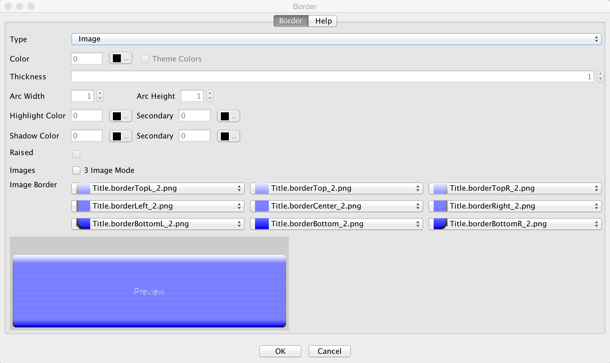
You can pick the image represented by every section in the border from the combo boxes. They are organized in the same way the border is with the 9-pieces placed in the same position they would occupy when the border is rendered.
|
Note
|
Notice that the other elements in the UI are disabled when the image border type is selected. |
The 9-piece border has a (rarely used) special case: 3 image mode. In this mode a developer can specify the top left corner, the top image and the center image to produce a 9 piece border. The corner and top piece are then rotated dynamically to produce a standard 9-piece border on the device.
This is useful for reducing application code size but isn’t used often as it requires a more symetric UI.
|
Note
|
Don’t confuse the 3-image mode for the 9-piece border with the horizontal/vertical image border below |
The 9-piece border is the workhorse of borders in Codename One, however there are some edge cases of UI elements that should grow on one axis and not on another. A perfect example of this is the iOS 6 style back button. If we tried to cut it into a 9-piece border the arrow effect would be broken.
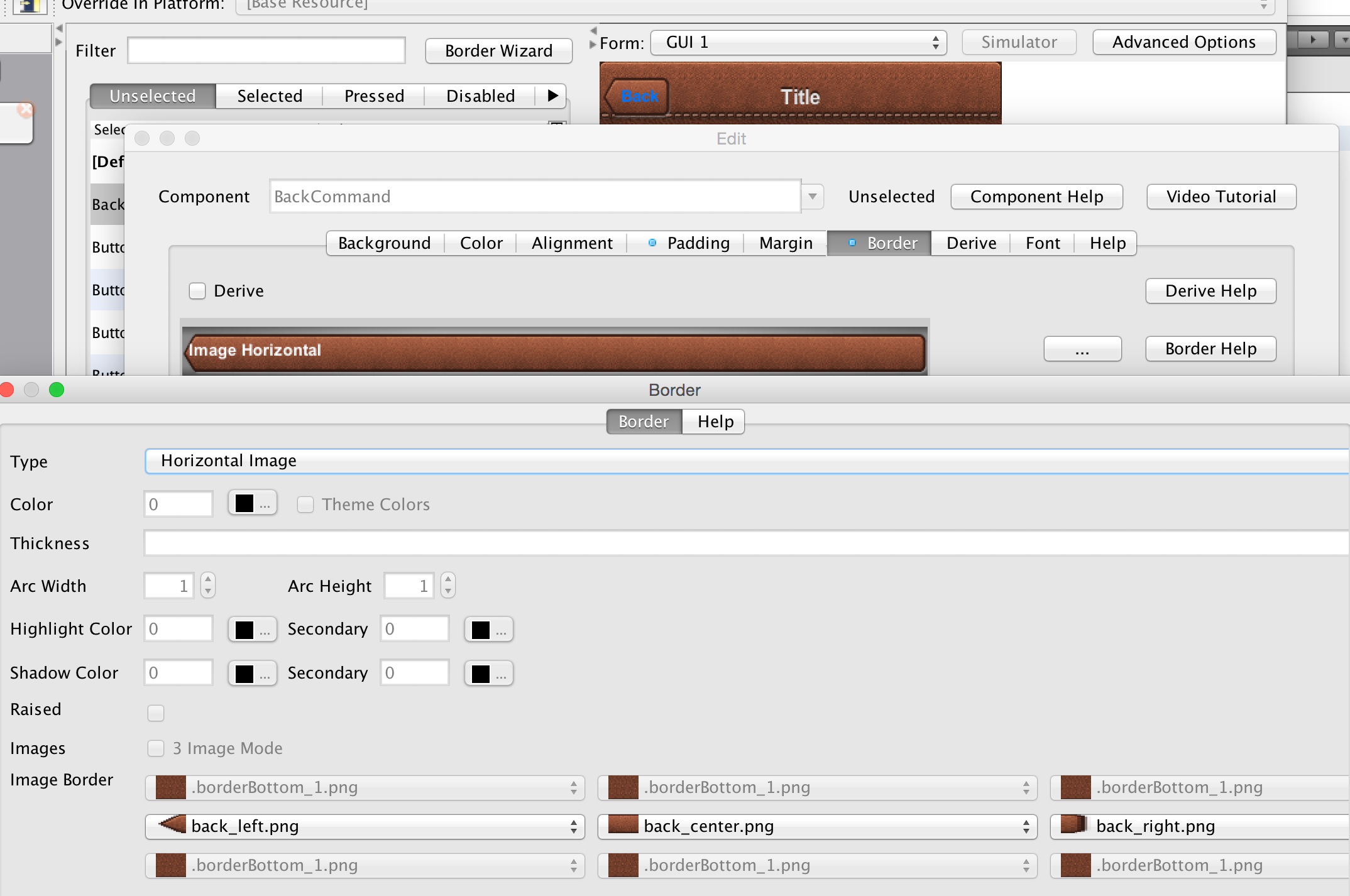
The horizontal and vertical image borders accept 3 images of their respective AXIS and build the border by placing one image on each side and tiling the center image between them. E.g. A horizontal border will never grow vertically.
|
Tip
|
In RTL/Bidi [1] modes the borders flip automatically to show the reverse direction. An iOS style back button will point to the right in such languages. |
Empty borders enforce the removal of a border. This is important if you would like to block a base style from having a border.
E.g. Buttons have borders by default. If you would like to create a Button that is strictly of solid color you could just define the border to be empty and then use the solid color as you see fit.
|
Important
|
There is a null border which is often confused with an empty border. You should use empty border and not null border |
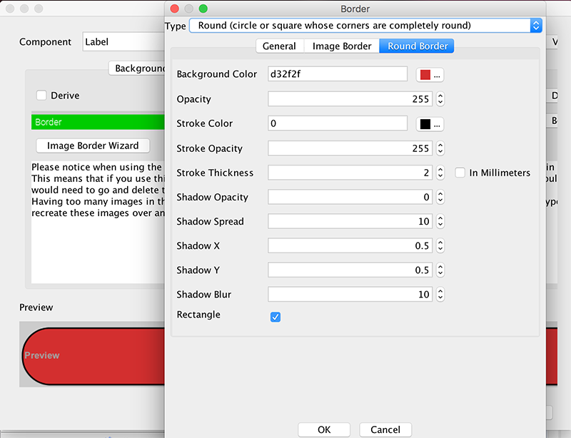
Circles and completely round border sides are problematic for multi-resolutions. You need to draw them dynamically and can’t use image borders which can’t be tiled/cut to fit round designs (due to physical constraints of the round shape).
We designed the RoundBorder to enable two distinct types of borders:
-
Circular borders - e.g. Android floating action
-
Rectangles with round (not rounded) sides
Round Border is a bit confusing since we already support a rounded border type. The rounded border type is a rectangle with rounded corners whereas the round border has completely round sides or appears as a circle.
To make matters worse the round border has a ridiculous number of features/configurations that would have made the already cluttered UI darn near impossible to navigate. To simplify this we split the UI into 3 tabs for standard borders, image borders and round border.
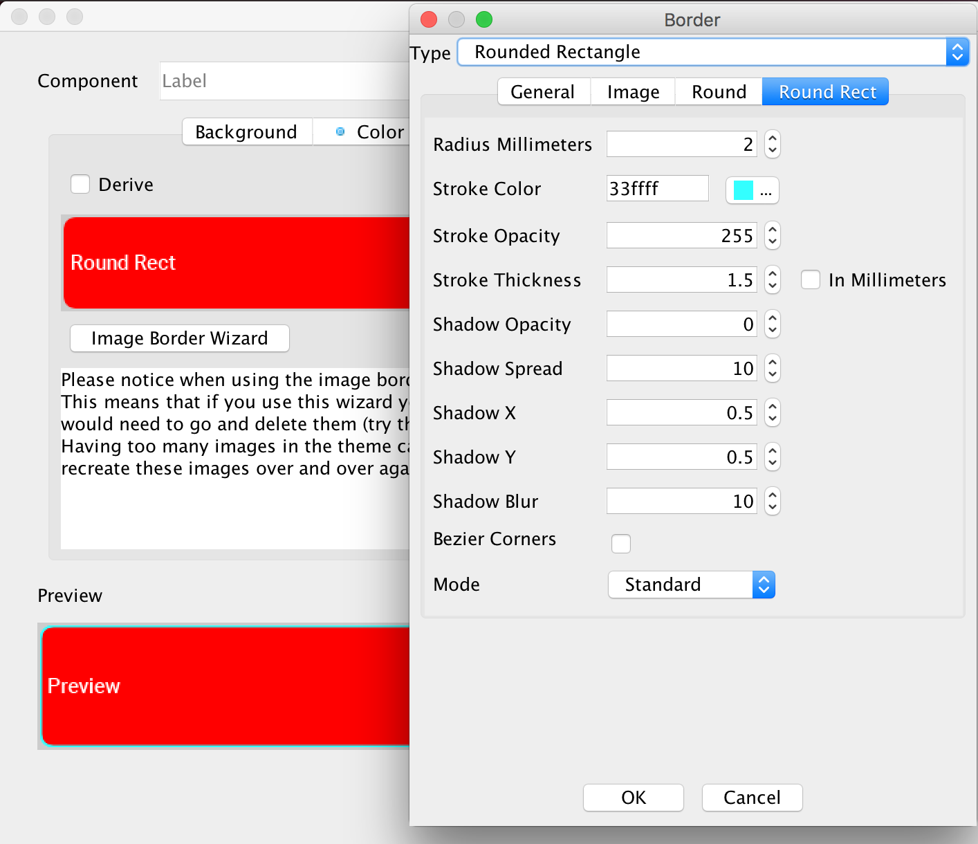
The RoundRectBorder was developed based on the RoundBorder and has similar features. It produces a rounded rectangle UI.
|
Tip
|
Don’t confuse the Rounded Rectangle border with the deprecated Rounded border…
|
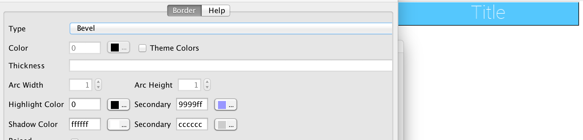
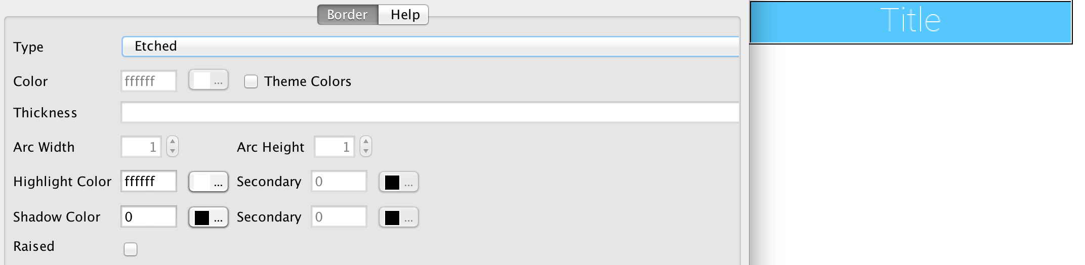
It’s a pretty simple border type akin to the RoundBorder.
We generally recommend avoiding bevel/etched border types as they aren’t as efficient and look a bit dated in todays applications. We cover them here mostly for completeness.
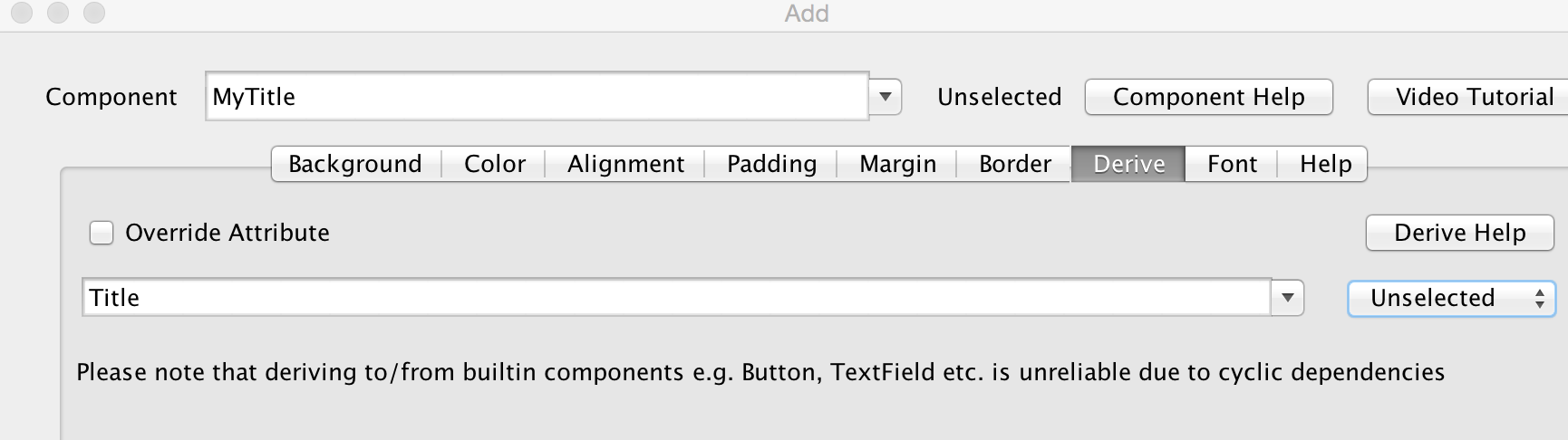
Derive allows us to inherit the behavior of a UIID and extend it with some customization.
E.g. Lets say we created a component that’s supposed to look like a title, we could do something like:
cmp.setUIID("Title");But title might sometimes be aligned to the left (based on theme) and we always want our component to be center aligned. However, we don’t want that to affect the actual titles in the app…
To solve this we can define a MyTitle UIID and derive the Title UIID. Then just customize that one attribute.
Style inheritance is a problematic topic in every tool that supports such behavior. Codename One styles start from a global default then have a system default applied and on top of that have the native OS default applied to them.
At that point a developer can define the style after all of the user settings are in place. Normally this works reasonably well, but there are some edge cases where inheriting a style can fail.
When you override an existing style such as Button and choose to derive from Button in a different selection mode or even a different component altogether such as Label you might trigger a recursion effect where a theme setting in the base theme depends on something in a base triggering an infinite loop.
To avoid this always inherit only from UIID’s you defined e.g. MyButton.
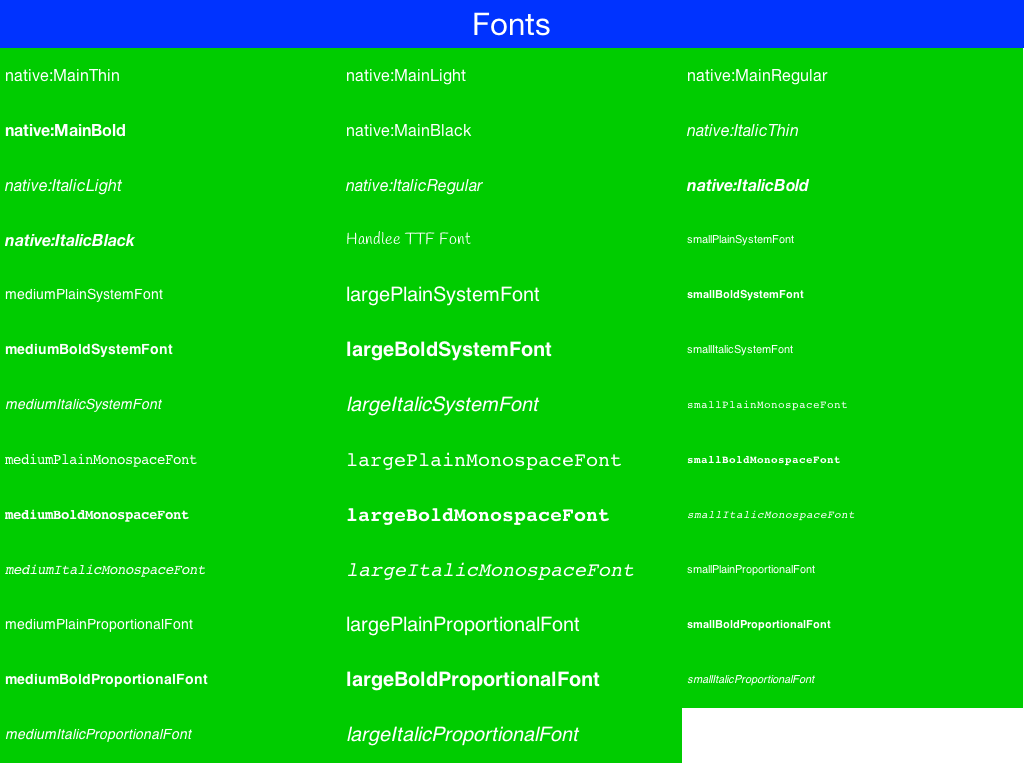
Codename One currently supports 3 font types:
-
System fonts — these are very simplistic builtin fonts. They work on all platforms and come in one of 3 sizes. However, they are ubiquitous and work in every platform in all languages.
-
TTF files — you can just place a TTF file in the src directory of the project and it will appear in the True Type combo box.
-
Native fonts — these aren’t supported on all platforms but generally they allow you to use a set of platform native good looking fonts. E.g. on Android the devices Roboto font will be used and on iOS San Francisco or Helvetica Neue will be used. This is the recommended font type we suggest for most use cases!
|
Warning
|
If you use a TTF file MAKE SURE not to delete the file when there MIGHT be a reference to it. This can cause hard to track down issues! |
|
Important
|
Notice that a TTF file must have the ".ttf" extension, otherwise the build server won’t be able to recognize the file as a font and set it up accordingly (devices need fonts to be defined in very specific ways). Once you do that, you can use the font from code or from the theme |
|
Note
|
System fonts are always defined even if you use a TTF or native font. If the native font/TTF is unavailable in a specific platform the system font will be used instead. |
You can size native/TTF fonts either via pixels, millimeters or based on the size of the equivalent system fonts:
-
System font size - the truetype font will have the same size as a small, medium or large system font. This allows the developer to size the font based on the device DPI
-
Millimeter size - allows sizing the font in a more DPI aware size
-
Pixels - useful for some unique cases, but highly problematic in multi-DPI scenarios
|
Note
|
You should notice that font sizing is very inconsistent between platforms we recommend using millimeters for sizing |
You can load a truetype font from code using:
if(Font.isTrueTypeFileSupported()) {
    Font myFont = Font.createTrueTypeFont(fontName, fontFileName);
    myFont = myFont.derive(sizeInPixels, Font.STYLE_PLAIN);
    // do something with the font
}
Notice that, in code, only pixel sizes are supported, so it’s up to you to decide how to convert that. We recommend using millimeters with the convertToPixels method. You also need to derive the font with the proper size, unless you want a 0 sized font which isn’t very useful.
The font name is the difficult bit, iOS requires the name of the font in order to load the font. This font name doesn’t always correlate to the file name making this task rather "tricky". The actual font name is sometimes viewable within a font viewer. It isn’t always intuitive, so be sure to test that on the device to make sure you got it right.
|
Important
|
due to copyright restrictions we cannot distribute Helvetica and thus can’t simulate it. In the simulator you will see Roboto and not the device font unless you are running on a Mac |
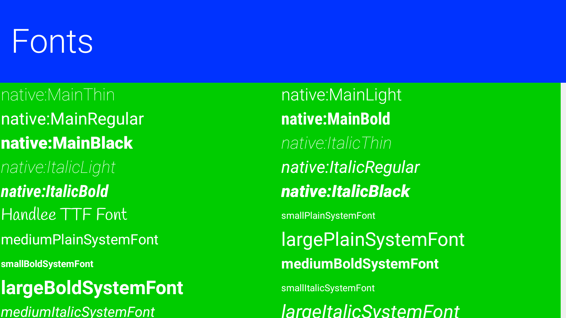
The code below demonstrates all the major fonts available in Codename One with the handlee ttf file posing as a standin for arbitrary TTF:
private Label createForFont(Font fnt, String s) {
  Label l = new Label(s);
  l.getUnselectedStyle().setFont(fnt);
  return l;
}

public void showForm() {
  GridLayout gr = new GridLayout(5);
  gr.setAutoFit(true);
  Form hi = new Form("Fonts", gr);

  int fontSize = Display.getInstance().convertToPixels(3);

  // requires Handlee-Regular.ttf in the src folder root!
  Font ttfFont = Font.createTrueTypeFont("Handlee", "Handlee-Regular.ttf").
                      derive(fontSize, Font.STYLE_PLAIN);

  Font smallPlainSystemFont = Font.createSystemFont(Font.FACE_SYSTEM, Font.STYLE_PLAIN, Font.SIZE_SMALL);
  Font mediumPlainSystemFont = Font.createSystemFont(Font.FACE_SYSTEM, Font.STYLE_PLAIN, Font.SIZE_MEDIUM);
  Font largePlainSystemFont = Font.createSystemFont(Font.FACE_SYSTEM, Font.STYLE_PLAIN, Font.SIZE_LARGE);
  Font smallBoldSystemFont = Font.createSystemFont(Font.FACE_SYSTEM, Font.STYLE_BOLD, Font.SIZE_SMALL);
  Font mediumBoldSystemFont = Font.createSystemFont(Font.FACE_SYSTEM, Font.STYLE_BOLD, Font.SIZE_MEDIUM);
  Font largeBoldSystemFont = Font.createSystemFont(Font.FACE_SYSTEM, Font.STYLE_BOLD, Font.SIZE_LARGE);
  Font smallItalicSystemFont = Font.createSystemFont(Font.FACE_SYSTEM, Font.STYLE_ITALIC, Font.SIZE_SMALL);
  Font mediumItalicSystemFont = Font.createSystemFont(Font.FACE_SYSTEM, Font.STYLE_ITALIC, Font.SIZE_MEDIUM);
  Font largeItalicSystemFont = Font.createSystemFont(Font.FACE_SYSTEM, Font.STYLE_ITALIC, Font.SIZE_LARGE);

  Font smallPlainMonospaceFont = Font.createSystemFont(Font.FACE_MONOSPACE, Font.STYLE_PLAIN, Font.SIZE_SMALL);
  Font mediumPlainMonospaceFont = Font.createSystemFont(Font.FACE_MONOSPACE, Font.STYLE_PLAIN, Font.SIZE_MEDIUM);
  Font largePlainMonospaceFont = Font.createSystemFont(Font.FACE_MONOSPACE, Font.STYLE_PLAIN, Font.SIZE_LARGE);
  Font smallBoldMonospaceFont = Font.createSystemFont(Font.FACE_MONOSPACE, Font.STYLE_BOLD, Font.SIZE_SMALL);
  Font mediumBoldMonospaceFont = Font.createSystemFont(Font.FACE_MONOSPACE, Font.STYLE_BOLD, Font.SIZE_MEDIUM);
  Font largeBoldMonospaceFont = Font.createSystemFont(Font.FACE_MONOSPACE, Font.STYLE_BOLD, Font.SIZE_LARGE);
  Font smallItalicMonospaceFont = Font.createSystemFont(Font.FACE_MONOSPACE, Font.STYLE_ITALIC, Font.SIZE_SMALL);
  Font mediumItalicMonospaceFont = Font.createSystemFont(Font.FACE_MONOSPACE, Font.STYLE_ITALIC, Font.SIZE_MEDIUM);
  Font largeItalicMonospaceFont = Font.createSystemFont(Font.FACE_MONOSPACE, Font.STYLE_ITALIC, Font.SIZE_LARGE);

  Font smallPlainProportionalFont = Font.createSystemFont(Font.FACE_PROPORTIONAL, Font.STYLE_PLAIN, Font.SIZE_SMALL);
  Font mediumPlainProportionalFont = Font.createSystemFont(Font.FACE_PROPORTIONAL, Font.STYLE_PLAIN, Font.SIZE_MEDIUM);
  Font largePlainProportionalFont = Font.createSystemFont(Font.FACE_PROPORTIONAL, Font.STYLE_PLAIN, Font.SIZE_LARGE);
  Font smallBoldProportionalFont = Font.createSystemFont(Font.FACE_PROPORTIONAL, Font.STYLE_BOLD, Font.SIZE_SMALL);
  Font mediumBoldProportionalFont = Font.createSystemFont(Font.FACE_PROPORTIONAL, Font.STYLE_BOLD, Font.SIZE_MEDIUM);
  Font largeBoldProportionalFont = Font.createSystemFont(Font.FACE_PROPORTIONAL, Font.STYLE_BOLD, Font.SIZE_LARGE);
  Font smallItalicProportionalFont = Font.createSystemFont(Font.FACE_PROPORTIONAL, Font.STYLE_ITALIC, Font.SIZE_SMALL);
  Font mediumItalicProportionalFont = Font.createSystemFont(Font.FACE_PROPORTIONAL, Font.STYLE_ITALIC, Font.SIZE_MEDIUM);
  Font largeItalicProportionalFont = Font.createSystemFont(Font.FACE_PROPORTIONAL, Font.STYLE_ITALIC, Font.SIZE_LARGE);

  String[] nativeFontTypes = {
      "native:MainThin", "native:MainLight",
      "native:MainRegular", "native:MainBold",
      "native:MainBlack", "native:ItalicThin",
      "native:ItalicLight", "native:ItalicRegular",
      "native:ItalicBold", "native:ItalicBlack"};

  for(String s : nativeFontTypes) {
      Font tt  = Font.createTrueTypeFont(s, s).derive(fontSize, Font.STYLE_PLAIN);
      hi.add(createForFont(tt, s));
  }

  hi.add(createForFont(ttfFont, "Handlee TTF Font")).
          add(createForFont(smallPlainSystemFont, "smallPlainSystemFont")).
          add(createForFont(mediumPlainSystemFont, "mediumPlainSystemFont")).
          add(createForFont(largePlainSystemFont, "largePlainSystemFont")).
          add(createForFont(smallBoldSystemFont, "smallBoldSystemFont")).
          add(createForFont(mediumBoldSystemFont, "mediumBoldSystemFont")).
          add(createForFont(largeBoldSystemFont, "largeBoldSystemFont")).
          add(createForFont(smallPlainSystemFont, "smallItalicSystemFont")).
          add(createForFont(mediumItalicSystemFont, "mediumItalicSystemFont")).
          add(createForFont(largeItalicSystemFont, "largeItalicSystemFont")).

          add(createForFont(smallPlainMonospaceFont, "smallPlainMonospaceFont")).
          add(createForFont(mediumPlainMonospaceFont, "mediumPlainMonospaceFont")).
          add(createForFont(largePlainMonospaceFont, "largePlainMonospaceFont")).
          add(createForFont(smallBoldMonospaceFont, "smallBoldMonospaceFont")).
          add(createForFont(mediumBoldMonospaceFont, "mediumBoldMonospaceFont")).
          add(createForFont(largeBoldMonospaceFont, "largeBoldMonospaceFont")).
          add(createForFont(smallItalicMonospaceFont, "smallItalicMonospaceFont")).
          add(createForFont(mediumItalicMonospaceFont, "mediumItalicMonospaceFont")).
          add(createForFont(largeItalicMonospaceFont, "largeItalicMonospaceFont")).

          add(createForFont(smallPlainProportionalFont, "smallPlainProportionalFont")).
          add(createForFont(mediumPlainProportionalFont, "mediumPlainProportionalFont")).
          add(createForFont(largePlainProportionalFont, "largePlainProportionalFont")).
          add(createForFont(smallBoldProportionalFont, "smallBoldProportionalFont")).
          add(createForFont(mediumBoldProportionalFont, "mediumBoldProportionalFont")).
          add(createForFont(largeBoldProportionalFont, "largeBoldProportionalFont")).
          add(createForFont(smallItalicProportionalFont, "smallItalicProportionalFont")).
          add(createForFont(mediumItalicProportionalFont, "mediumItalicProportionalFont")).
          add(createForFont(largeItalicProportionalFont, "largeItalicProportionalFont"));

  hi.show();
}
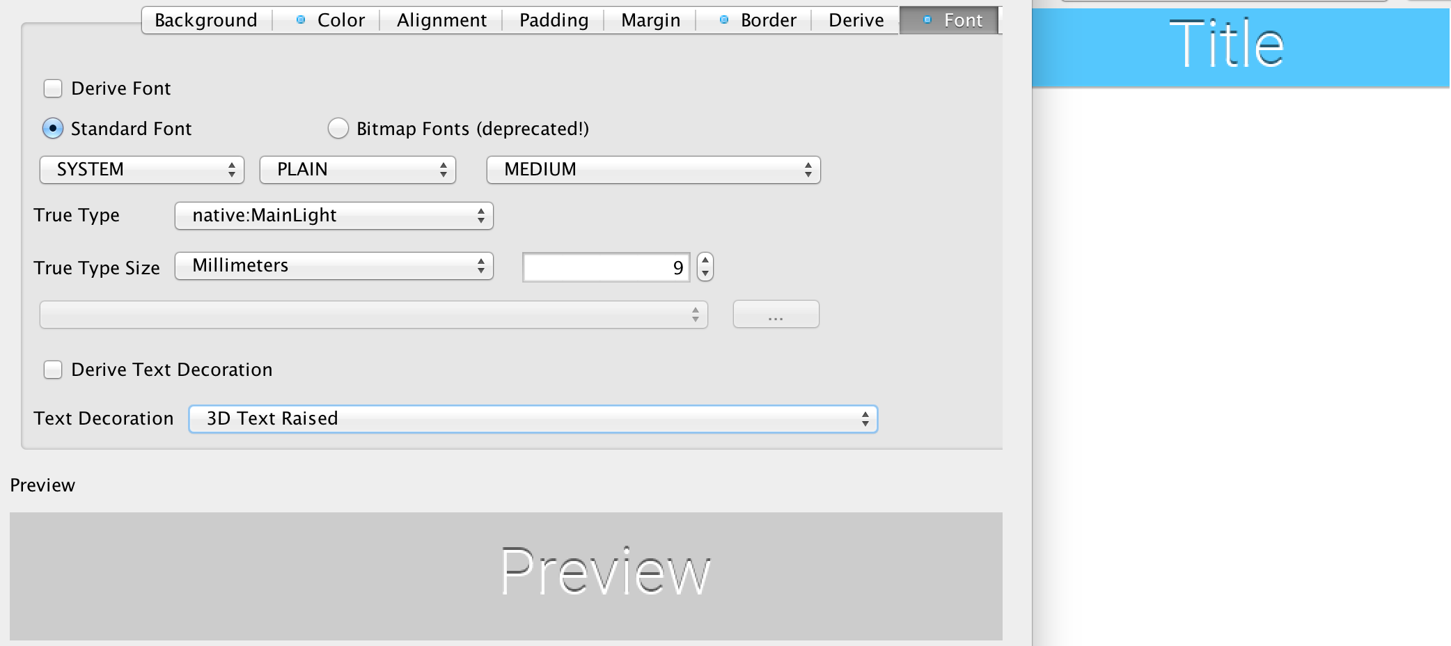
You can define an effect to be applied to a specific font, specifically:
-
Underline
-
Strike thru
-
3d text raised/lowered
-
3d shadow north
The "3d" effects effectively just draw the text twice, with a sligh offest and two different colors to create a "3d" feel.
All of the effects are relatively simple and performant.